FAZER GROUP
Fazer Brand Identity
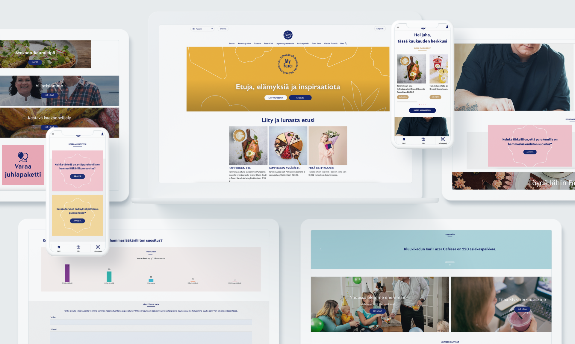
Fazer had a renewed brand positioning, with a goal of becoming a modern, sustainable food experience company, which builded on the heritage of the past century. We wanted to create a visual identity that conveys the brand promise and which would span across the different businesses as well as markets, creating a unique, unified and recognizable identity for a broad spectrum of touchpoints: e.g., retail environments, packages, brand as well as corporate communication, and digital channels.
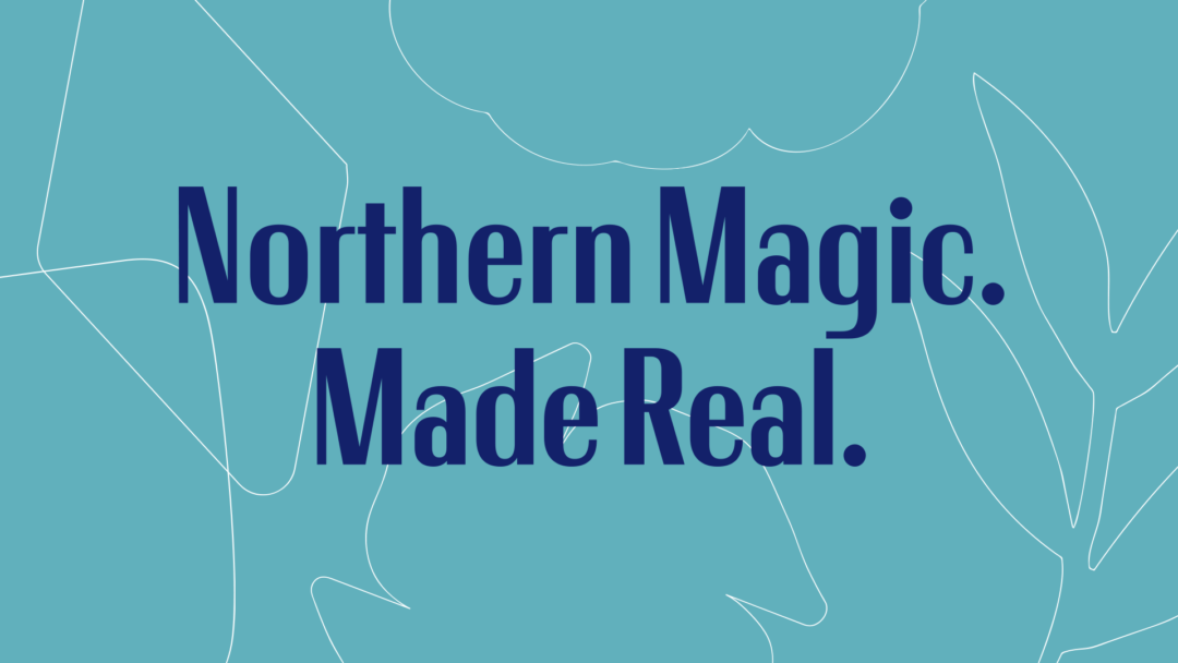
The brand themes Northern liberty, true relationships and fearless creativity describe the values and deeper meaning that needed a visual form and representation in the different uses.
Approach
We created the brand identity concept with various internal stakeholders. The collaborative approach ensured the design system offers flexibility to meet the needs of different categories and markets, and that the system is easy to adapt. The key insight for a successful identity is the balance of uniformity and flexibility to ensure that each business and market can remain relevant and competitive in the respective categories.
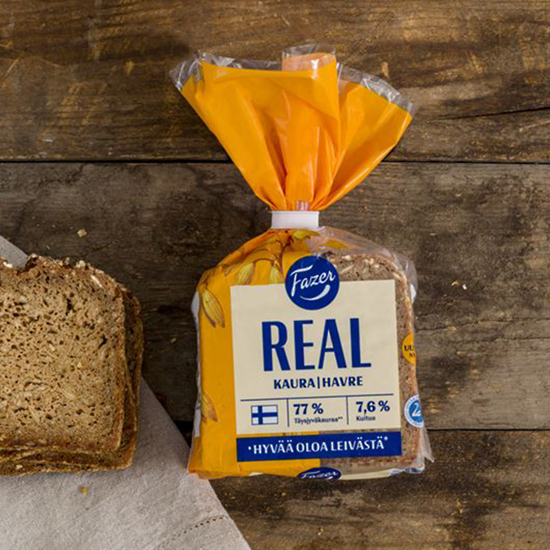
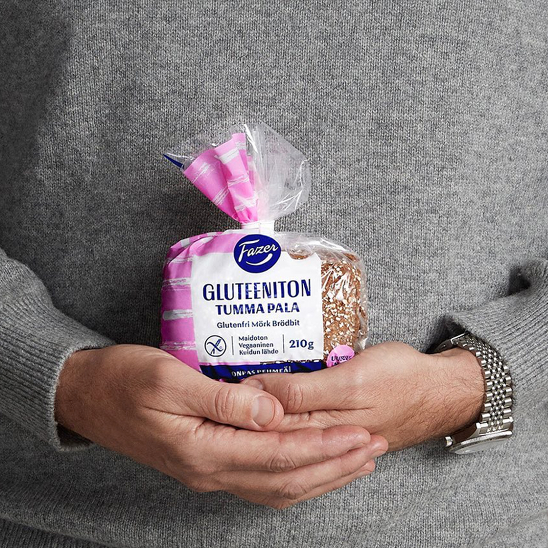
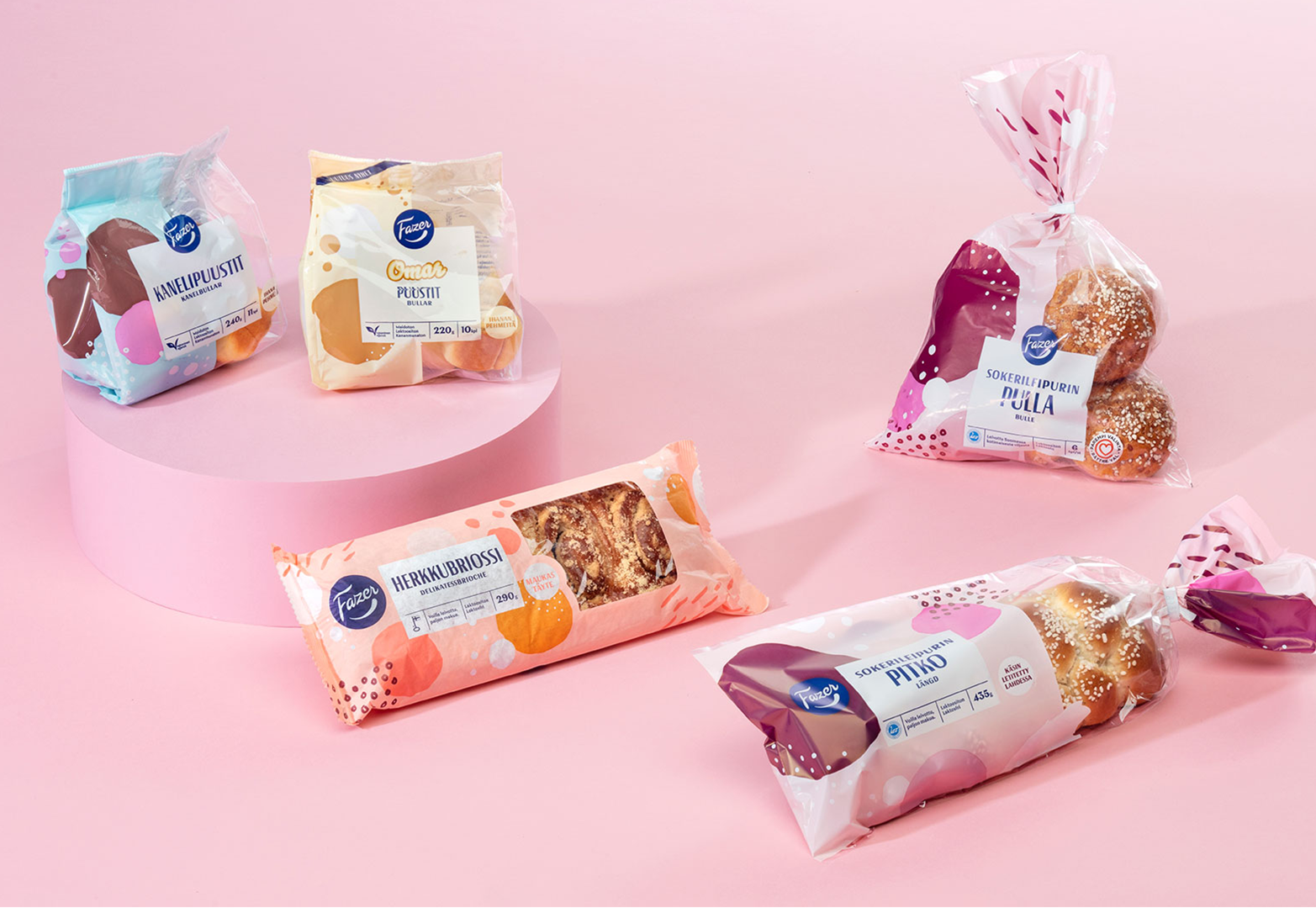
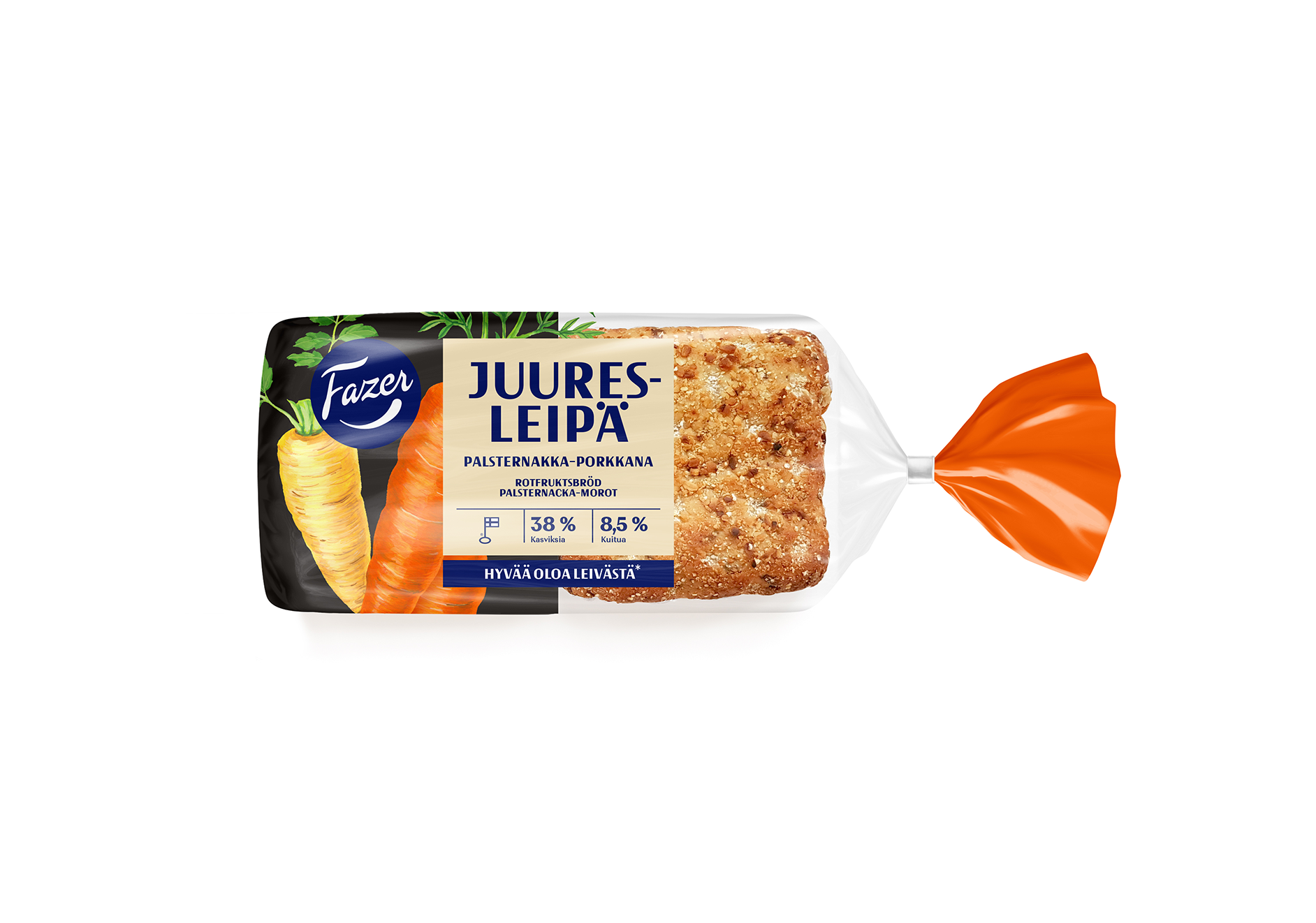
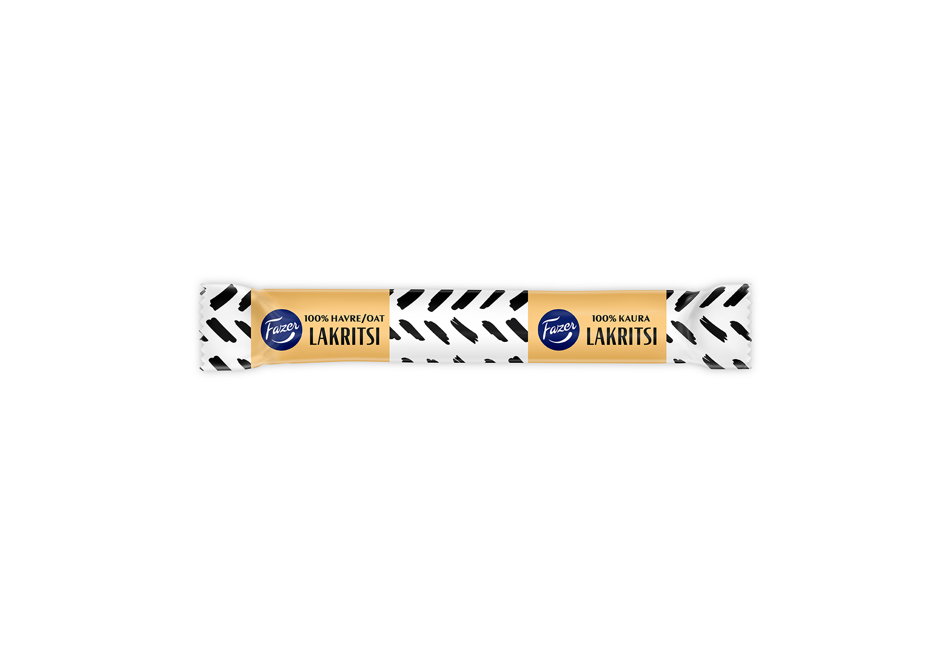
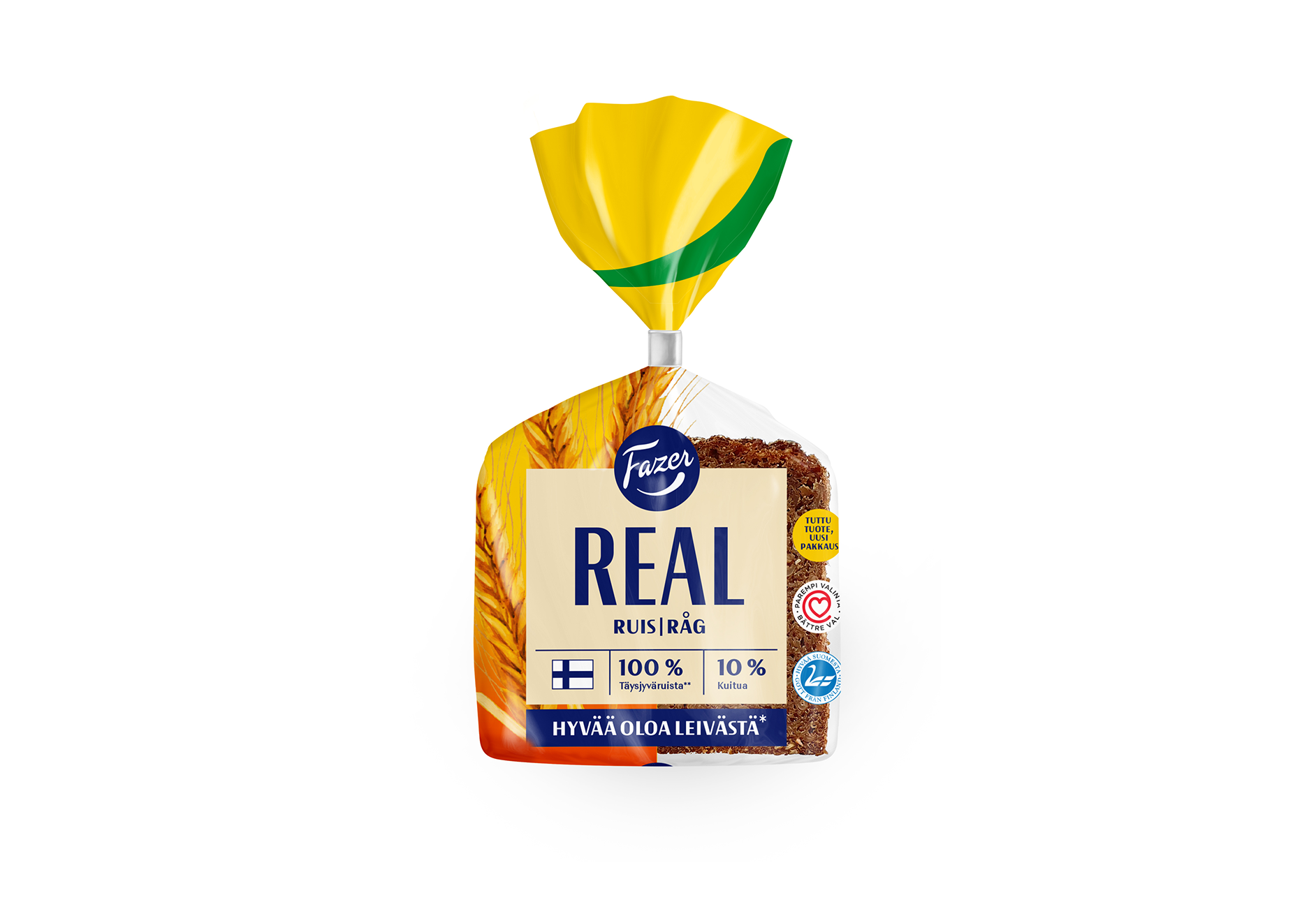
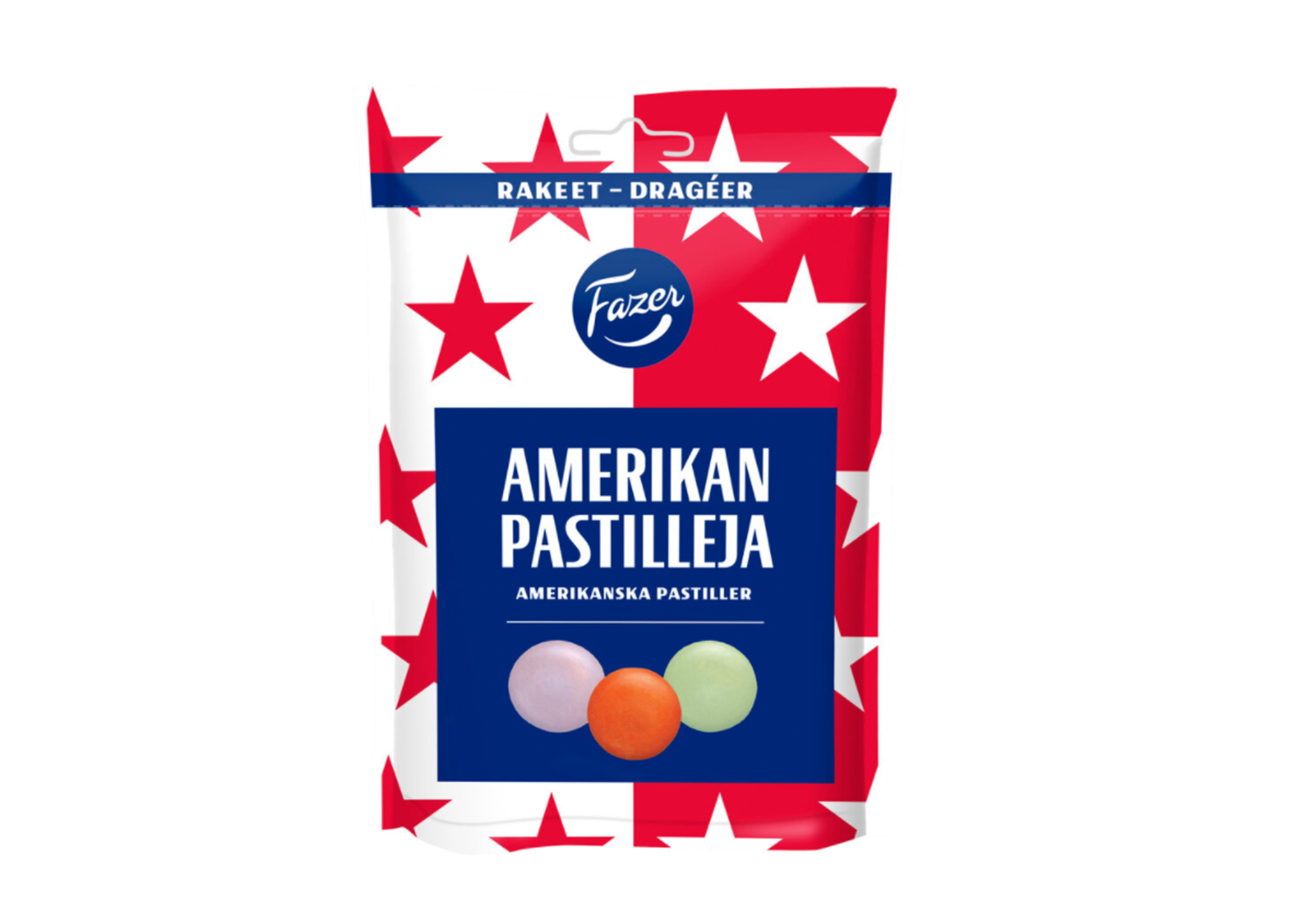
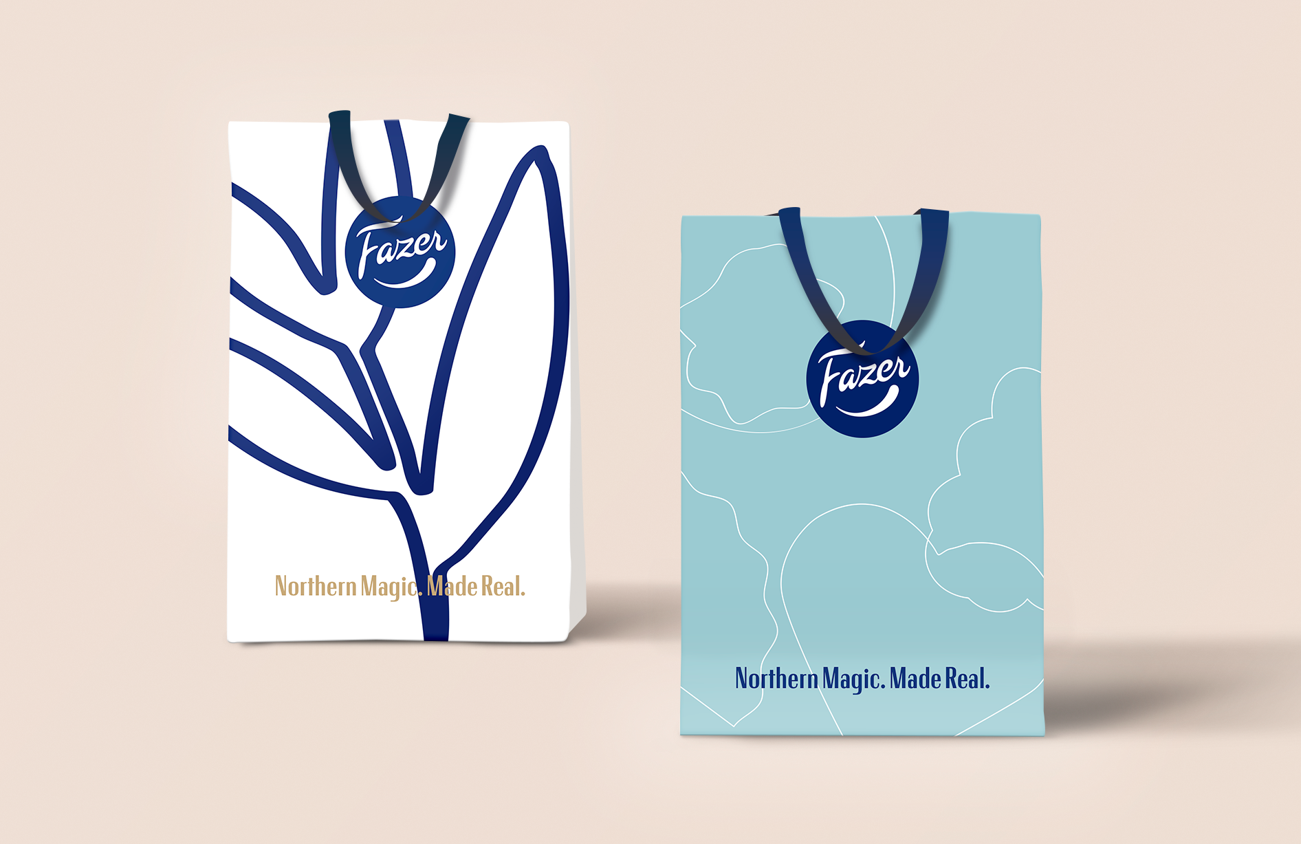
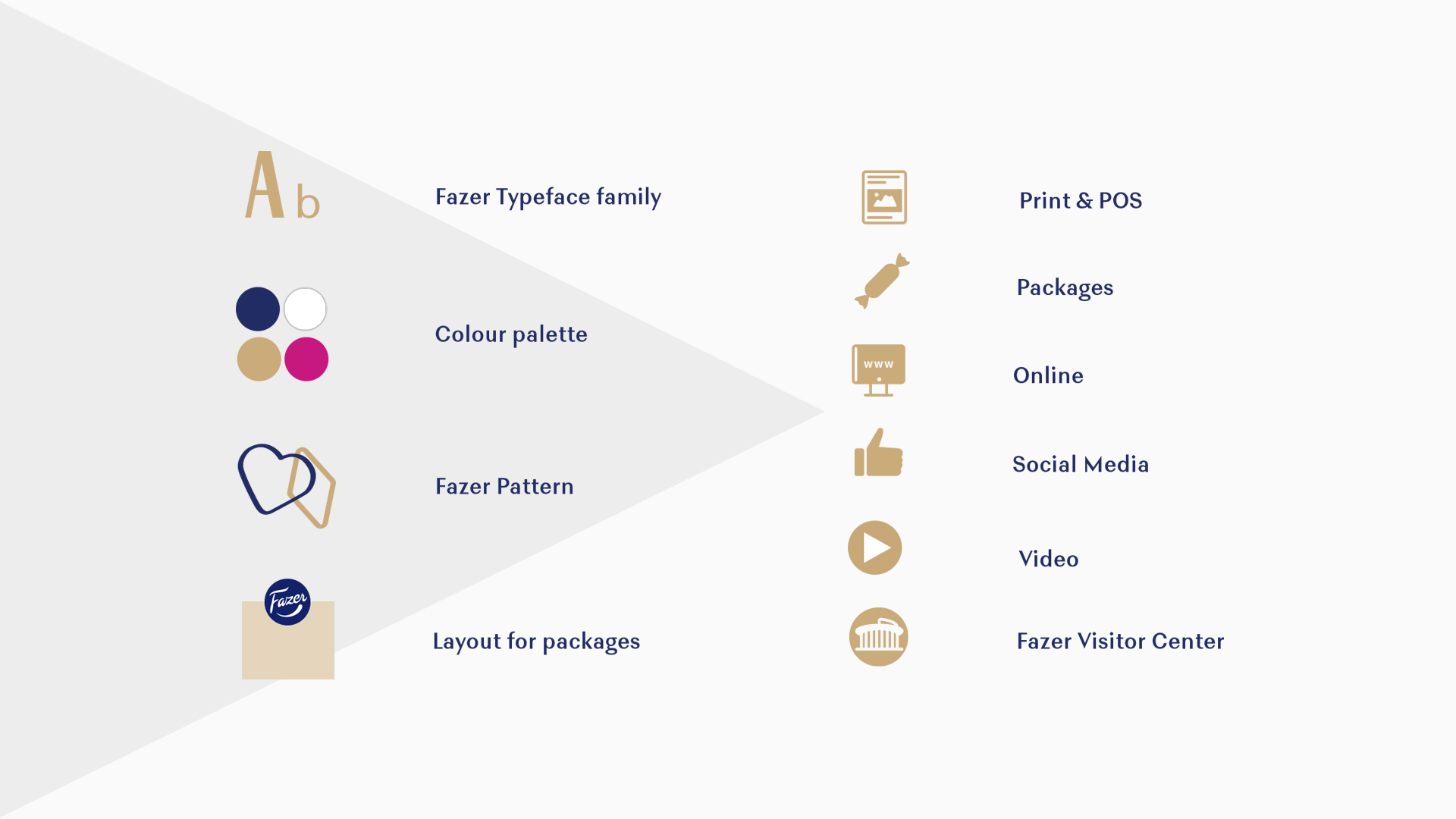
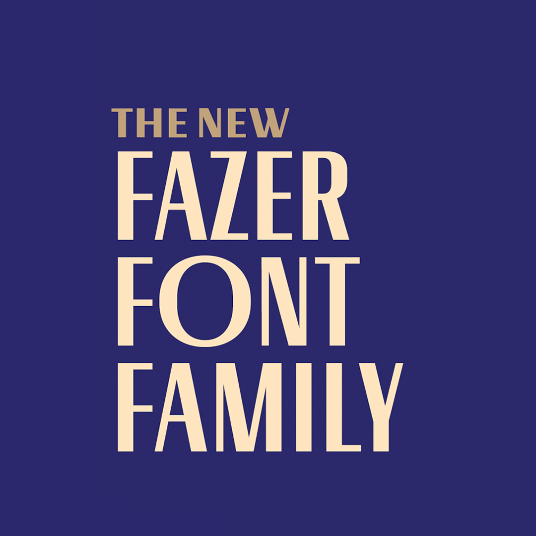
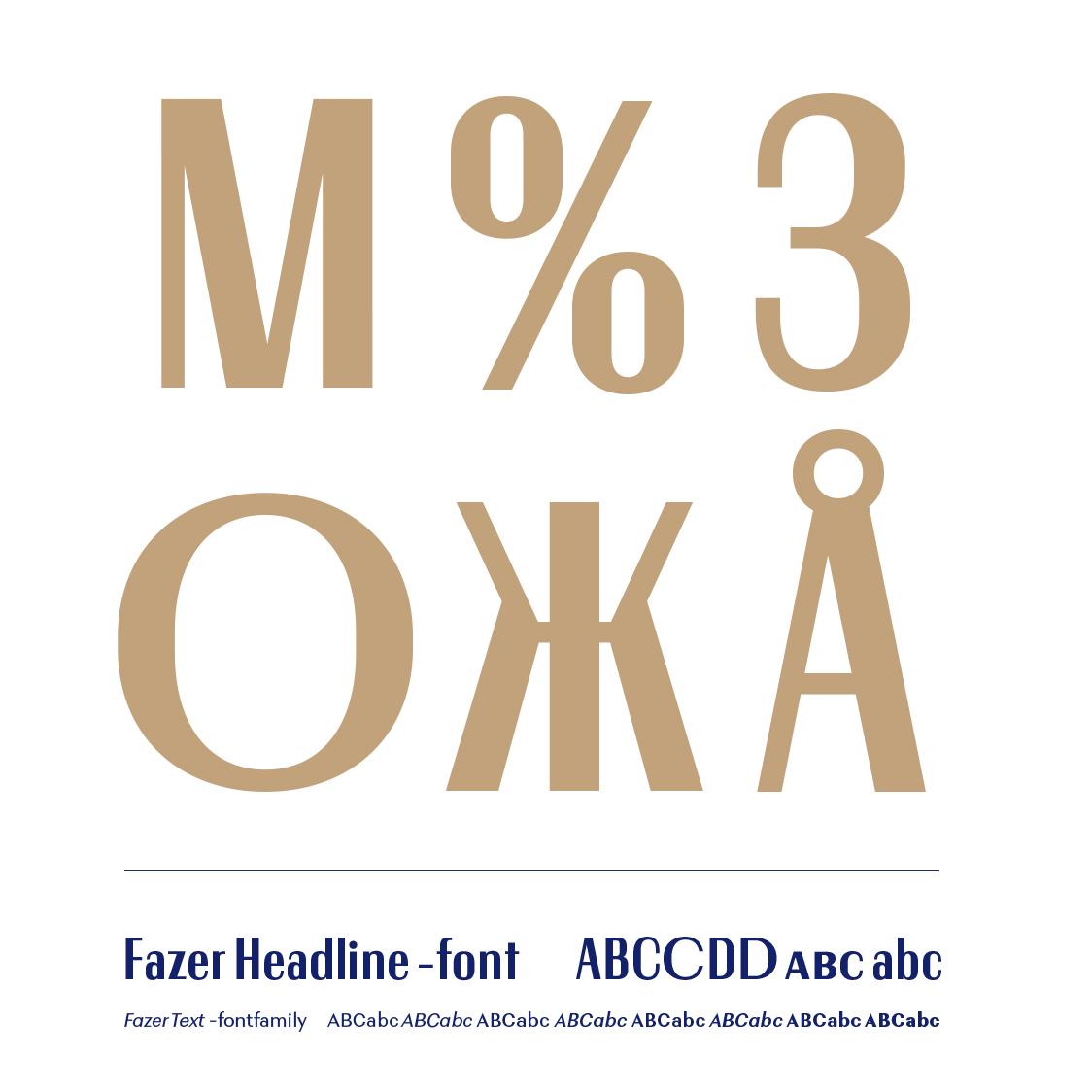
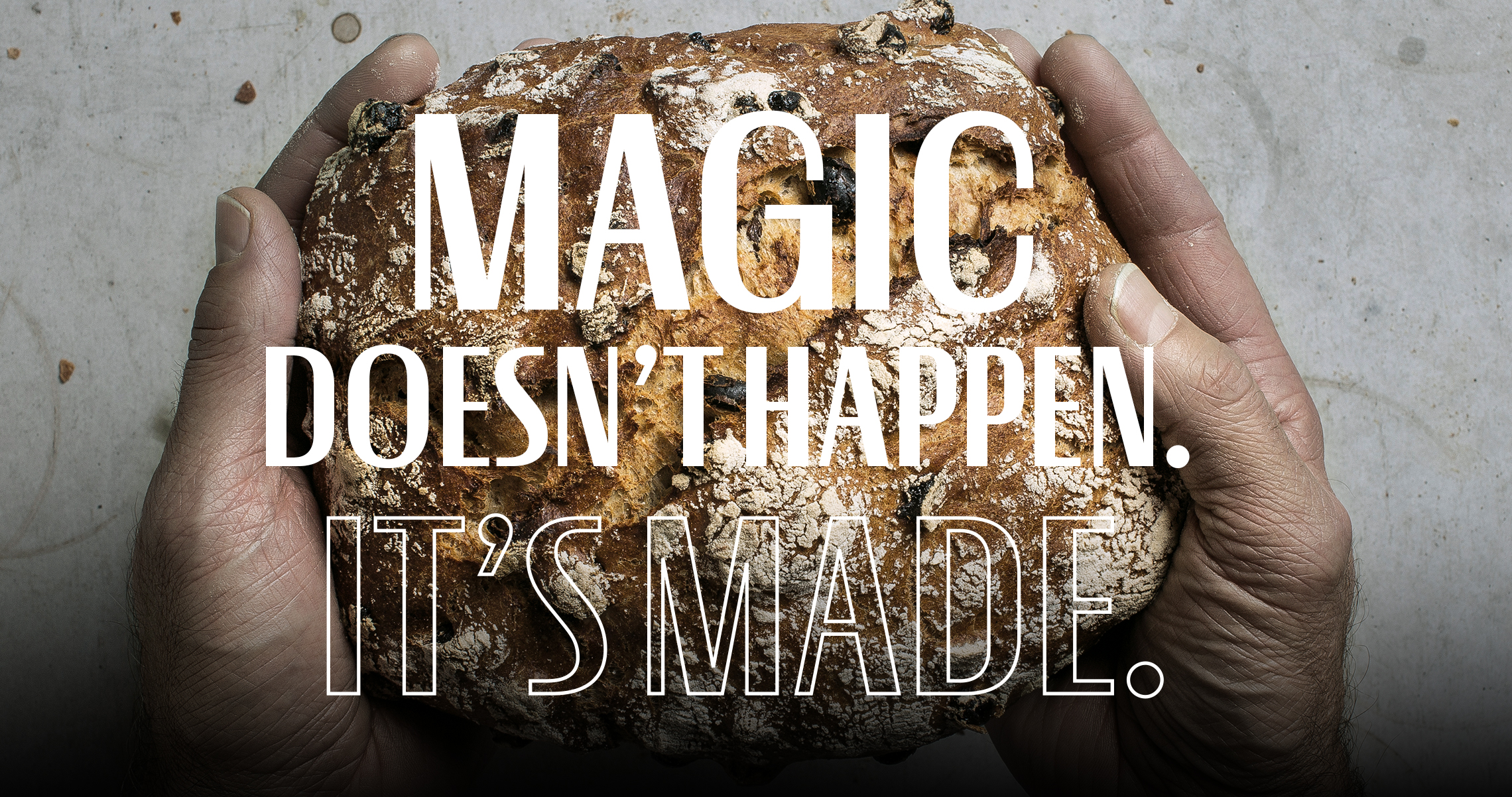
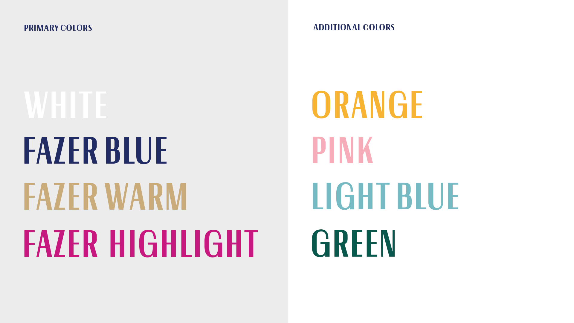
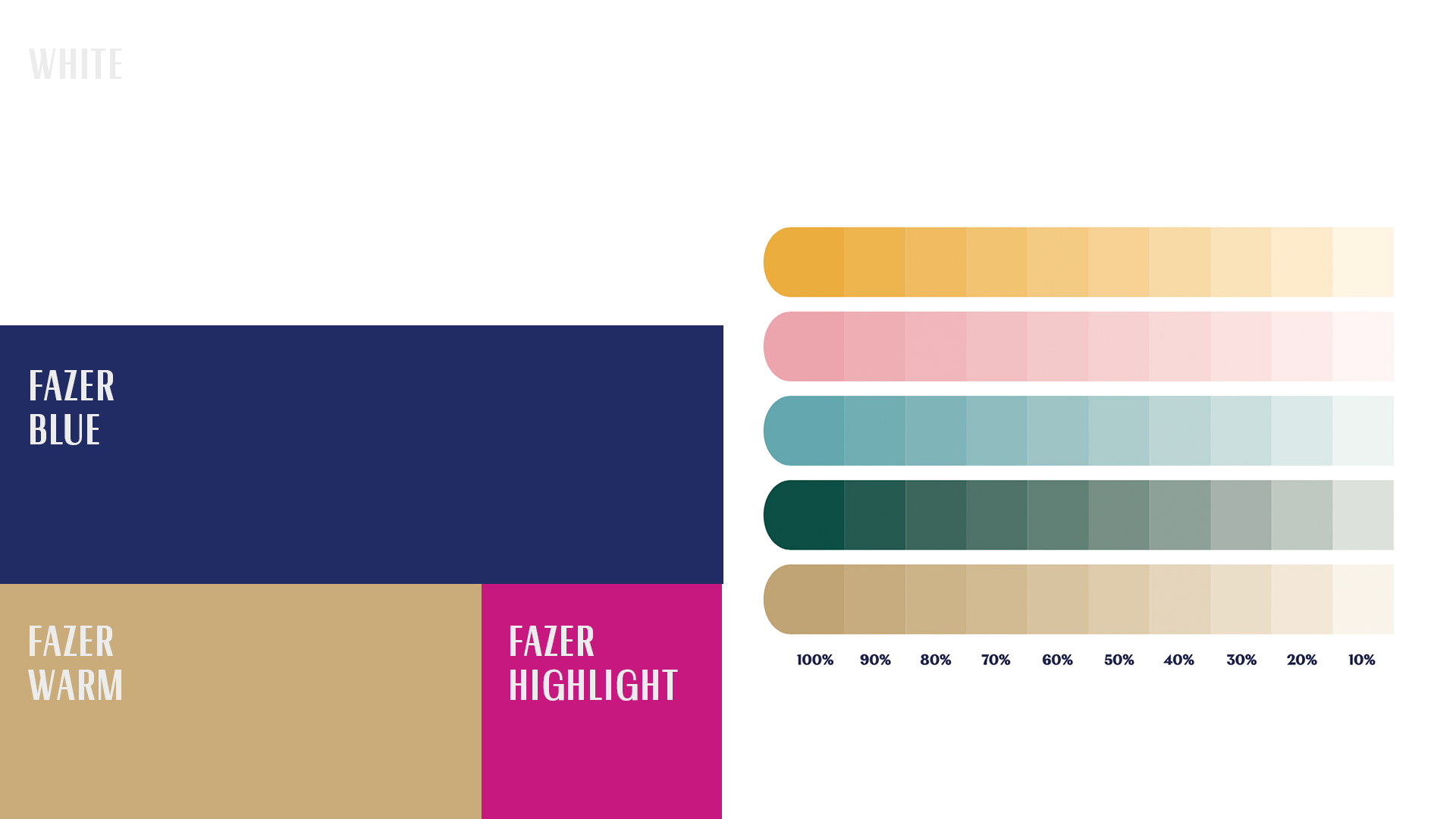
The Fazer custom typeface family, a system and layouts for product packages, and additions to the Fazer colour palette were the key outcomes of the work. The Fazer timeless lettering in the earlier days inspired us to design the contemporary font family, and it was the key achieving visual coherence in all touchpoints. A design system and layout guidelines for package designs create coherency across categories, since the package is often the main media. As a closure for the big entity, we designed the final supportive brand asset: a versatile, adaptable and flexible pattern.
Results
The brand identity and the guidelines supporting its use are meant for internal and external partner use. The guidelines are comprised in sections covering the background and objectives as well practical application instructions and examples.
The Fazer brand and strategic objectives are the tenets of the brand visuals. The design system is flexibile allowing freedom to play the category and its conventions. The elements also support renewal, which is needed to keep relevant in the consumers’ minds.
The Fazer visual identity conveys the brand positioning. The brand identity and coherent use of the visual assets are very powerful tools in strengthening the brand. The Northern Magic themes: Northern Liberty, True Relationships and Fearless Creativity have been translated to design cues, which are found in the overall identity as well as in details of the concept. Northern Magic. Made Real. is reflected in design elements such as shapes, colours or patterns but also in actions that Fazer commits to, for example in constantly seeking more sustainable solutions in packaging.
With a common design logic and coherent use of the brand identity assets the Fazer brand will become stronger. The brand will be more uniform and recognizable across the categories, and make it easier for the consumers to find the brand. The design solution supports the brand in expressing what it believes in and what it stands for.
We wanted to create a visual identity conveying the brand promise and spanning across businesses and markets. Our idea is a unique, unified and recognizable identity in various touchpoints, such as packages, brand and corporate communication, as well as digital channels.
The key outcomes are a Fazer custom typeface family, a system and layouts for product packages, and additions to the Fazer colour palette. Fazer’s timeless lettering in the earlier days inspired us with the contemporary font family, which gives
visual coherence in all touchpoints. A design system and layout guidelines for packages build coherency across categories.

What was the main benefit of the project?
Delivered result:
Coherence and a joint expression for Fazer brand, based on thorough consumer insights and strategy. The design makes Fazer relevant in current time with our brand and company heritage running through it and a timeless expression that will not become obsolete.
Process:
Under the inspiring and professional guidance of Pentagon in workshops, Fazer brand executives got the opportunity to discuss brand strategy, exchange ideas and form a common understanding of the Fazer brand.
Camilla Fjällberg / Head of Brand & Portfolio / Fazer Bageri Sverige
Unique typography


Layout for packages