FAZER CONFECTIONERY
Fazer LAKRITSI – creating a new brand with the visual heritage
Fazer had decided to launch a new premium liquorice brand and with this brand expand the category in a premium direction especially in the Finnish market. Fazer had a strong history in liquorice, but the portfolio was difficult to manage and the existing small brands did not stretch to cover the more premium needs.
Package is the main media in this category and both the overall visual identity and the on-pack details should communicate the right message: Fine Finnish Liquorice, which was the tagline for the brand.
The concept solution was built on the heritage of Fazer within this category, but expanding the category to cover new use situations. The shelf-impact, recognizability and ability to create an umbrella for next steps in the portfolio development, were among the success criteria.
Approach
The concept design work was driven by consumer insight and customers, thought-leaders and retail representatives were involved in the process to provide inspiration and to validate the design decisions. The purpose was to understand the current and latent needs of the consumers, the perspective of the retail customers as well as seizing the relevant positive trends.
The research through design –approach enabled us to look into various alternative combinations of key brand messages, product range structures and visual identities. The aim was to find a credible, relevant value proposition, which is commercially viable as well as feasible from the manufacturing point-of-view.
The positioning required a new approach in the visual identity and packaging development. The concept was built around core elements such as a strong visual identity suitable for high quality products and the long heritage of Fazer in liquorice manufacturing. The aim was to create a modern, simple and recognizable packaging line for the new use situations: gifting and special moments.
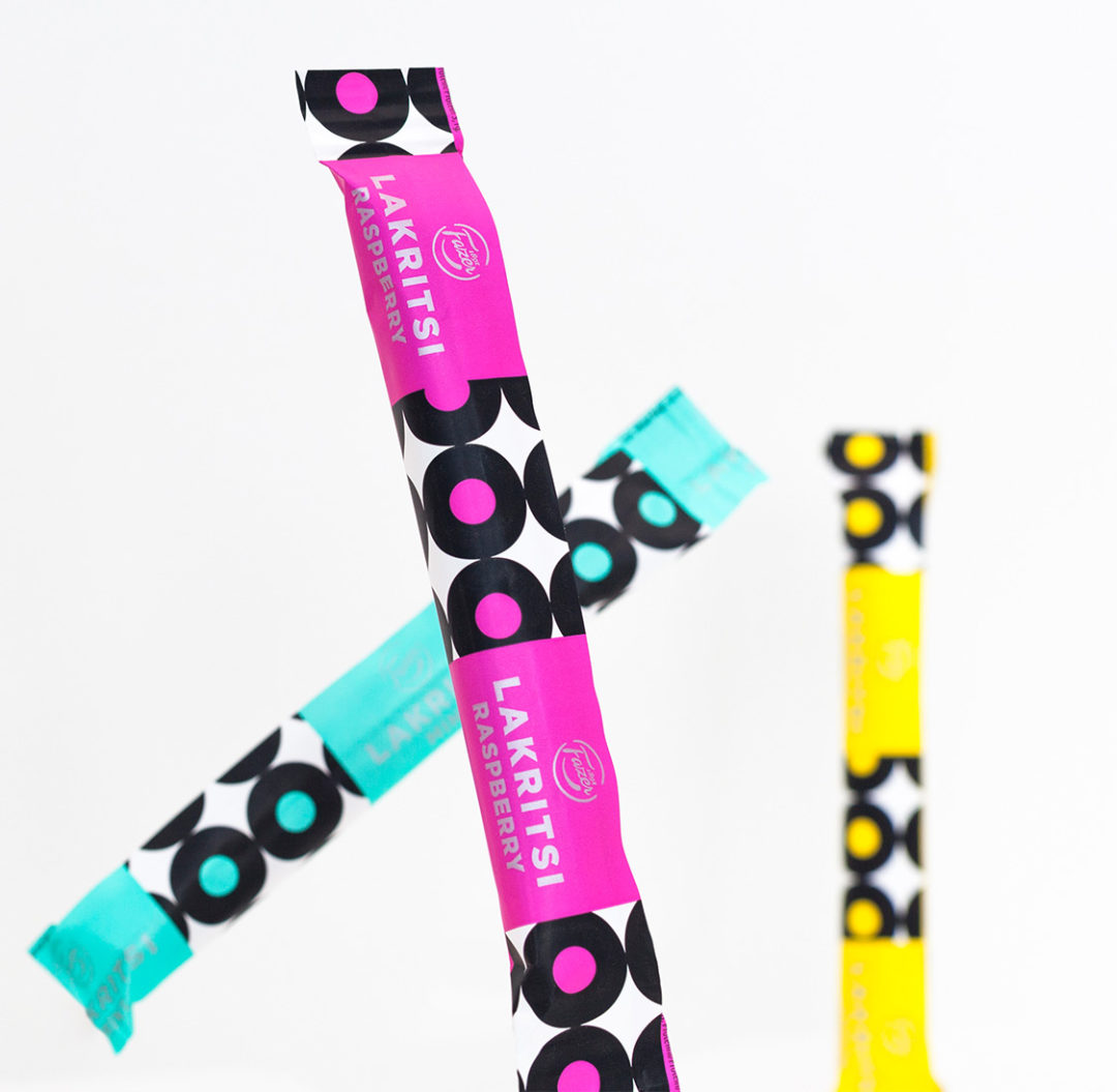
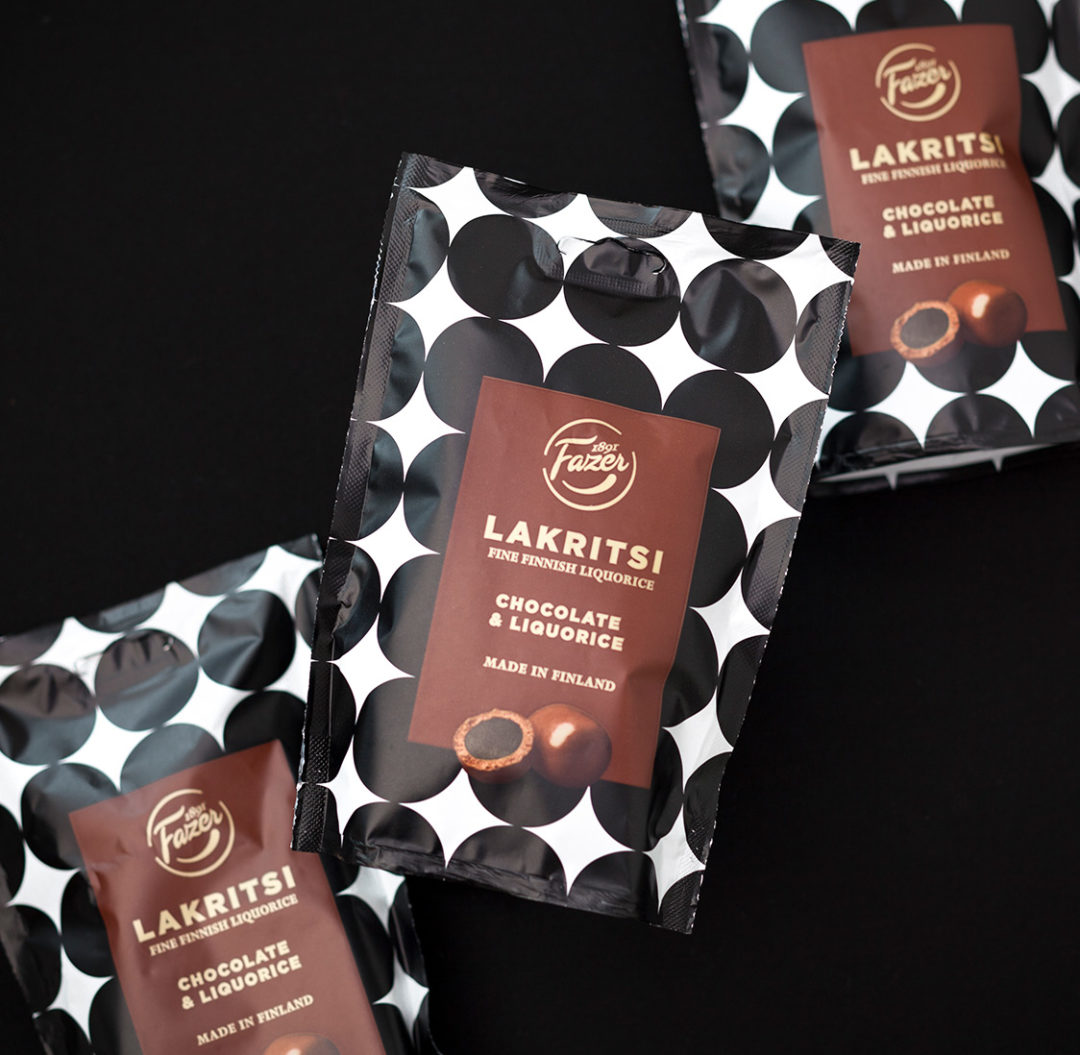
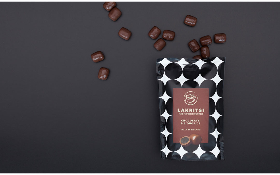
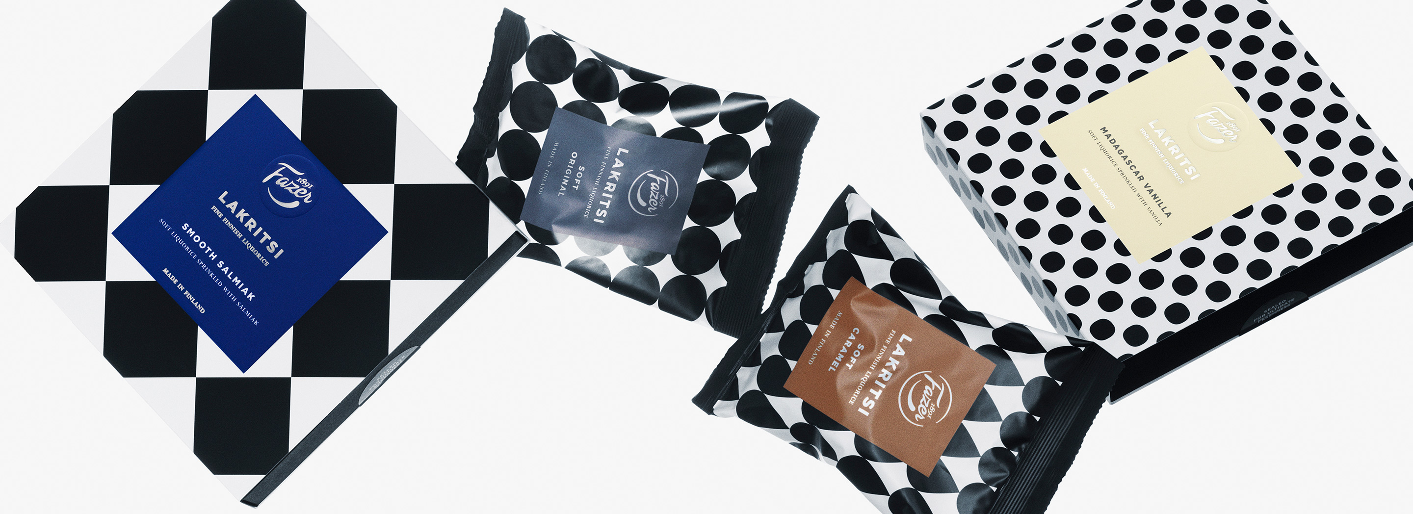
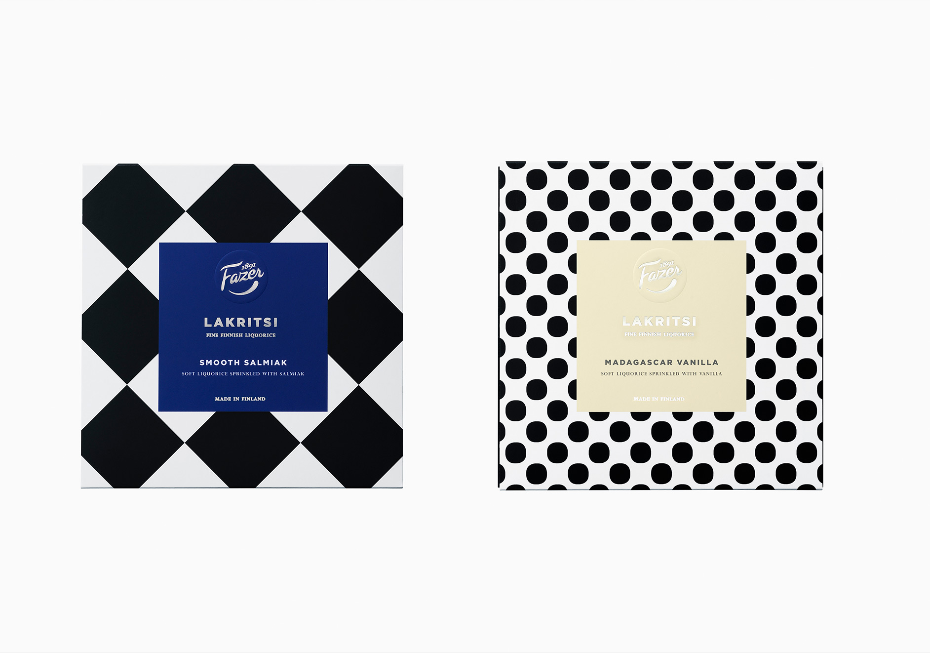
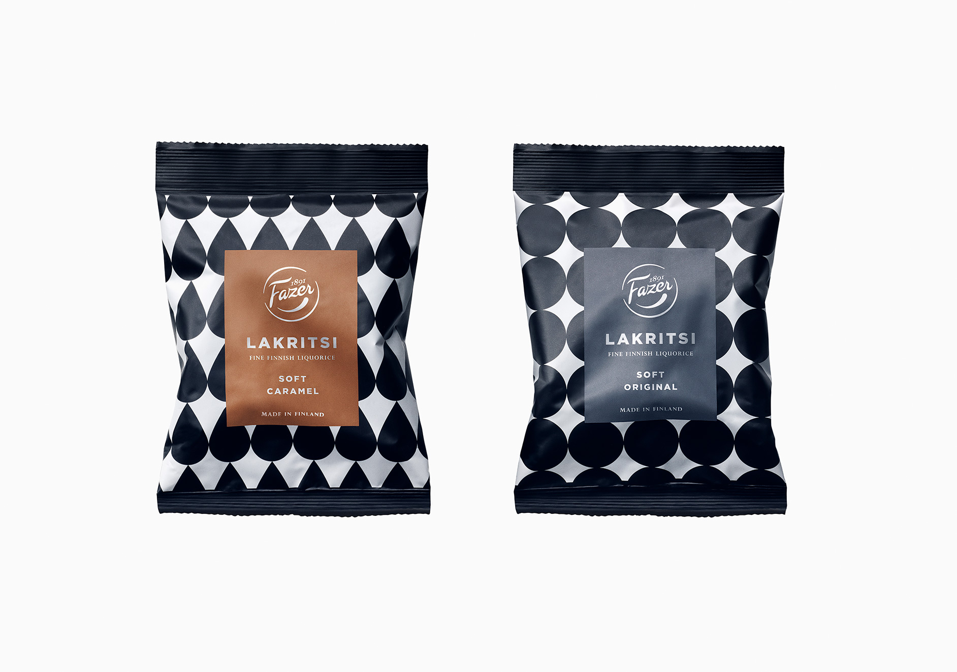
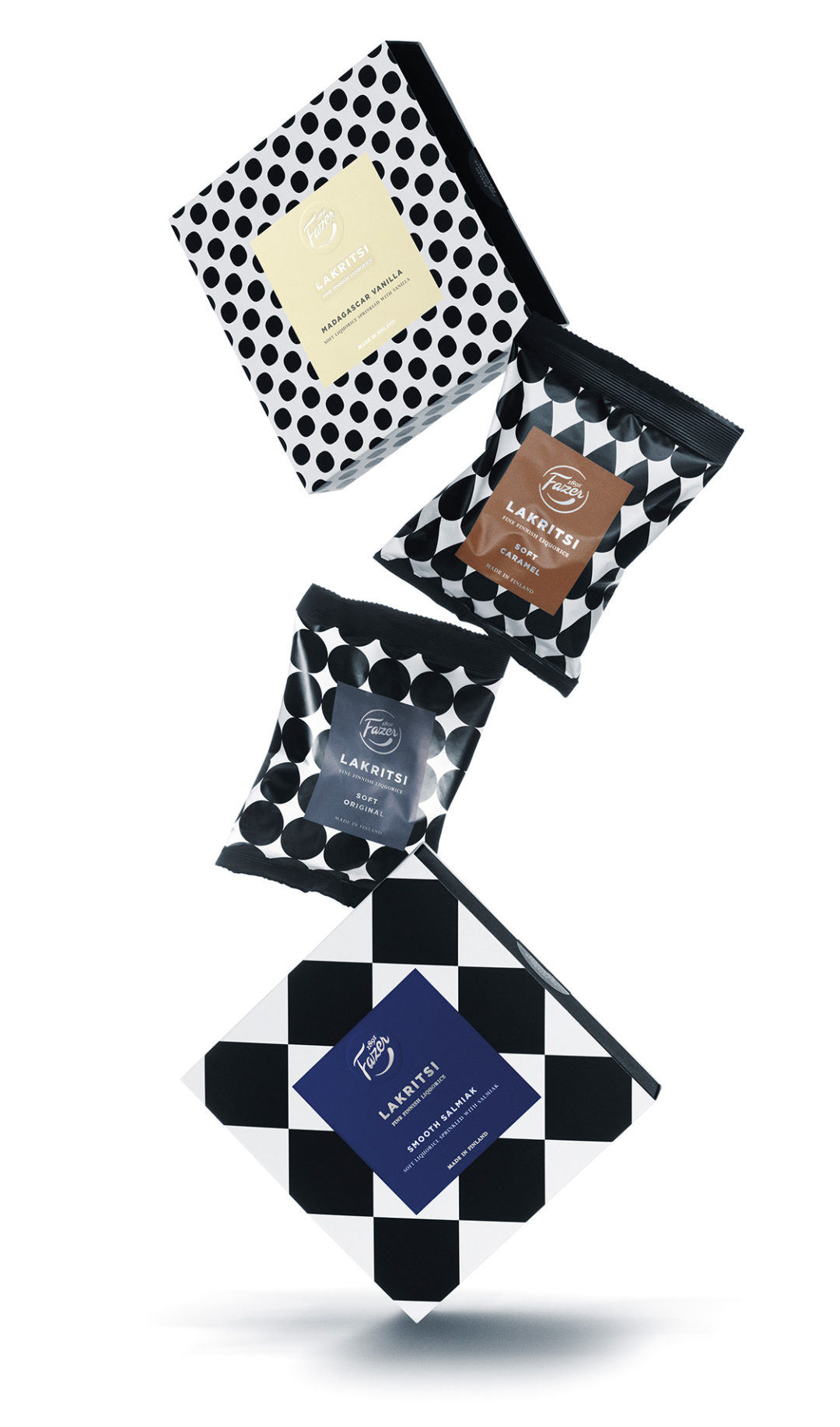
The visual identity of LAKRITSI packaging concept was inspired by the traditional salmiakki visuals, bringing the iconic elements into a contemporary form. The visual concept comprises of a system of identifiable patterns and etiquettes in colors communicating the taste profile of each product. With the strong and simple visual concept, the importance of the details was notable.
Result
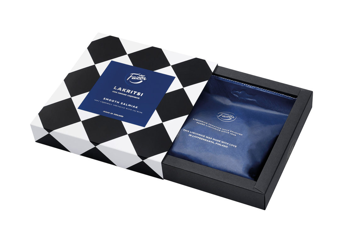
The first Fazer LAKRITSI products launched included two bags for personal consumption and two carton boxes for gifting occasions. Since the initial lauch, the portfolio has grown to include a number of flavors, product types, all under the Fazer LAKRITSI umbrella and utilizing the visual assets.
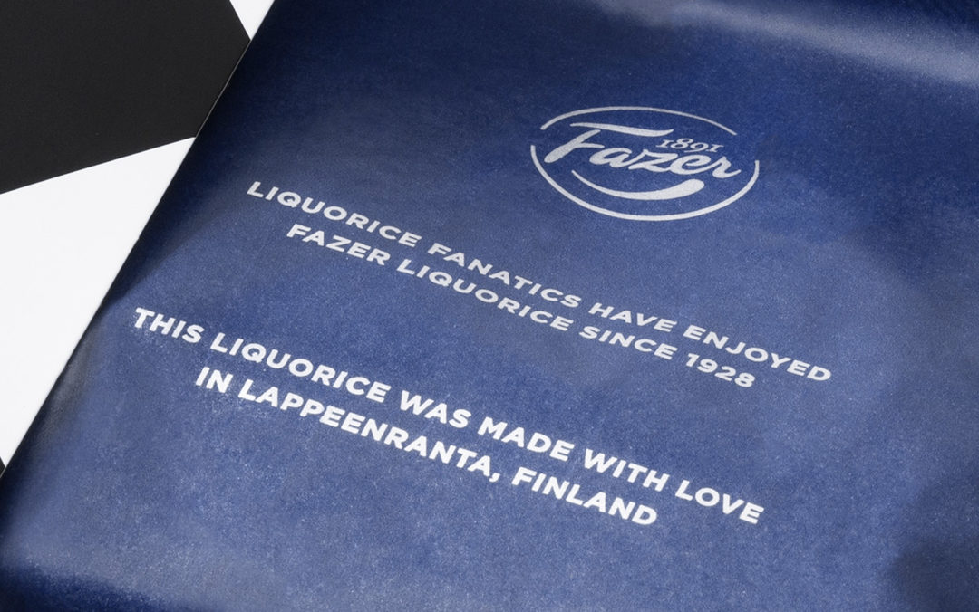
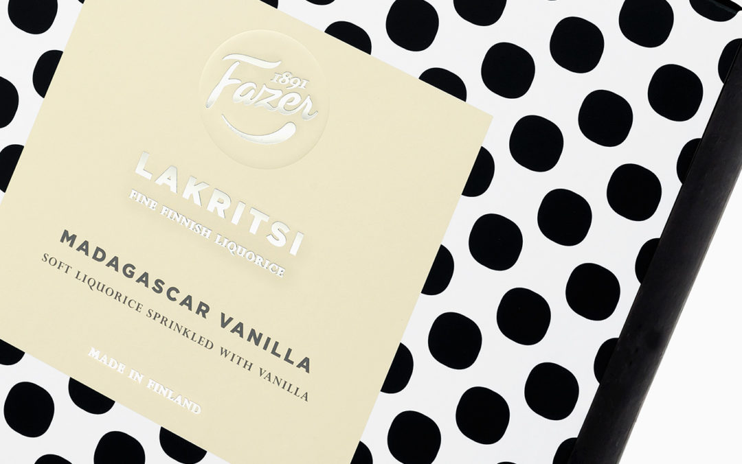
The details included choosing a haptical soft-touch material both for the bags and the carton boxes, creating a link to the soft and smooth liquorice inside; foiling and an embossed logo were also used on the boxes to create a high quality feel. The brand key messages are told on the package and the messages included the Lappeenranta –origin, the taste guide, as well as the Fazer promise of creating taste sensations, marked with the Fazer rooster on the bag and the inner bag.
Fazer LAKRITSI has been awarded with several prizes, including two Vuoden Huiput (Best Finnish Creative Design) awards and a Fennia Prize Winner recognition. Vuoden Huiput jury praised especially the strategic use of design and long-term cooperation between the design office and the company.

Fazer LAKRITSI packaging creates a strong brand block with its graphic black and white patterns. Fazer LAKRITSI is renewing the category and making Fine Finnish Liquorice a delicacy equal to chocolate.
Result highlights
1400
Consumer reactions in one day during pre-launch in social media
From 5 to 10%
Doubling the liquorice bag sales. Market share from 5 to 10 %.
+14%
Growth in younger customer group. Segment grown 14 % in value, 15% in volume.
Vuoden Huiput Gold award / Packaging design: “Classic graphic design at its best. A fairly everyday product has been turned into something more with the help of packaging, graphics and materials: now you can take a box of liquorice instead of a bottle of wine as a gift. Sophisticated without losing the excellent shelf visibility and distinctiveness. This work sets new standards for Finnish packaging design.”
– Arguments by the Vuoden Huiput competition jury
