KOTIVARA
New brand identity and packaging concept for an over 80-year-old family business
We partnered in the work of clarifying the traditional Kotivara brand and designing the new visual identity. The renewal of the Oulu-based family business, founded already in 1943, was comprehensive. Our goal was to highlight the brand’s distinguishing factors and build a modern identity that also communicates the long history.
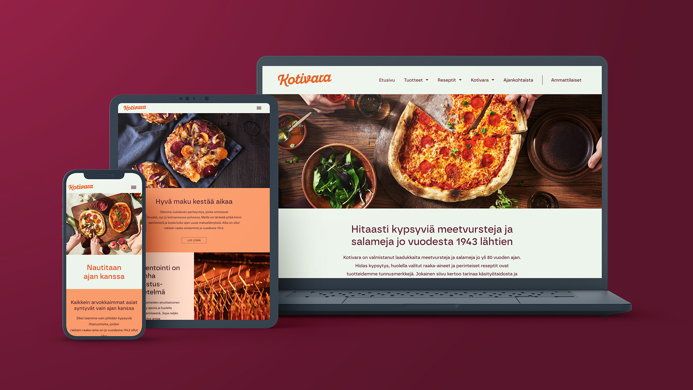
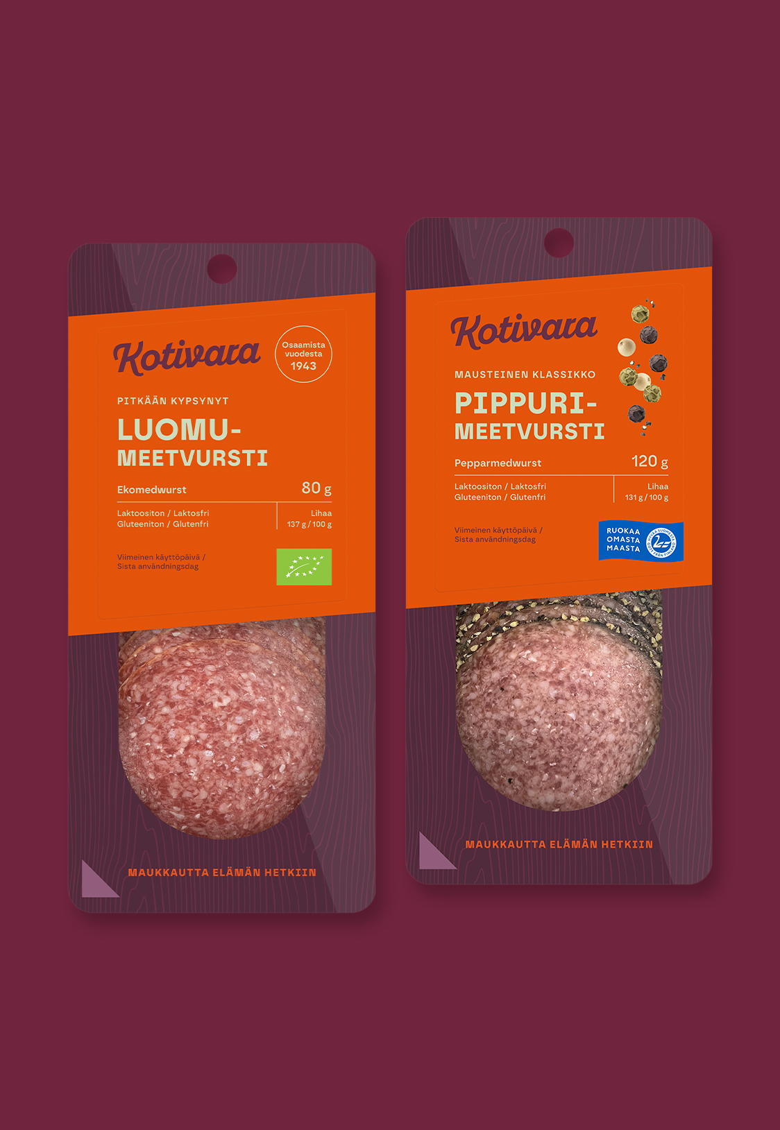
Kotivara received a new brand identity and packaging concept. At the same time, we developed a new marketing communication concept, considering images, brand messages, and packaging across all product categories while maintaining strong recognisability.
The renewed brand is not just a new look, but a promise of quality, tradition, and continuous development.
Challenge
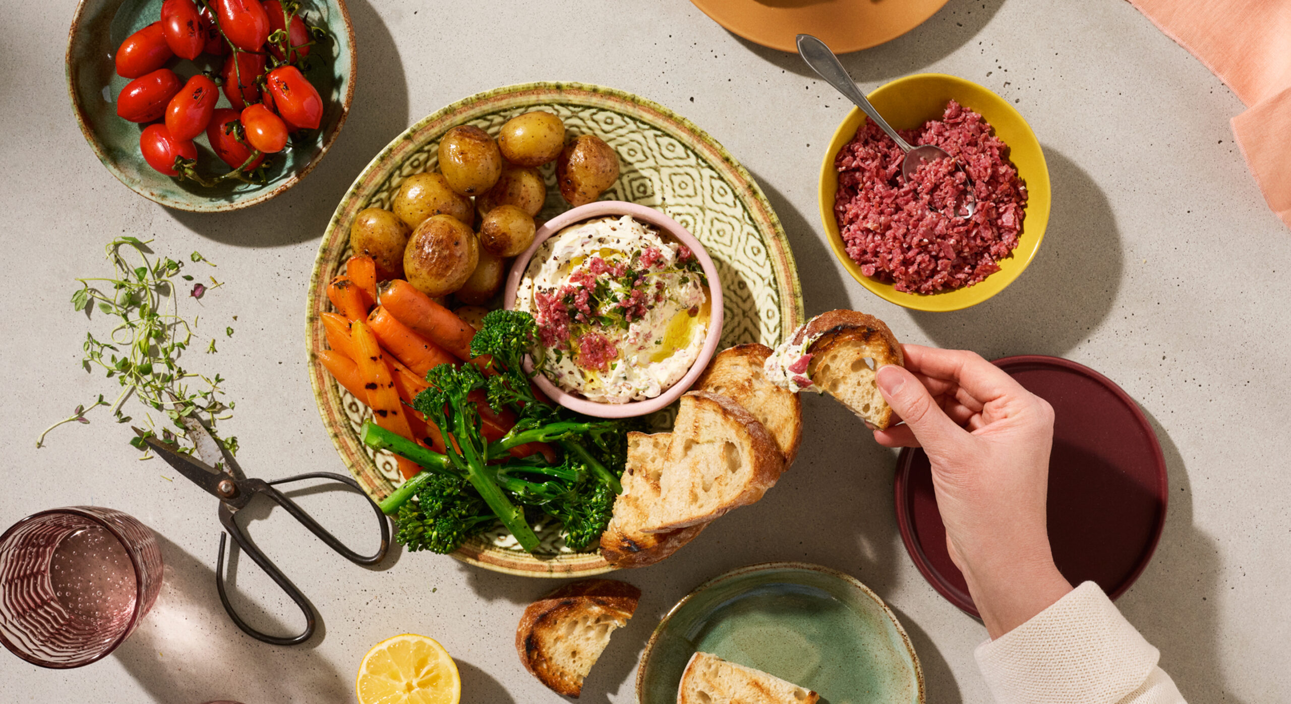
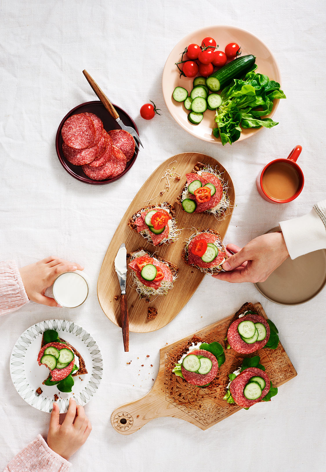
The purpose of the renewal was to bring Kotivara’s identity up to date while honouring its long history. The idea of a renewal arose from the need to respond to the spirit of the times. The renewal of the Oulu-based family business, which has been operating since 1943, was comprehensive: in addition to updating the visual identity and product portfolio, the brand’s values and story were clarified to meet the expectations of today’s consumers. Kotivara’s products are chosen by people who want to enjoy the small moments in life. The most valuable things should not be rushed but savoured over time.
Our goal was to highlight the brand’s distinctive strengths and build a modern identity that would also support the goal of being the category owner, developing the category with the consumer at the centre and considering the goals of the trade.
Approach
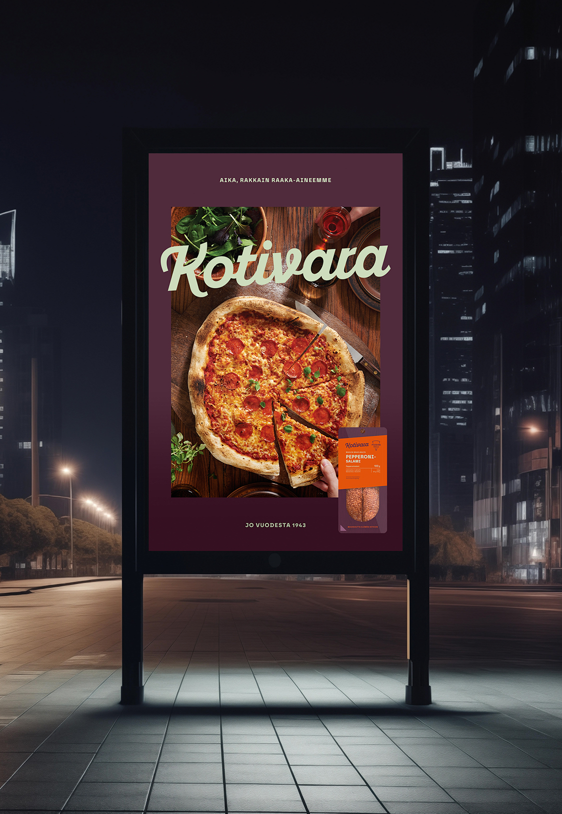
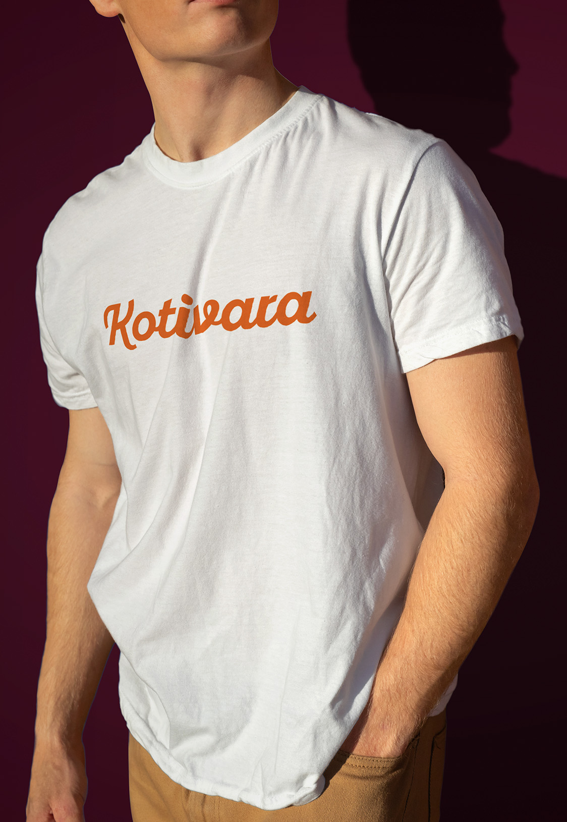
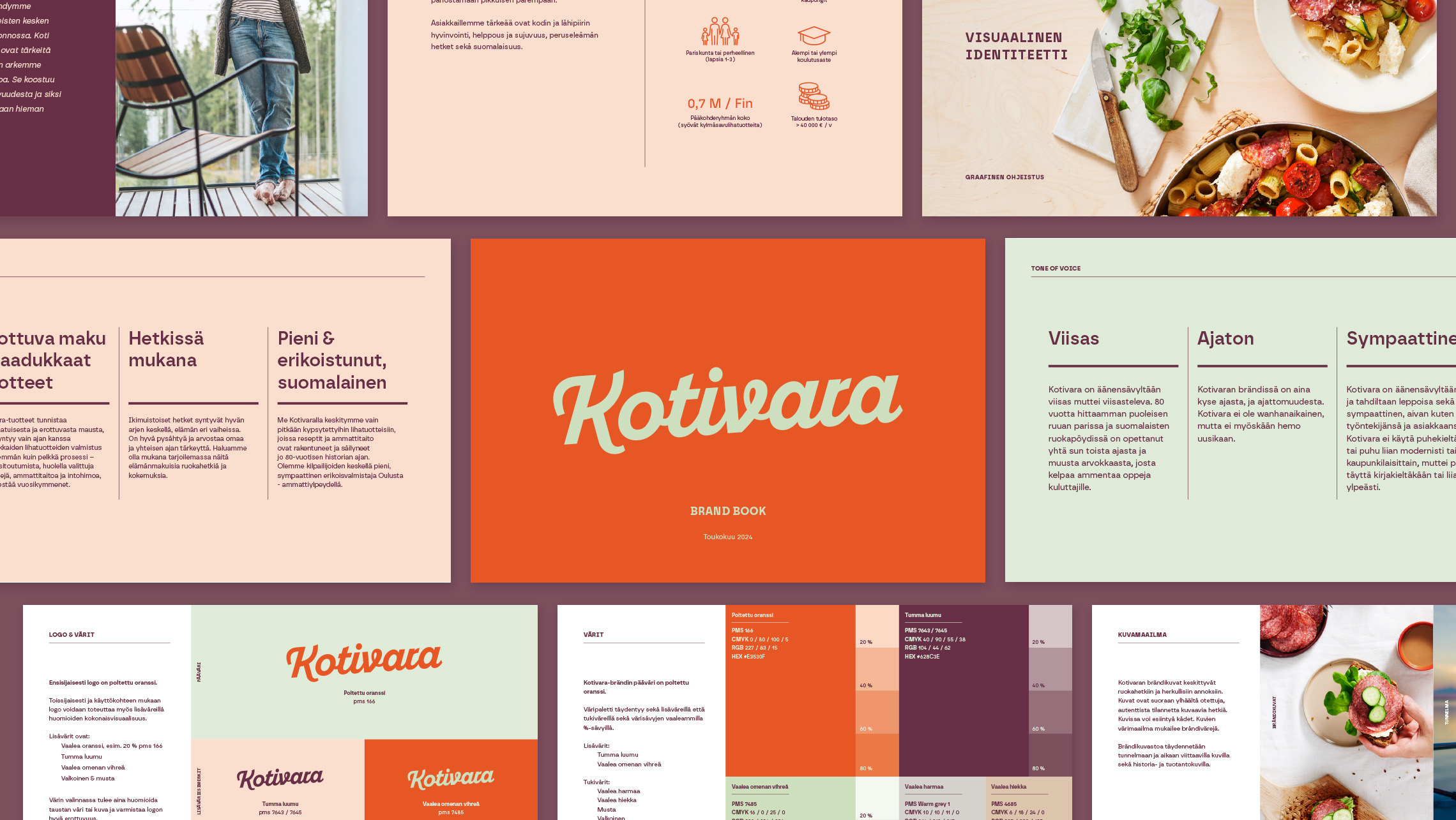
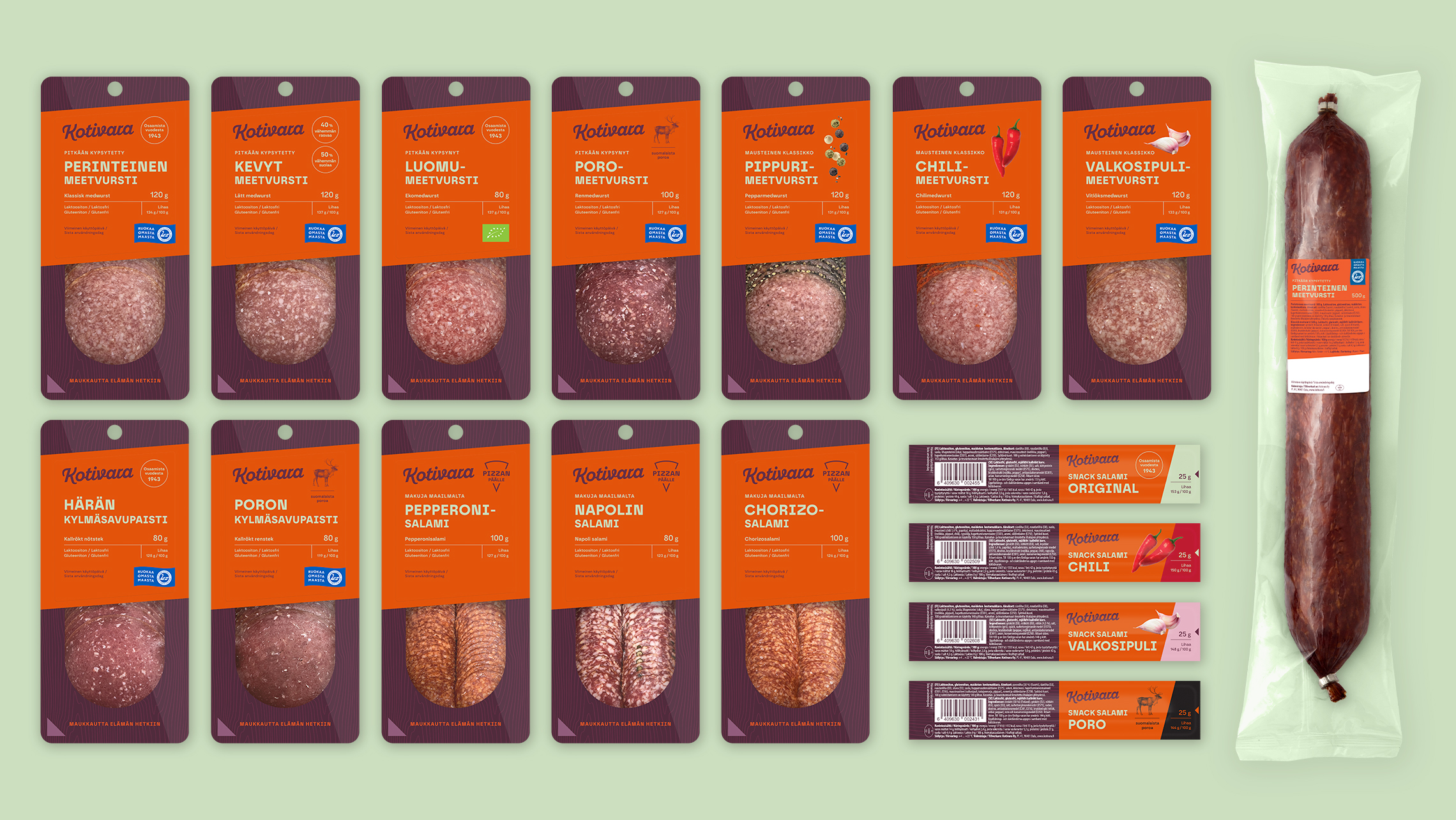
The central goal of the visual identity renewal was to update the design language to be modern while retaining the brand’s long-standing iconic orange colour.
Kotivara’s long history and artisan expertise were a strong foundation for the renewal. Traditions are visible in both in the way the products are made and in their story, but the renewal marked a step toward a more modern and appealing overall look.
The visual identity was softened by introducing supporting colors, such as light green and dark plum, alongside the main orange colour. For the packaging, the aim was to create a unified and clear identity that enhances brand recognition on the store shelf.
Result
The renewal combines Kotivara’s strong traditions with a modern visual identity designed to strengthen the brand’s position in Finnish kitchens. Kotivara received new core brand elements, a modernised logo, updated visual assets, and a new packaging concept. At the same time, we updated the marketing communication concept, considering images, brand messages, and all the different product category packages while maintaining strong recognisability.
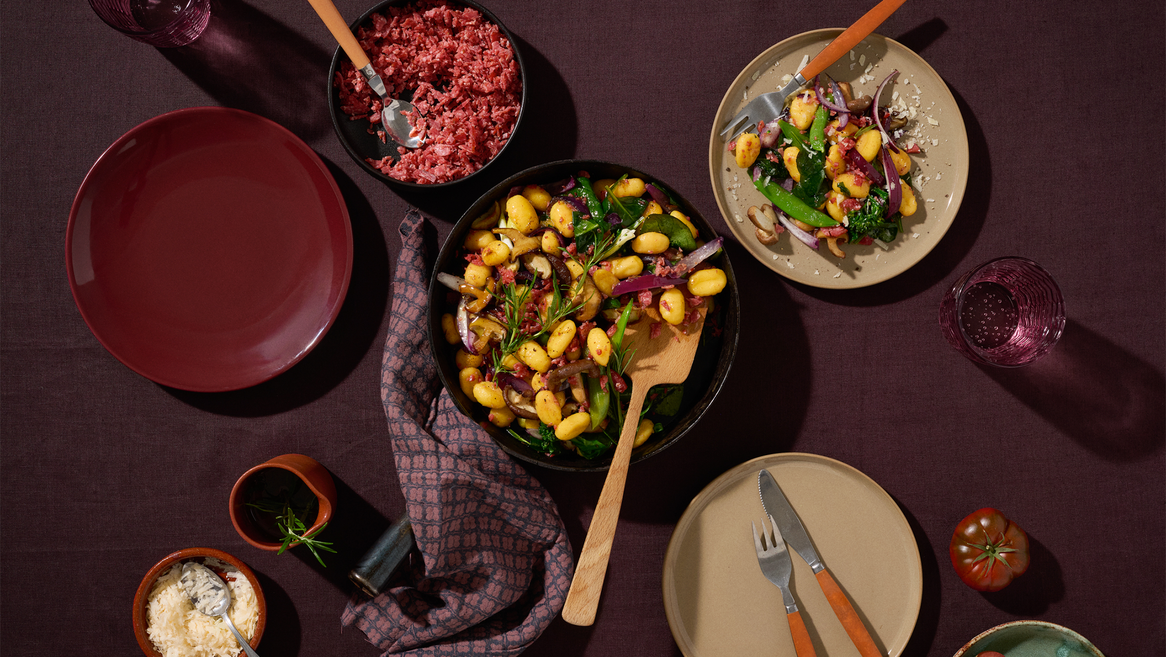
The strong brand colours communicate the slowly matured, flavorful products. All product packages received a consistent look, increasing their visibility and recognisability on store shelves. Special attention was paid to hierarchy in the packaging design: Kotivara is the main focus, but the product features and markings emphasising Finnish origin are also clearly visible in the packaging.
The renewed brand is not just a new look, but a promise of quality, tradition, and continuous development.
Photography: Elina Himanen, Fotonokka
Styling: Suvi Rüster
“The purpose of the renewal was to bring Kotivara’s visual identity up to date without forgetting its history. Ultimately, Kotivara’s brand is about time and timelessness.”
– Pia Thurman, Senior Designer, Pentagon Design