FAZER BAKERY
Package renewal for Oululainen’s Traditional Finnish Rye Bread
Oululainen’s Traditonal Finnish Rye Bread is an authentic innovation drawing from austerity, baked in Lahti already since 1947. The unique process of preparation, utilizing the low after heat of the oven, is the secret recipe that brings out the signature texture and delicious taste. Authenticity, simplisticity and modesty are charasteristics that resonate greatly also in the current times, and something that is seldom achived in new products.
The challenge was that the previous packages did not clearly communicate the authentic character and image of the product. The key brand attributes that were emphasized in the renewal were Finnishness, trustworthiness, healty and natural. The packages also needed a visual update but the recognizability needed to be maintained.
Approach
The idea that inspired the design team was that the traditional Finnish rye bread truly represents the traditional Finnish mentality and lifestyle of creating innovative and timeless solutions from scarcity. The thought of utmost plain and reduced bread that only has few simple and pure ingredients and represents unique resilience was the starting point for the visuality of the package.
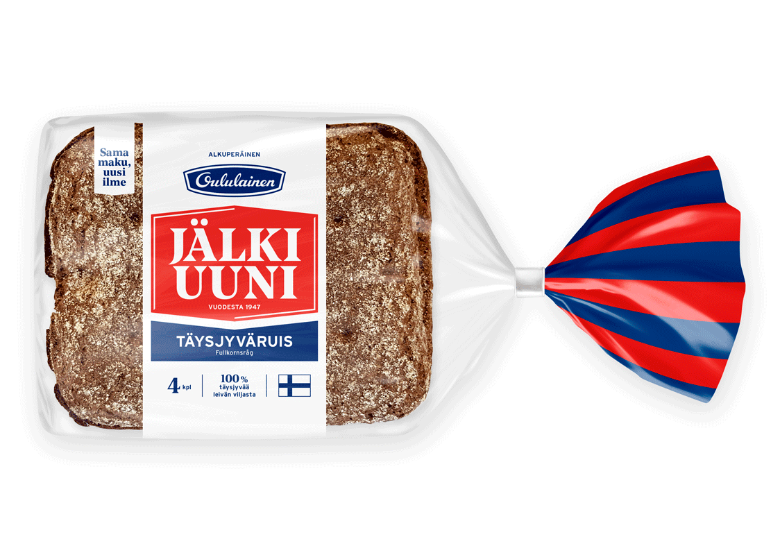
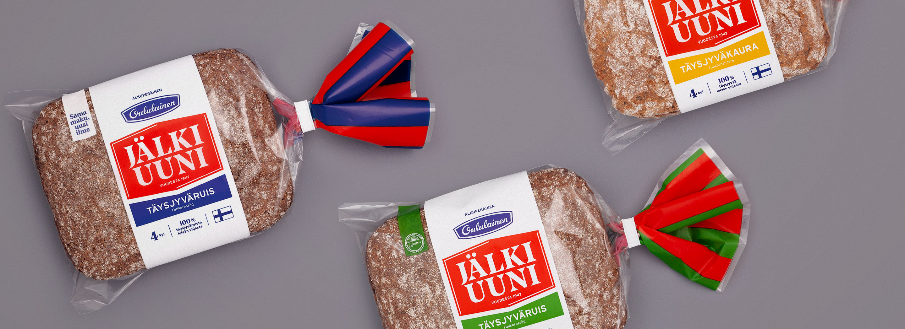
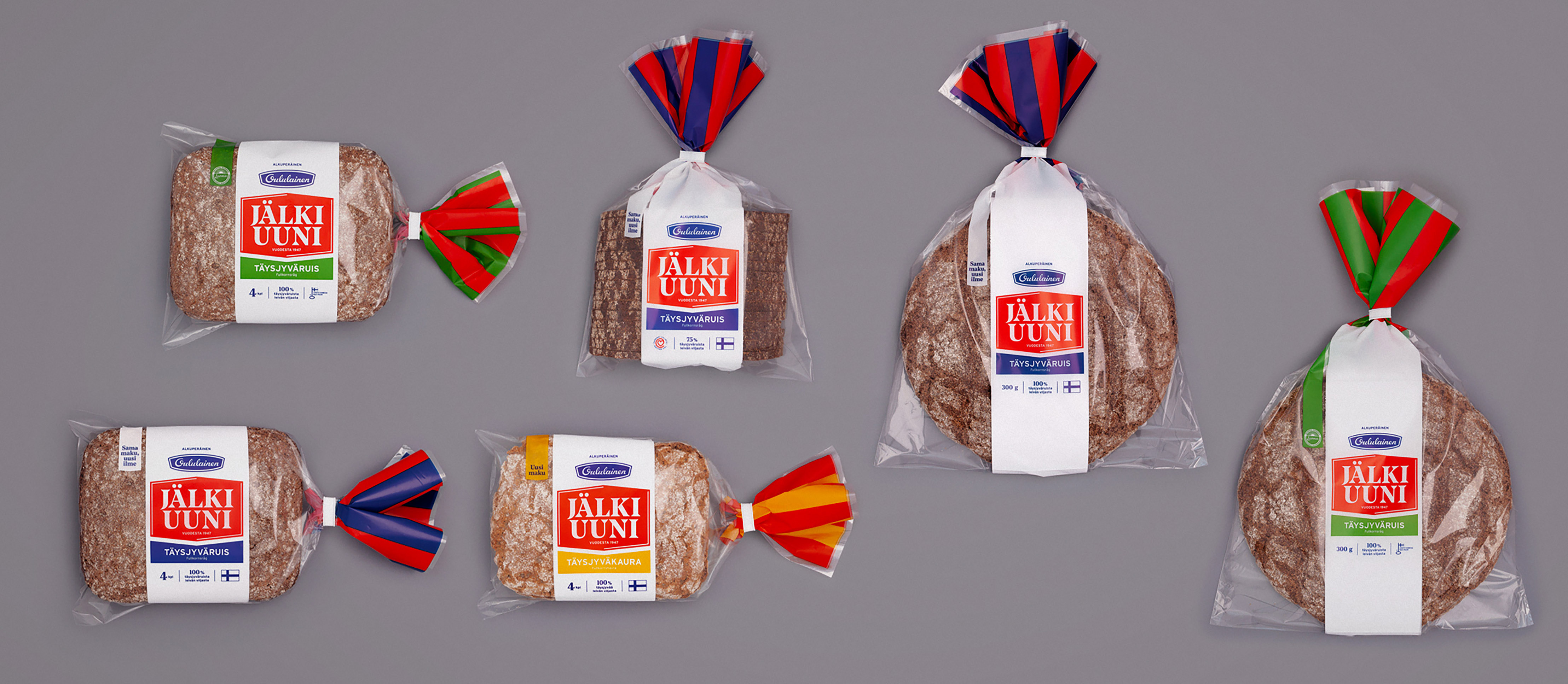
The idea was to highlight the beautiful surface of the bread and also at the same time diminish the print area to increase the sustainability of the packaging. The sign of the Traditional Finnish Rye Bread was designed to be easily detached from the packaging and used in versatile contexts.
The design team ideated several alternative visual directions that were analysed together with the client to decide on the most potential directions. For testing with consumers two visual directions were developed and one was selected that best fullfilled the goals of brand attributes and recognizability.
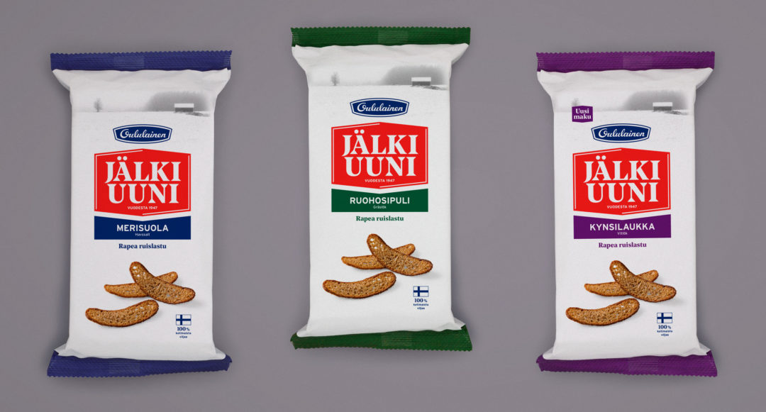
Once the visual direction, that was both attractive and renewed the brand and packaging in the right way, was discovered and decided on the challenges of communication and variant differentiation needed to be solved. This included for example the representation of key brand attributes in social media such as facebook. Oululainen also launched as a part of the renewal new product innovations that included a new thinner shape and usin oat as the main ingredient.
Result
After the renewal the Traditional Finnish Rye Bread represents a sophisticated and relevant brand for the consumers. Even though the package renewal was thorough, the new packaging remains recoqnizable in the shelves due to the familiar coloring. The Traditional Finnish Rye Bread also received an easily recoqnizable identity and a sign that work well in the shelf, packaging as well as in marketing communication.
The package look and feel is clear and modern, but it succesfully elevates the traditional colours and updated visual elements from history to today. A special emphasis was given to the backside of the packaging, it was clarified to communicate the utmost simplicity. The Traditional Finnish Rye Bread is a noteworthy option for a conscious and quality oriented consumers.
The commercial goal was to crystallize the brand promise for the consumer; ncrease sales as well as enable the broadening of the product portfolio under the Traditional Finnish Rye Bread brand. The feedback of the renewal packaging was positive.
![]()

The idea was to highlight the beautiful surface of the bread and also at the same time diminish the print area to increase the sustainability of the packaging. The sign of the Traditional Finnish Rye Bread was designed to be easily detached from the packaging and used in versatile contexts.