HELSINKI CITY TRANSPORT
Visual identity for City Transport
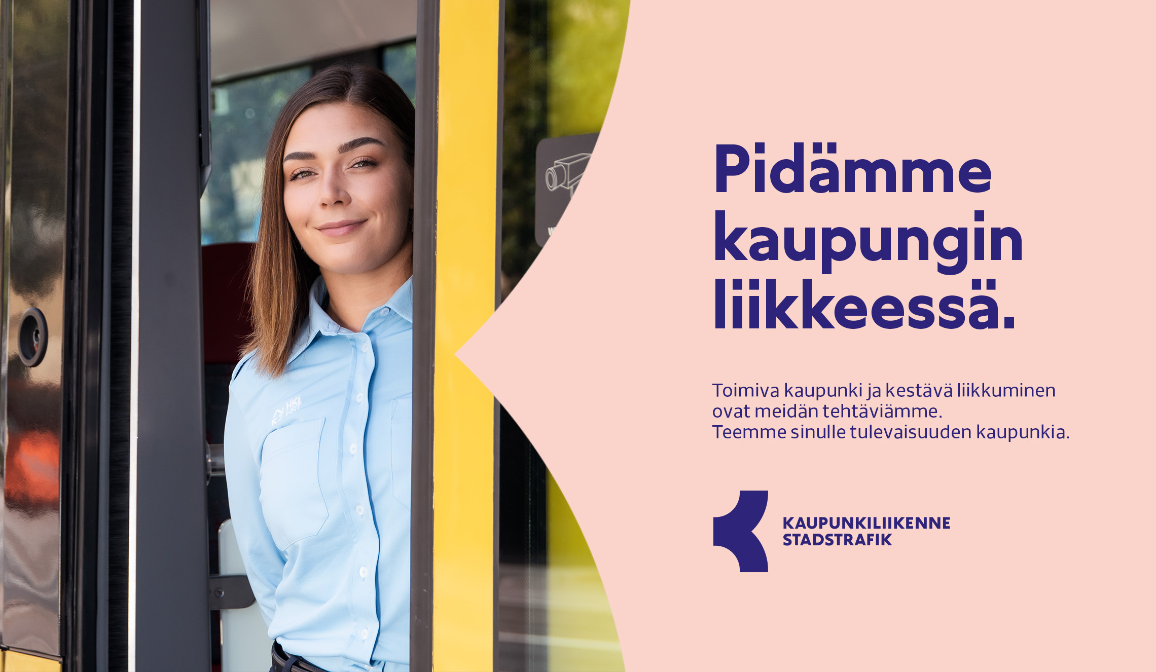
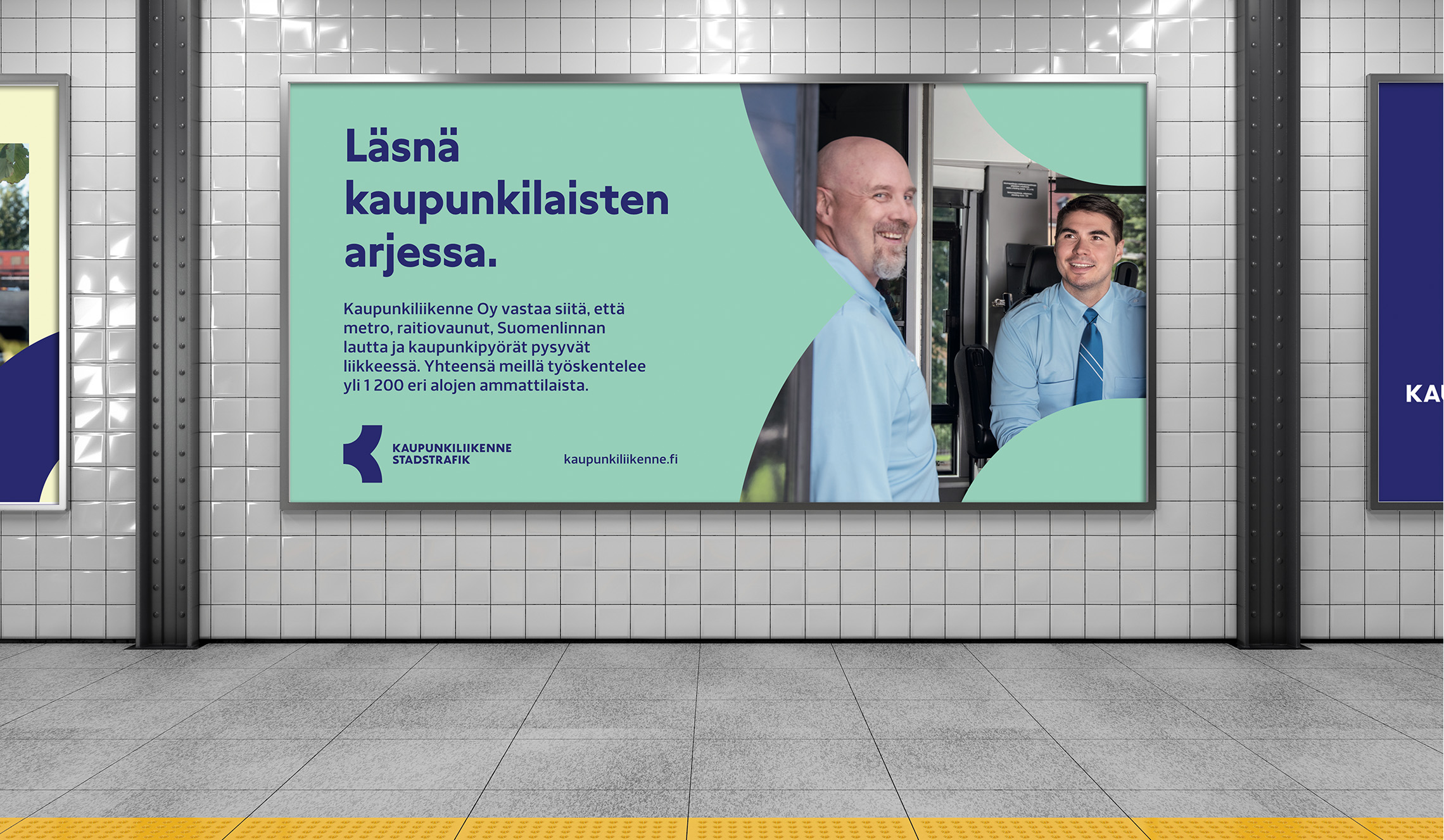
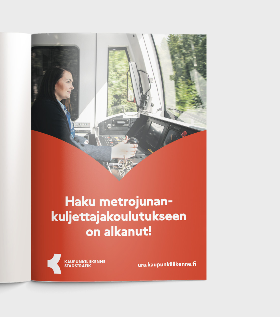
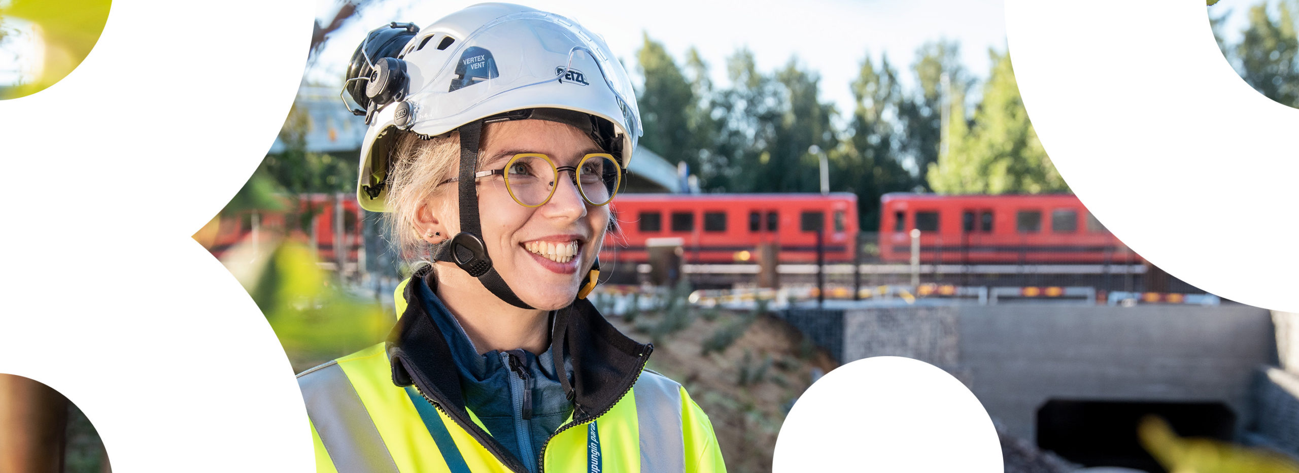
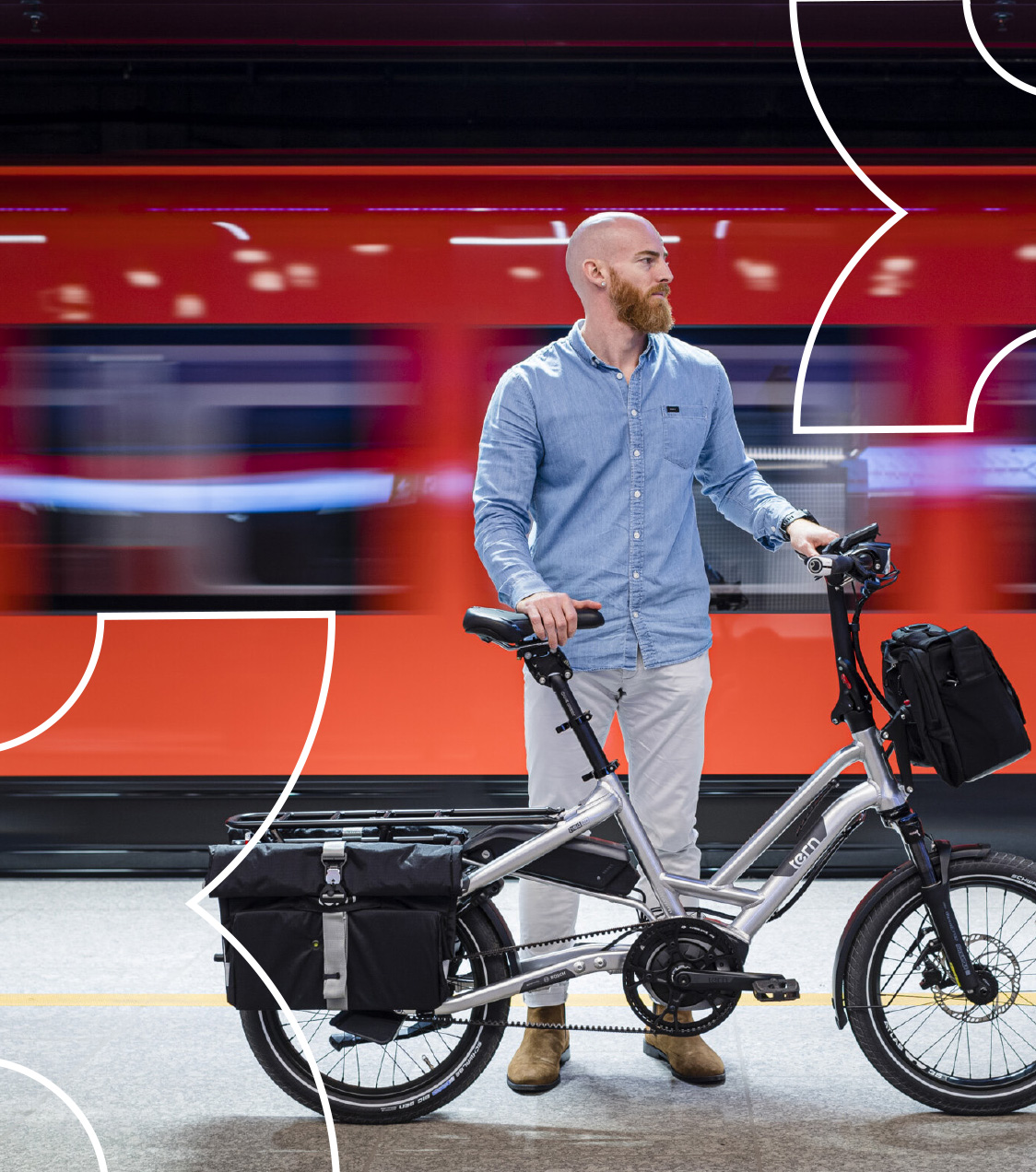
City Transport (in Finnish Kaupunkiliikenne) is an actor in the field of sustainable and functional city transport. City Transport continues the work of HKL and is responsible for keeping Helsinki’s metro, trams, Suomenlinna ferry and city bikes moving. A new and consistent visual identity was created to increase the company’s visibility.
Approach
The goal of the project was to raise the company’s profile as a leading and modern actor in the field of city transport.
The new visual identity had to be distinctive from the visuals of HSL, which got easily mixed with the old identity of City Transport.
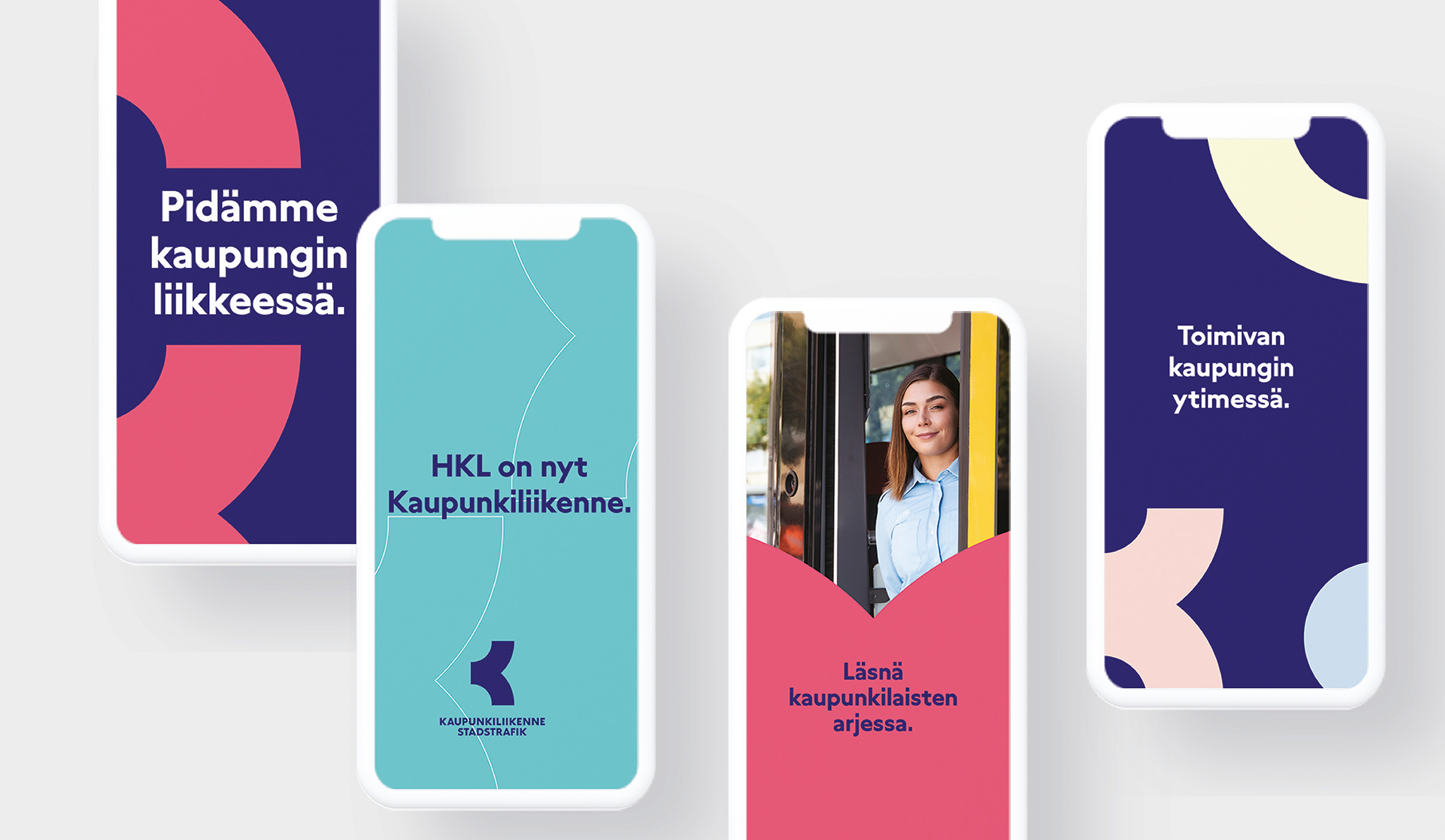
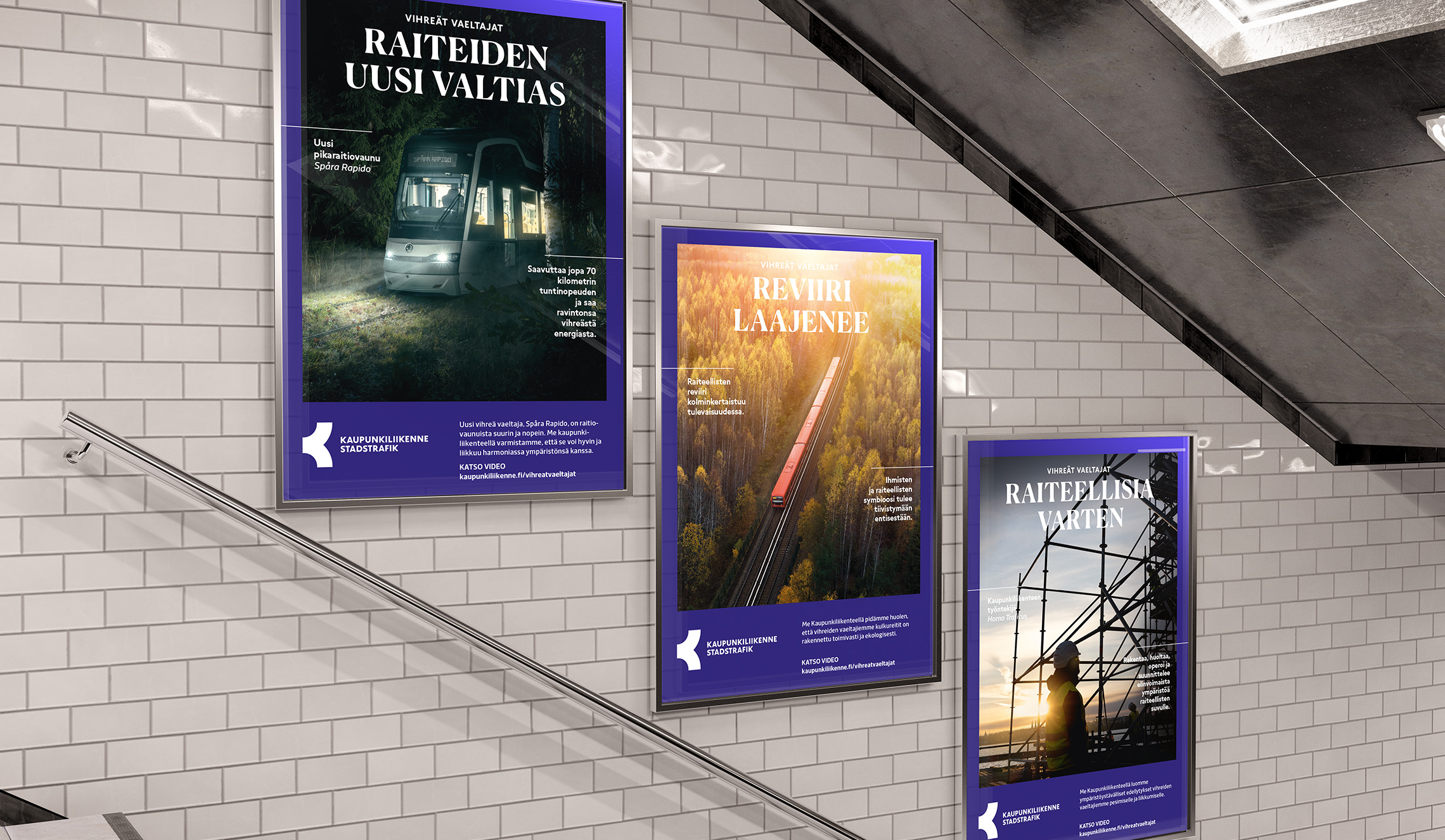
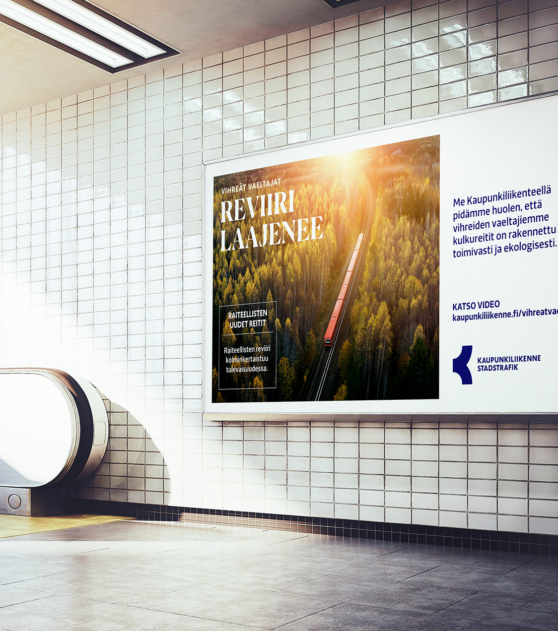
The new identity had to have a bold and recognizable design language. On the other hand, the identity had to be generally approachable, and it had to work across multiple channels, from the side of a bus to a banner on social media.
Results
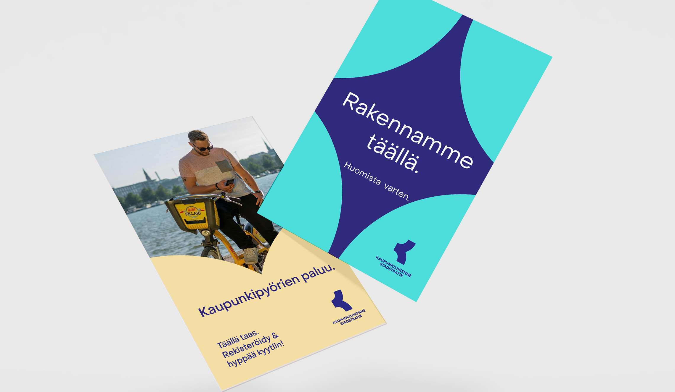
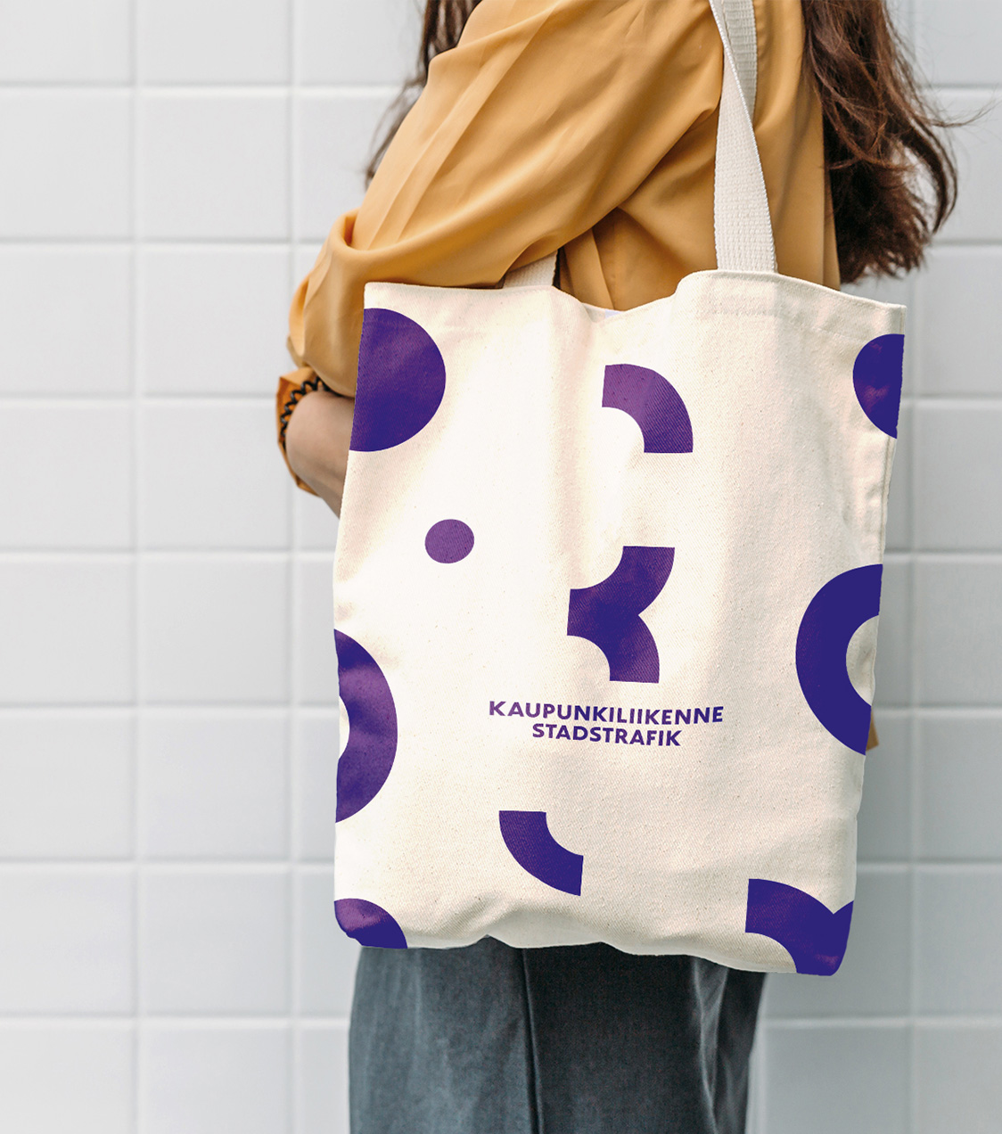
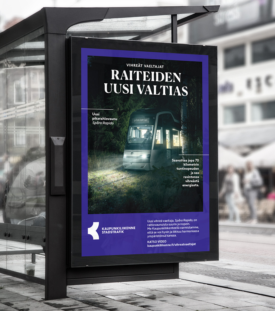
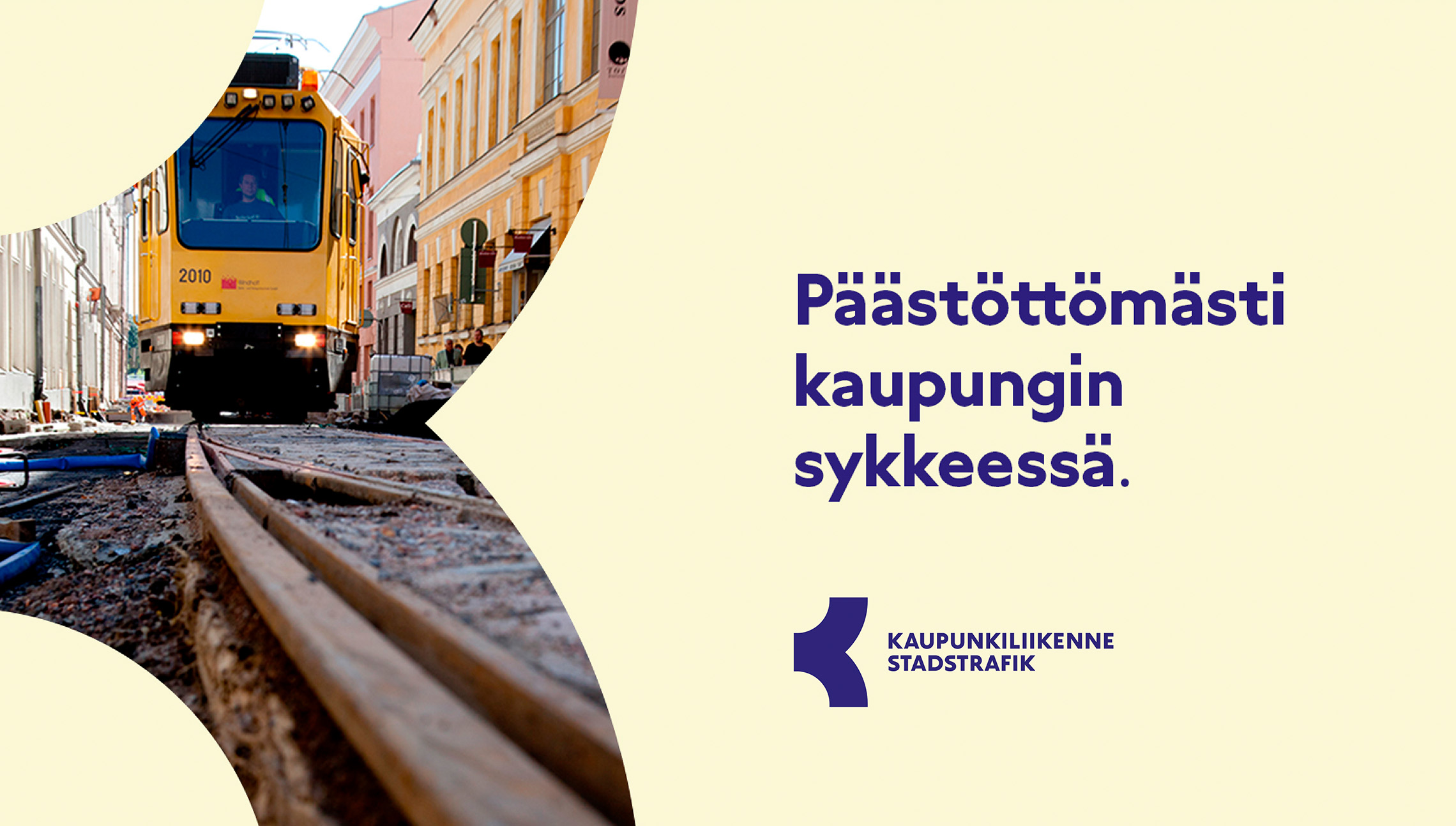
The visual concept for City Transport is built around the graphic style of the logo. The shape is derived from the letter K and connotations can be drawn to arrows, wheels, and intersections. Thus, being at the heart of what City Transport does.
The work included updating all the core elements of the visual identity as well as creating guidelines and examples of how to take them into practice in different applications while maintaining a consistent and recognizable visual style.

The logo shape is used throughout the identity as a strong brand element.
It is the backbone of the identity’s form language.
“Pentagon Design is a flexible partner. Their team is very professional and talented, and they meet the client’s needs.”
Elina Norrena
Head of Communications and HR Development, City Transport