SUOMALAINEN TYÖ
A bold visual and content rebranding – Collaboration from strategy to launch
In 2023, Suomalainen Työ ry (Finnish Work) updated its strategy, transitioning from a phase of strong growth to an era of sustainable impact. The association sought to position itself more prominently as an expert in work and employment, which also prompted a rebranding initiative. Alongside a name change from Suomalaisen työn liitto to Suomalainen työ ry, the organization adopted a bold new brand strategy and visual identity. To accompany the adoption of the new name, we developed a launch campaign emphasizing positive messaging about work.
Challenge
The brands managed by Suomalainen työ – Avainlippu, Design from Finland and Yhteiskunnallinen yritys – are highly recognized, but the umbrella organization itself has not enjoyed the same level of awareness. Suomalainen työ ry is an independent, nonpartisan actor, and the name change removed the word “association” to dispel any perception of being a lobbying organization. Similarly, the association’s previous visual identity no longer aligned with the needs of its new strategy and required an update.
The goal of the rebranding was to increase recognition and position Suomalainen työ as a facilitator and influencer in societal discussions around positive work culture and better working life. A comprehensive rebranding process was undertaken to create a new brand strategy, brand hierarchy, name, visual identity, and concepts for marketing communications and the brand launch.
Approach
The rebranding process began with interviews with Suomalainen työ’s board and members to clarify the objectives and direction of the initiative. A new brand strategy was co-created with the client’s team, leveraging the Brand Canvas framework to define the association’s new positioning and value proposition.
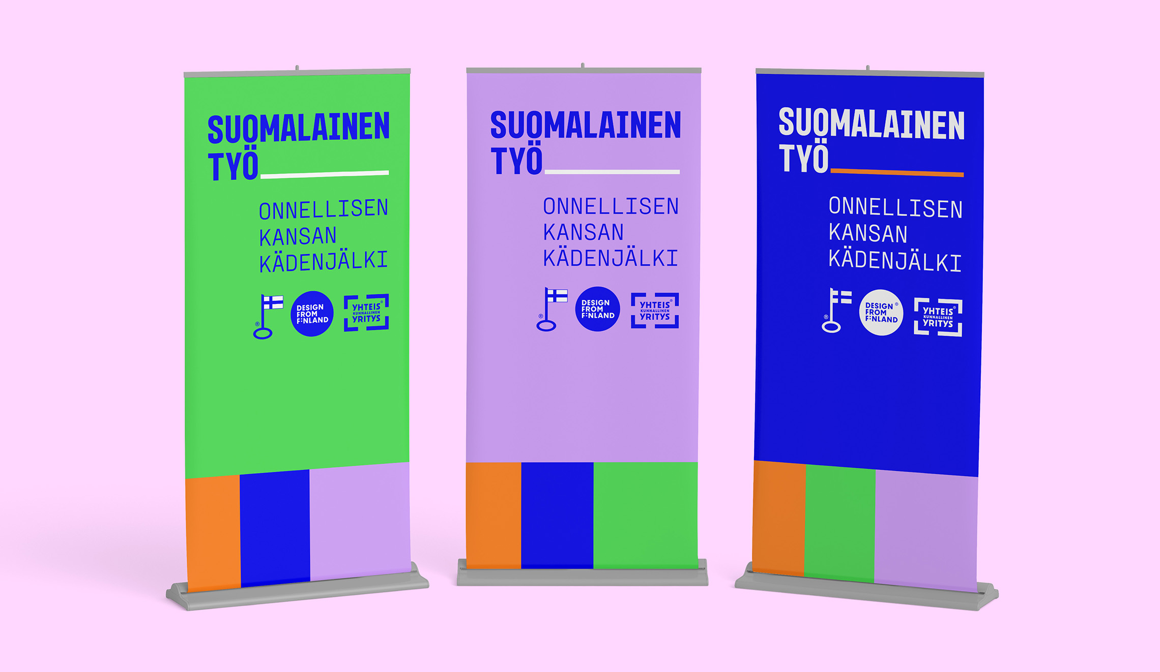
In the brand hierarchy work, the relationship between Suomalainen työ as the umbrella brand and the product brands it manages was clarified. The resulting architecture positions Suomalainen työ as the central brand, with all four brands mutually reinforcing one another.
The name change was developed collaboratively with the client, generating over 200 potential names. A shortlist was subjected to novelty research, and ultimately, “Suomalainen työ” was chosen as the name that best supported the new strategy and target positioning.
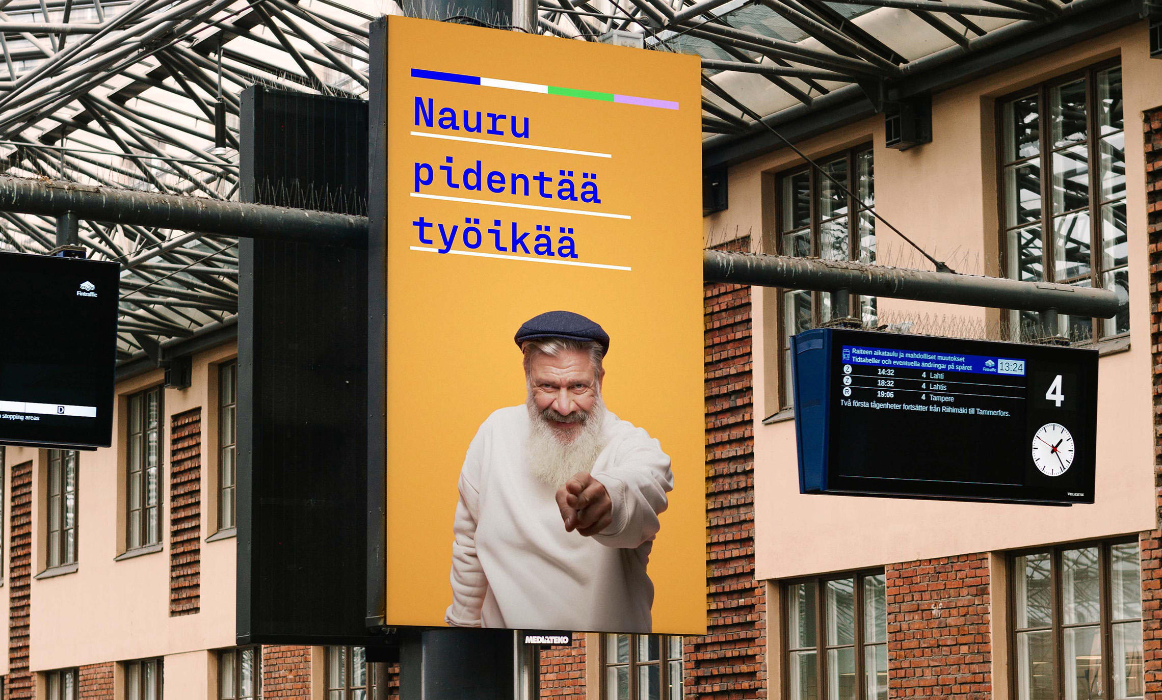
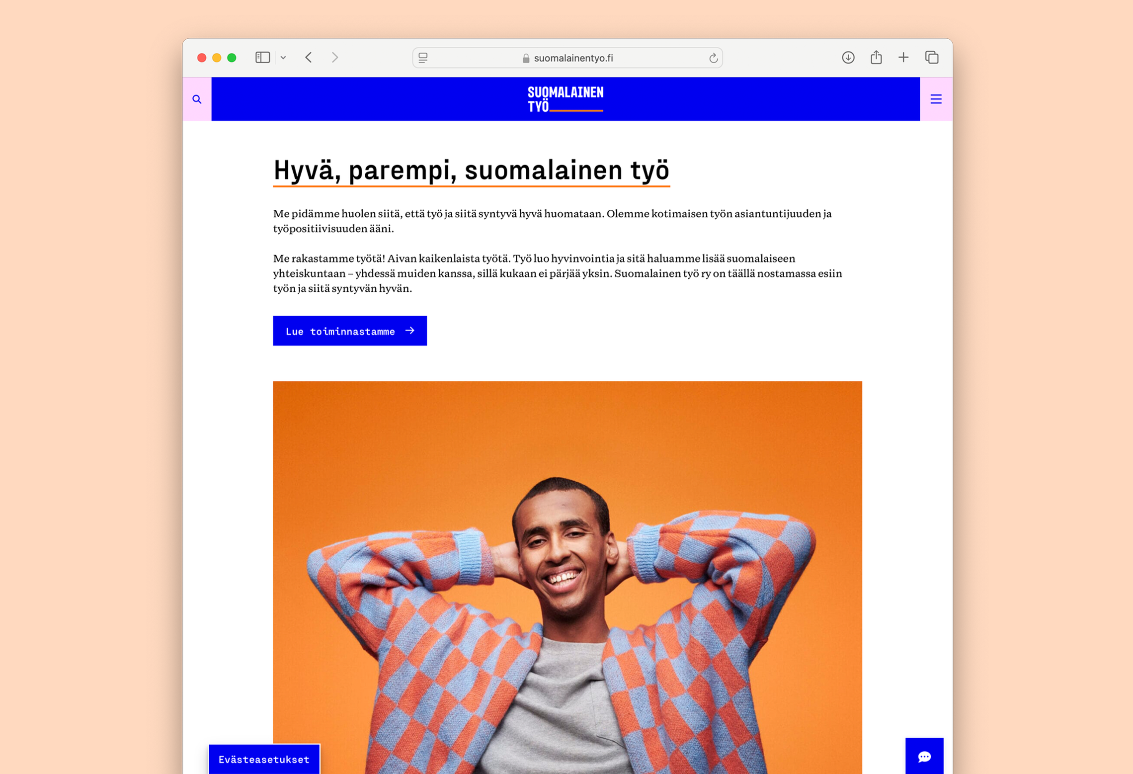
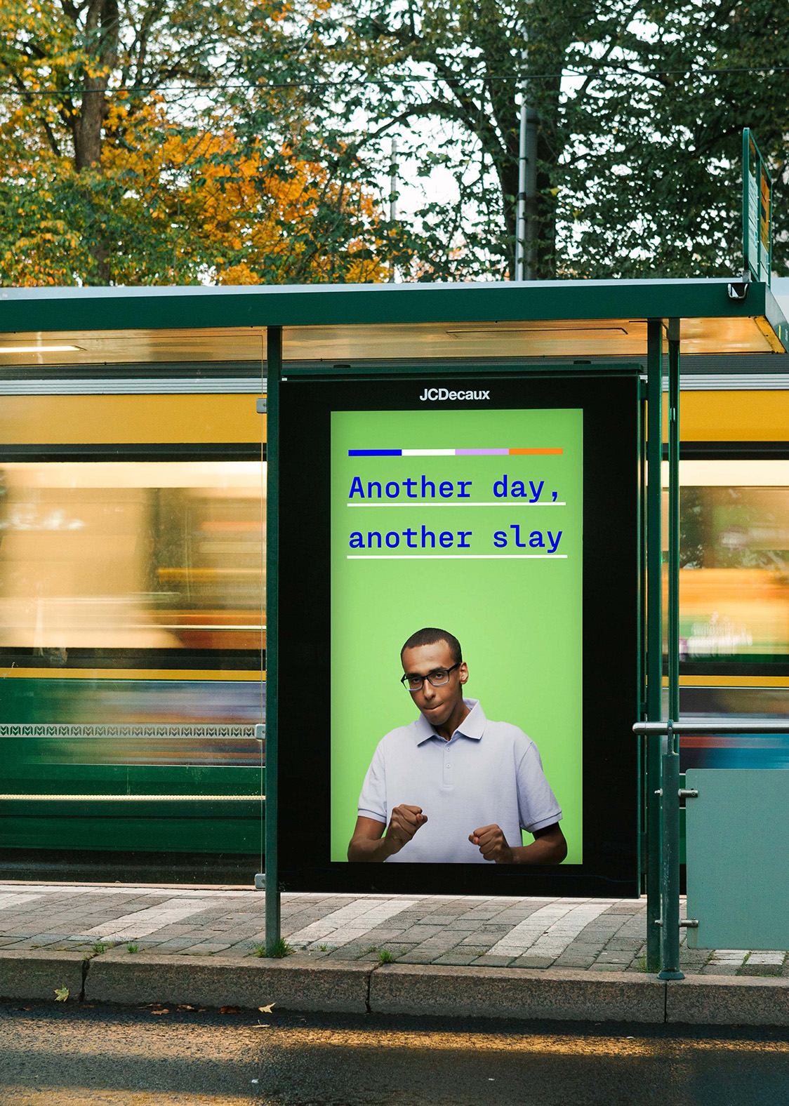
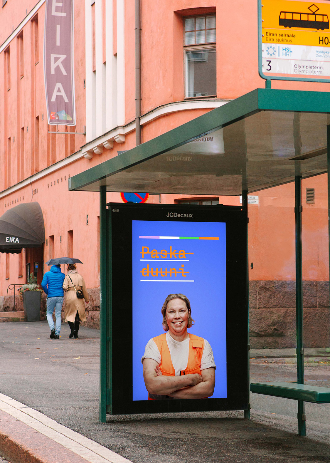
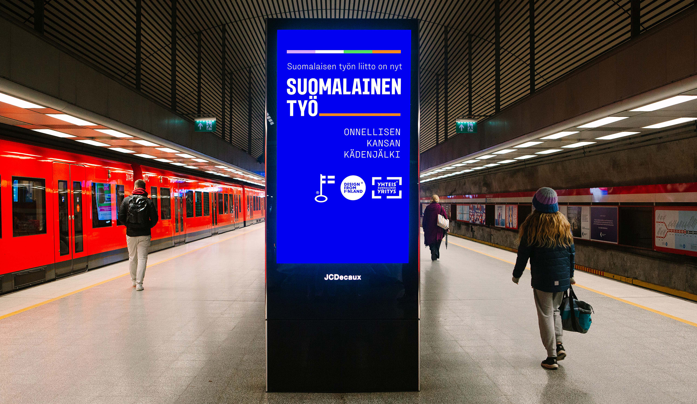
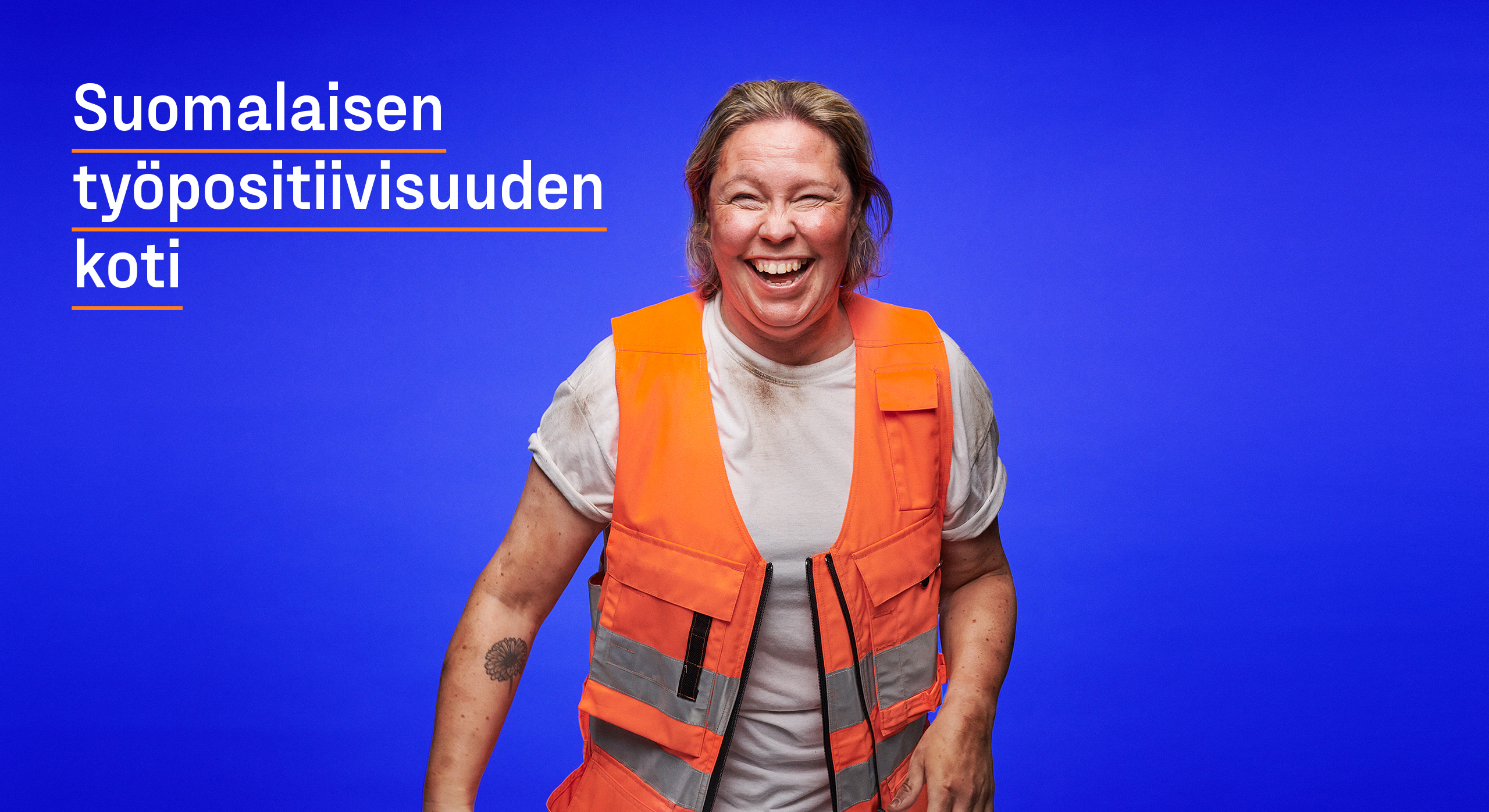
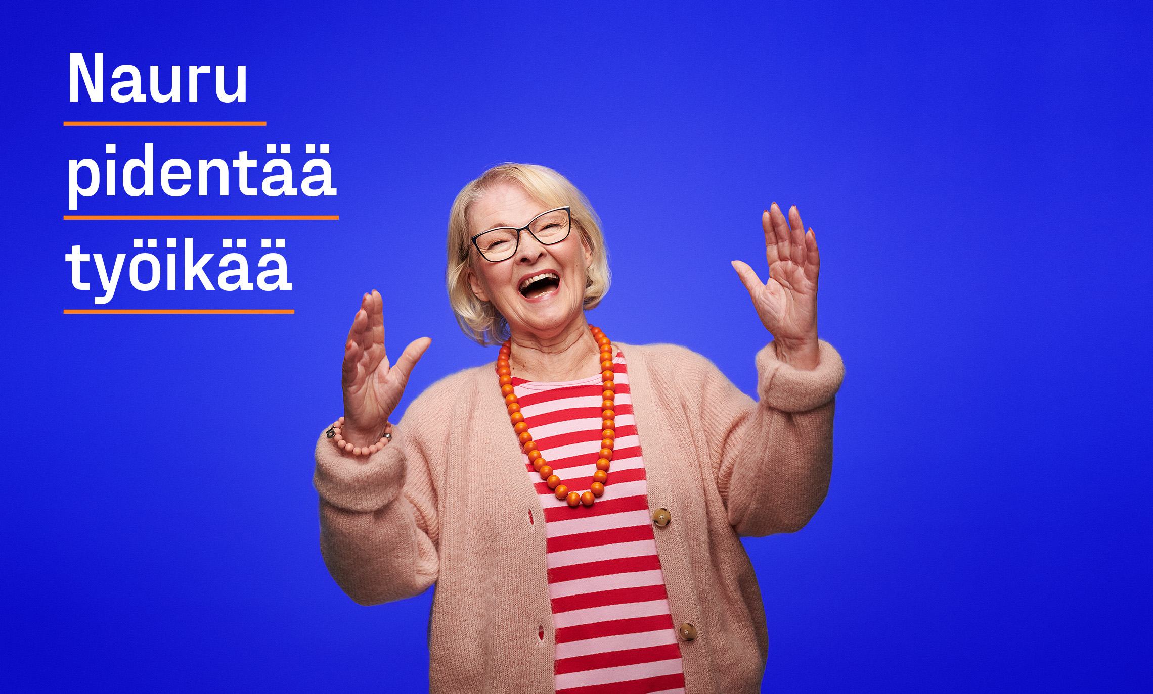
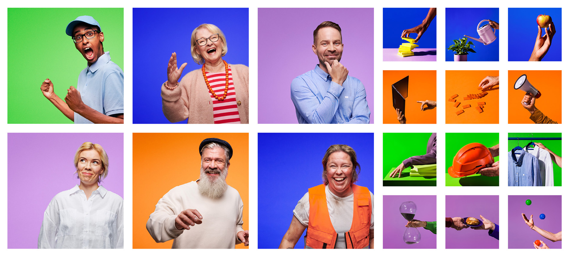
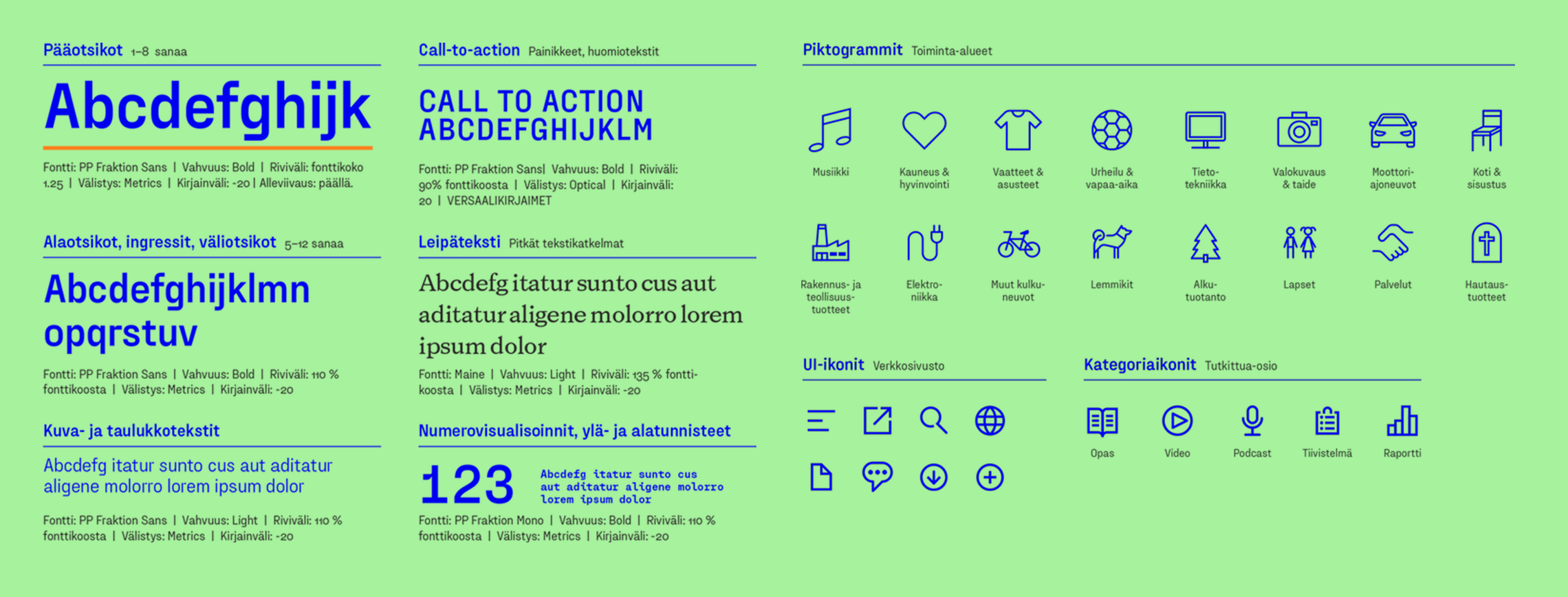
The aim of the visual identity renewal was a relevant and bold update that would stand out. While the previous identity leaned heavily on a blue-and-white palette reflecting traditional Finnishness, the new look retained blue while introducing a fresh palette of intermediate colors to convey positivity around work. A new wordmark and its linear elements communicate the diversity of working life. The image concept features natural, smiling, and laughing portraits of workers, concretizing the idea of work positivity.
The communications strategy work, which had been completed earlier, served as the foundation for identifying work positivity as the new focal point for communications. The aim was to highlight the positive impact of work on both individuals and society in all activities. Traditionally, the narrative around work tends to be negative, and the goal was to challenge this mindset by fostering new perspectives. The marketing communication concept highlights Suomalainen työ’s new, boldly societal role as a catalyst for change, a thought leader, and a facilitator – not merely a spokesperson.
Suomalainen työ’s new role is to champion Finnish work more strongly than ever. To achieve this, it was necessary to stand out and deliver a memorable message. Familiar sayings from people of different generations were repurposed into a series of bold, distinctive statements about work positivity. These statements conveyed Suomalainen työ’s beliefs while showing their commitment with a touch of humor.
Result
The result was Suomalainen työ. The goal of creating a noticeable transformation was achieved. The brand strategy, hierarchy, name, visual identity, and concepts for marketing communications and brand launch all boldly emphasize work positivity and enhance the visibility of Suomalainen työ.
The launch campaign gained widespread attention through digital media, outdoor advertising, and radio.
The renewed visual identity and launch have received extensive positive feedback, not only from members but also from external parties who felt the campaign supported their own work. The campaign effectively fulfilled its objectives and extended its impact beyond merely promoting Suomalainen työ’s message.
“I am delighted and proud of our new, bright visual identity. The visual identity is the visible embodiment of the brand, and we hoped for a bold approach and use of color in our appearance. I believe this change has been well realized in the outcome. The collaborative transformation journey with Pentagon was inspiring, and with such a professional partner, even significant changes can be made with confidence. We work for Finnish companies and organizations, and I hope our new name and identity will serve as an even stronger support for this work.”
– Katri Viippola, CEO, Suomalainen työ