MYSODA
Mysoda brand visual identity renewal
We have cooperated closely with Mysoda as their brand and product development partner since 2018. The partnership enables continuous development of the concept and identifying new opportunities for generating value for the client. As a partner, we are able to proactively propose new solutions and bring our expertise to support the customer’s decision-making.
Mysoda’s solution is a holistic, sustainable concept that includes both sustainable products, the world’s most local water from your own faucet, and locally produced carbon dioxide cylinders that can be exchanged at convenience stores.
Our cooperation with Mysoda has included the comprehensive renewal of the product portfolio for international growth, as well as the renewal of the brand and visual identity.
An identity renewal driven by product design
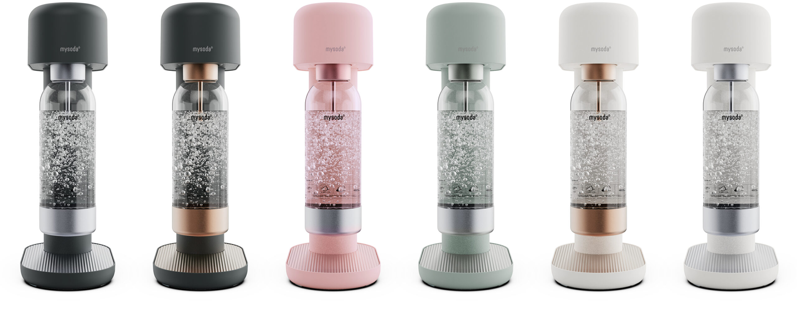
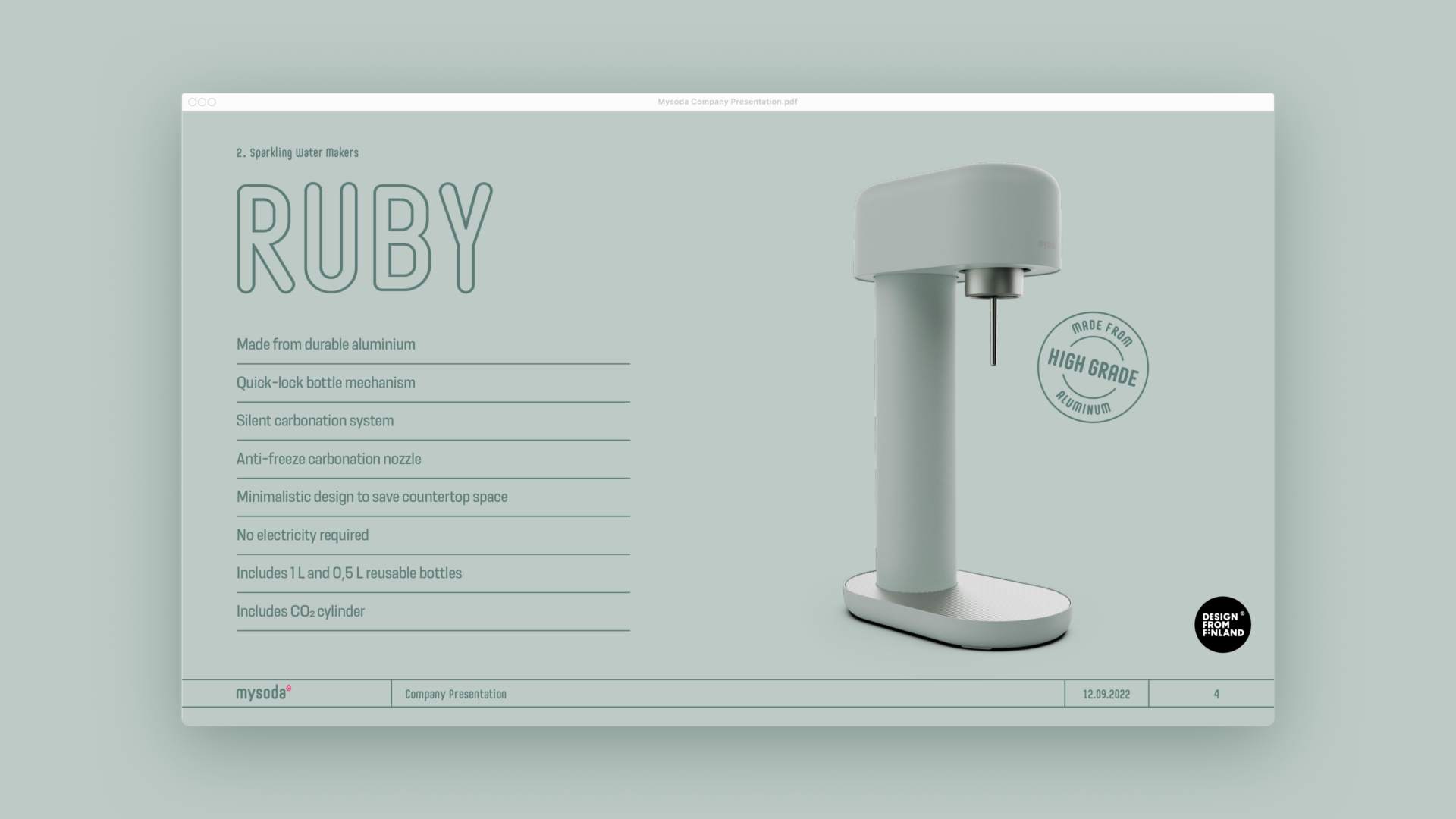
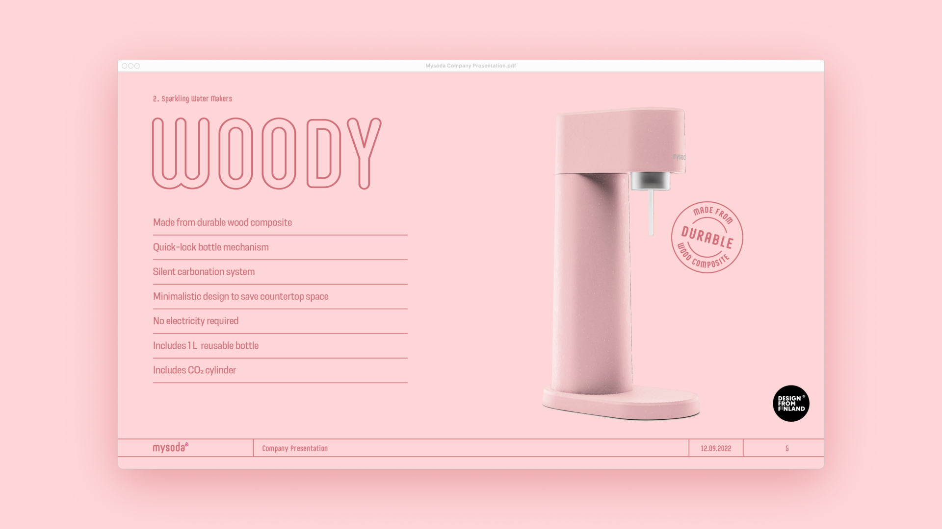
The award-winning and timelessly stylish design of the products was chosen as the spearhead of the new visual identity. Four home carbonator models in several smart color and material combinations enable Mysoda’s products to be suitable for a wide range of environments. This aspect was also wanted to be communicated in the visual identity.
Visual identity elements
From the previous visual identity, the distinct logo that communicates locality was kept, as well as the custom font family that draws from the design language of the products. The pictogram family and infographics were stylized from cartoonish to minimalistic, increasing the impression of quality.
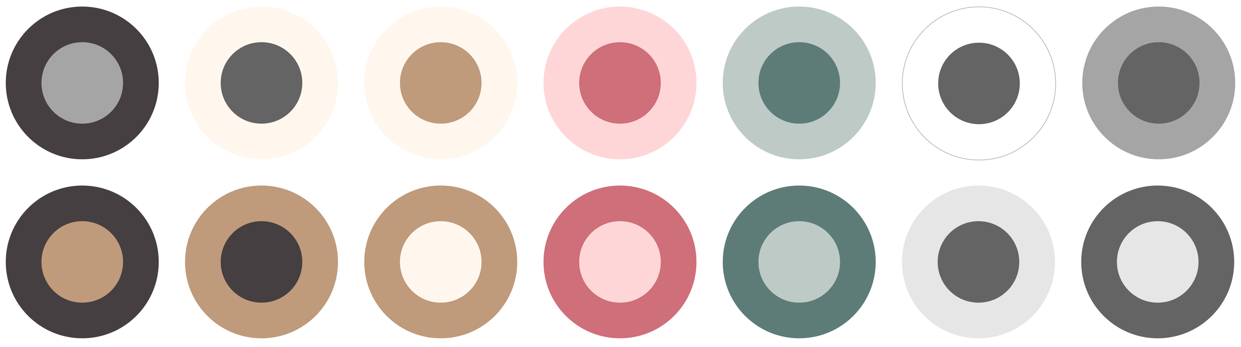
The previous color palette was developed to be more harmonious and versatile to better match the design of the devices themselves. In this way, without changing the main components of the previous look, it was possible to improve the quality image of the brand and to change the brand position to a more natural one, while maintaining recognizability.
![]()
Implementation
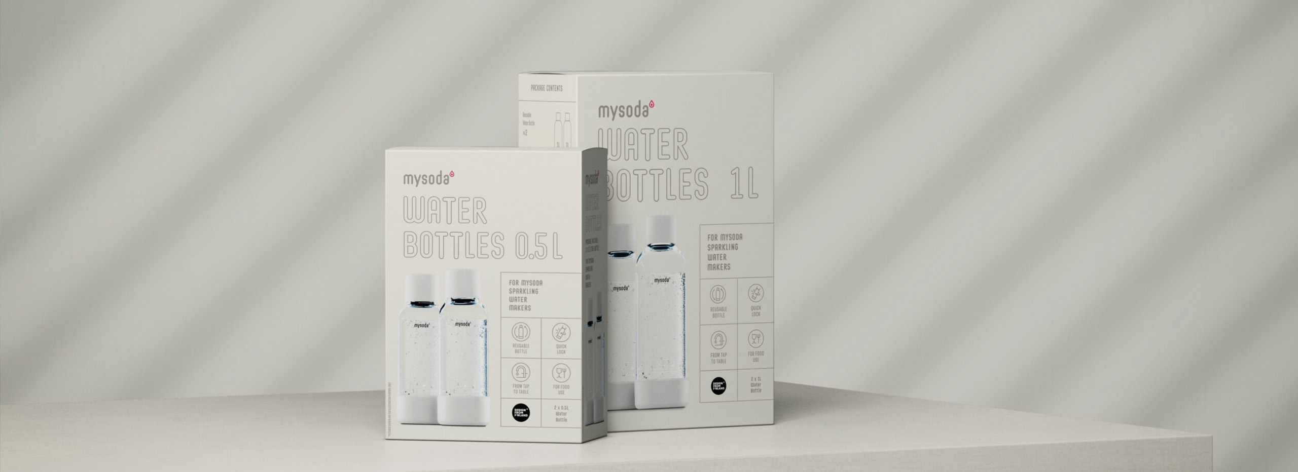
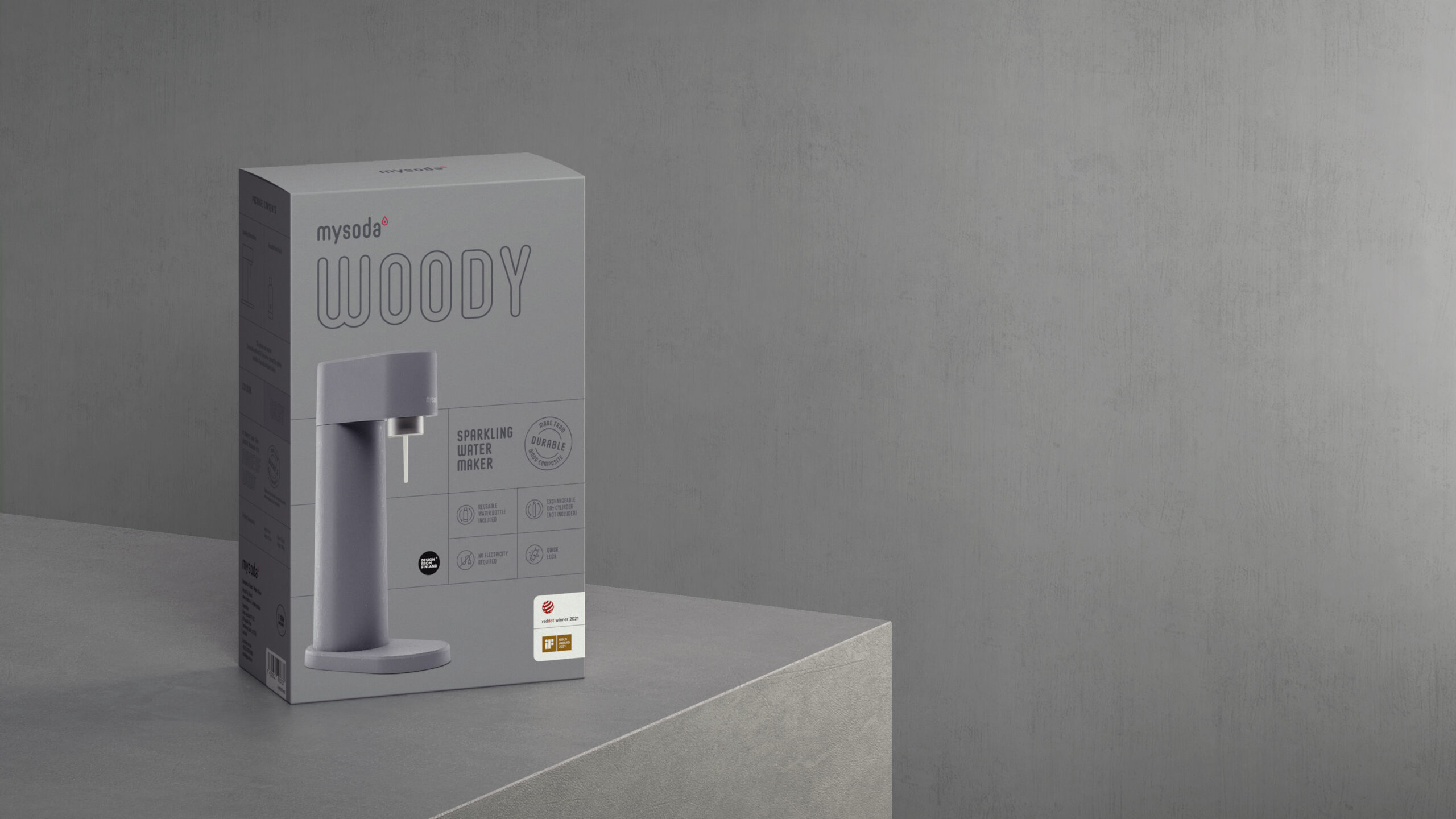
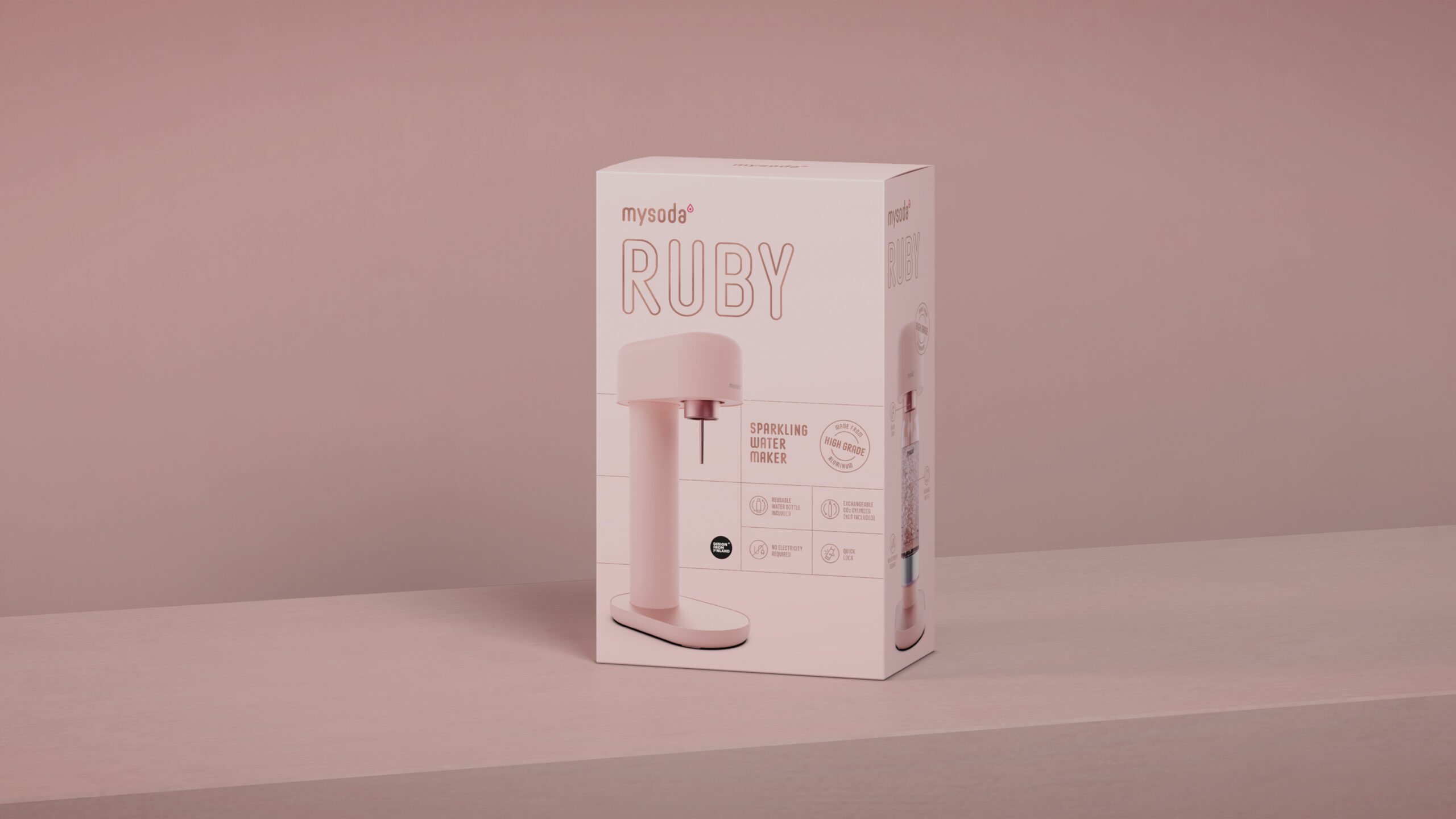
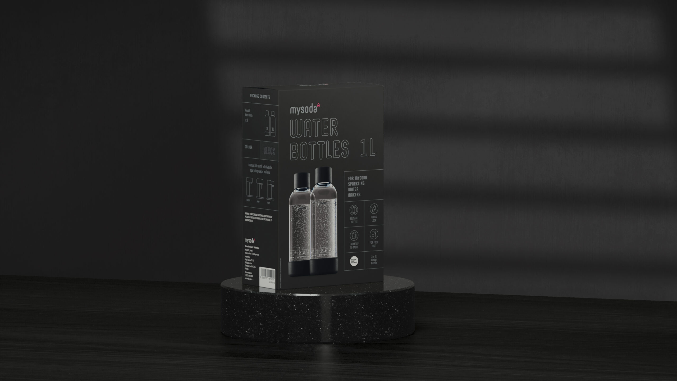
Packaging design
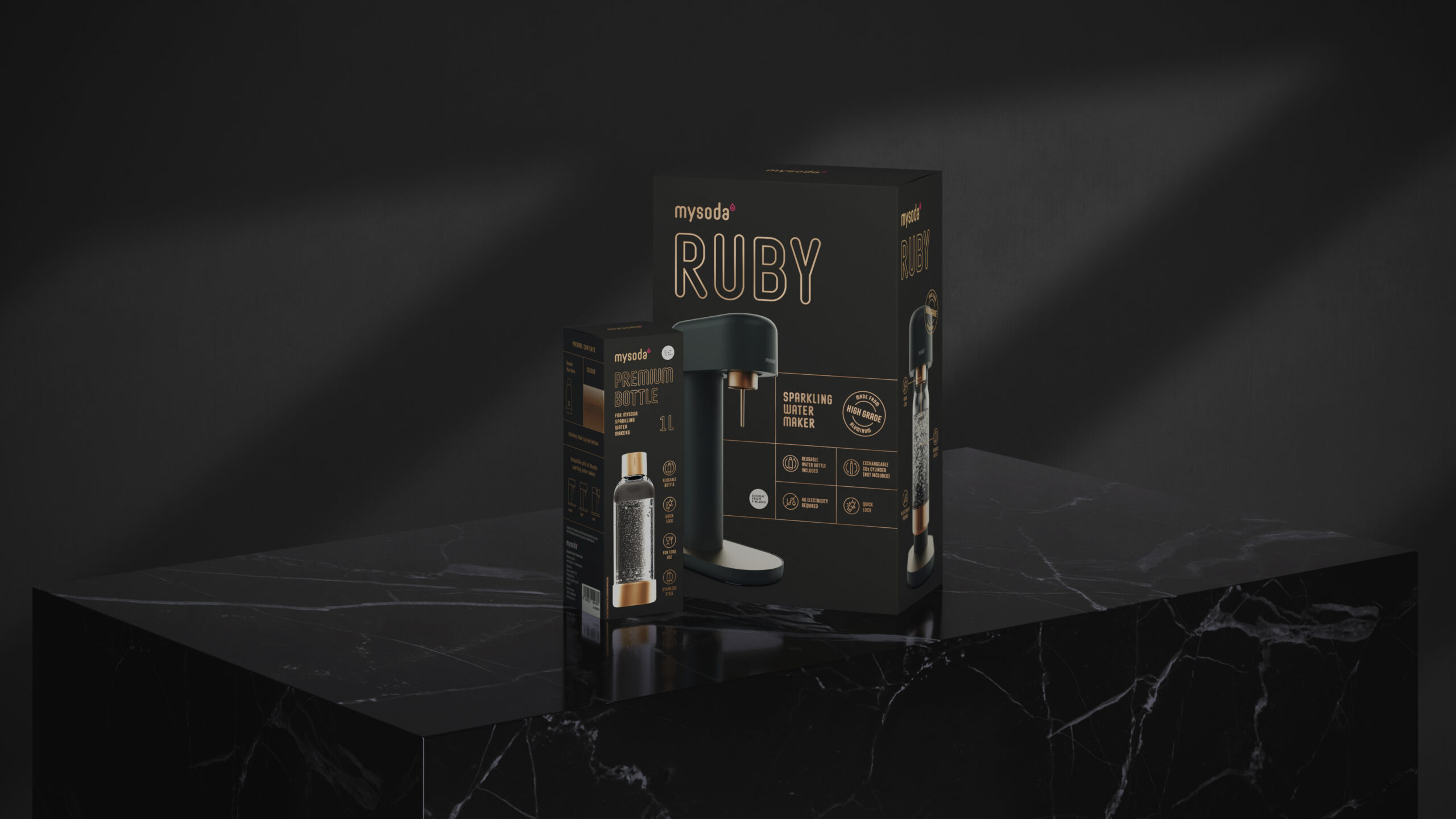
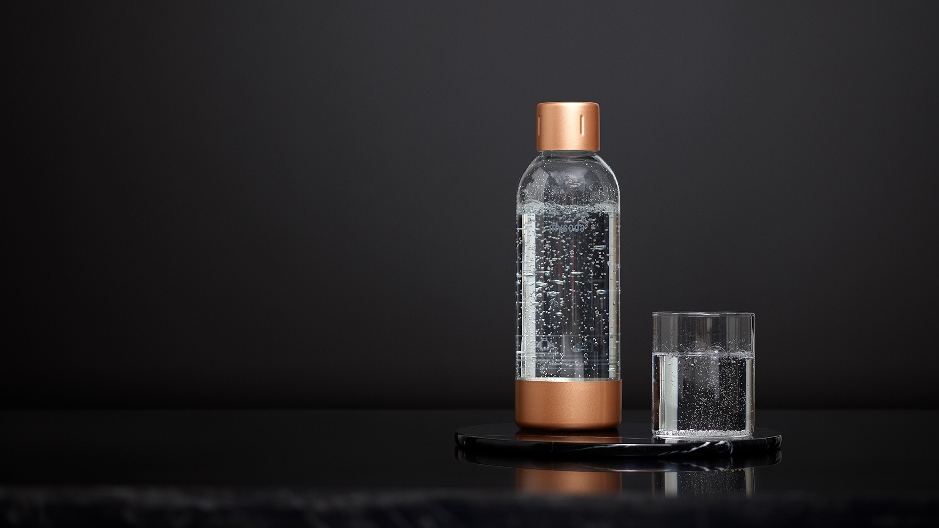
The packaging range proudly presents the design of the products, and the colors of the packaging follow the color tones of the devices and bottles. The Ruby devices and the packaging of the Premium series bottles use metallic Pantone colors in the graphics to subtly bring out the metallic details of the products, while the wood composite based Woody devices and standard bottles have a more natural finish.

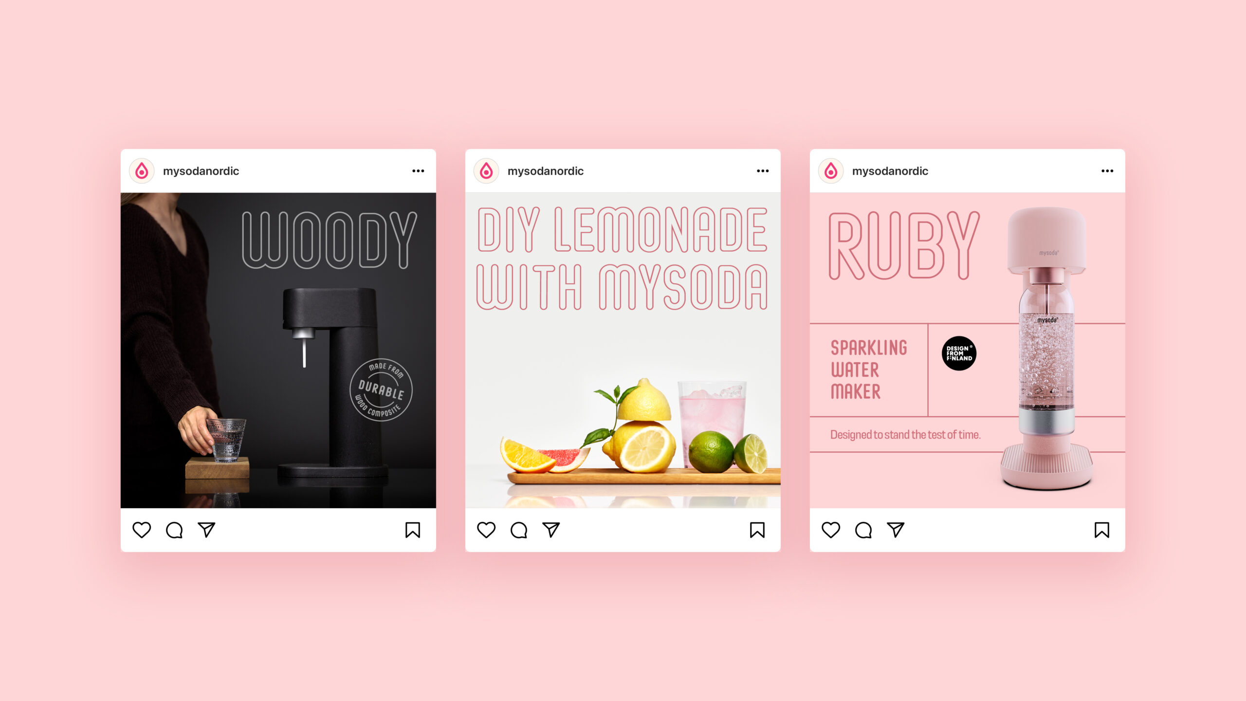
Application design
The strong color scheme has been widely used in applications. In the presentation template, even the more mundane content pages become visually interesting thanks to the use of color.


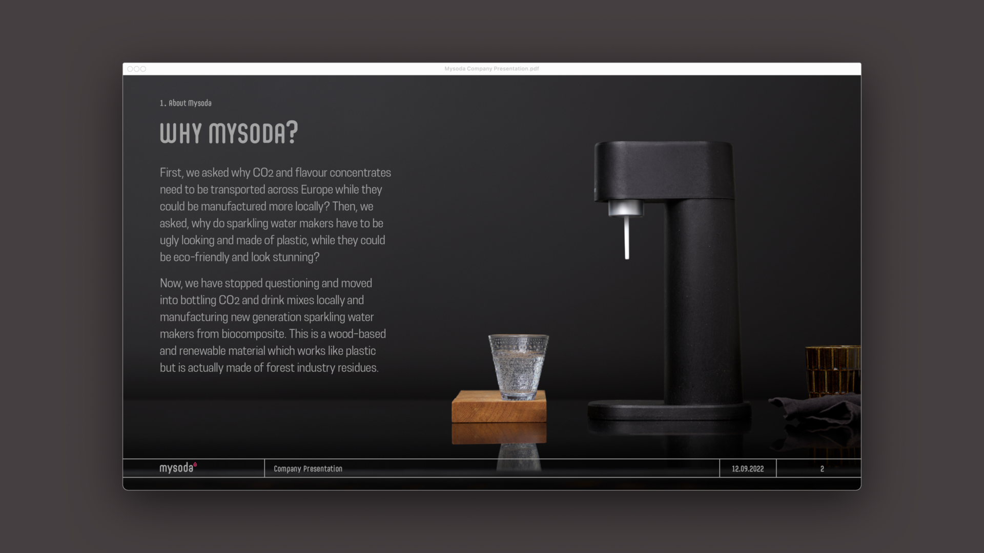
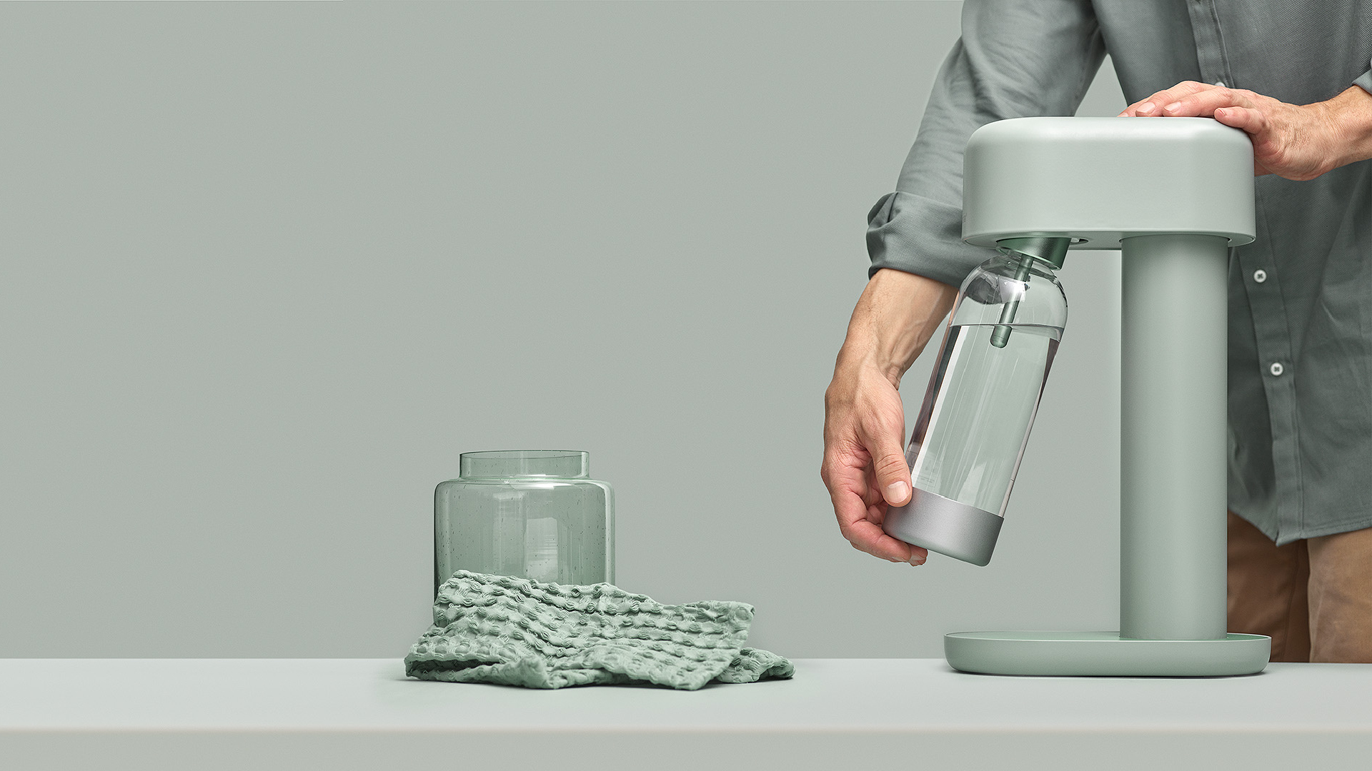
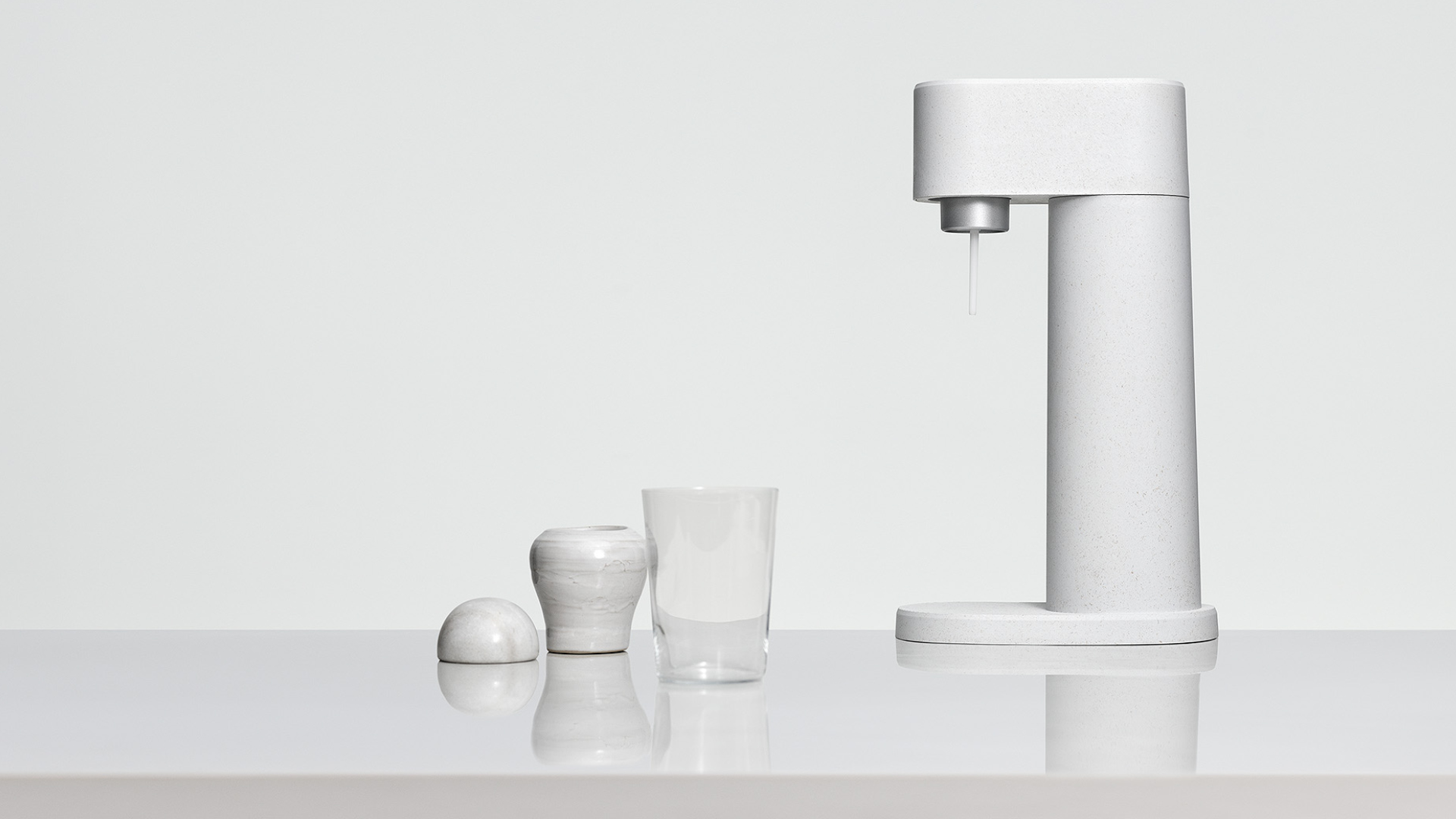
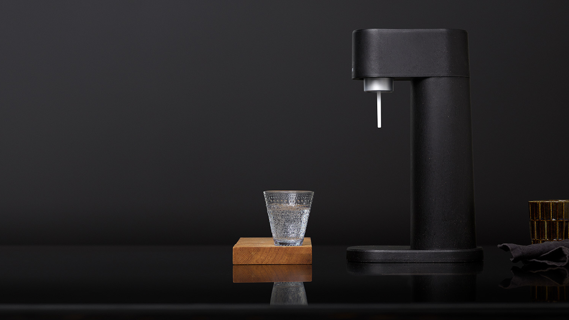
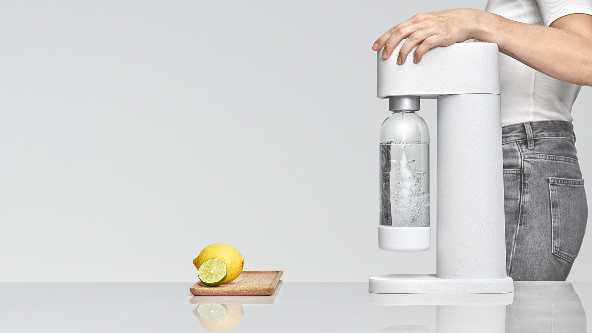
Brand photography
The photo concept is designed to support a minimalist color palette and match the colors of the device to the environment. The image layouts have been kept very reduced, suggestive and minimal to give the impression of a generic space where the device is the center of attention, in harmony with its surroundings.
Spacious images work with text and are suitable for use in many formats.
Photos: Stilleben / Christian Jakowleff
Styling: Päivi Häikiö

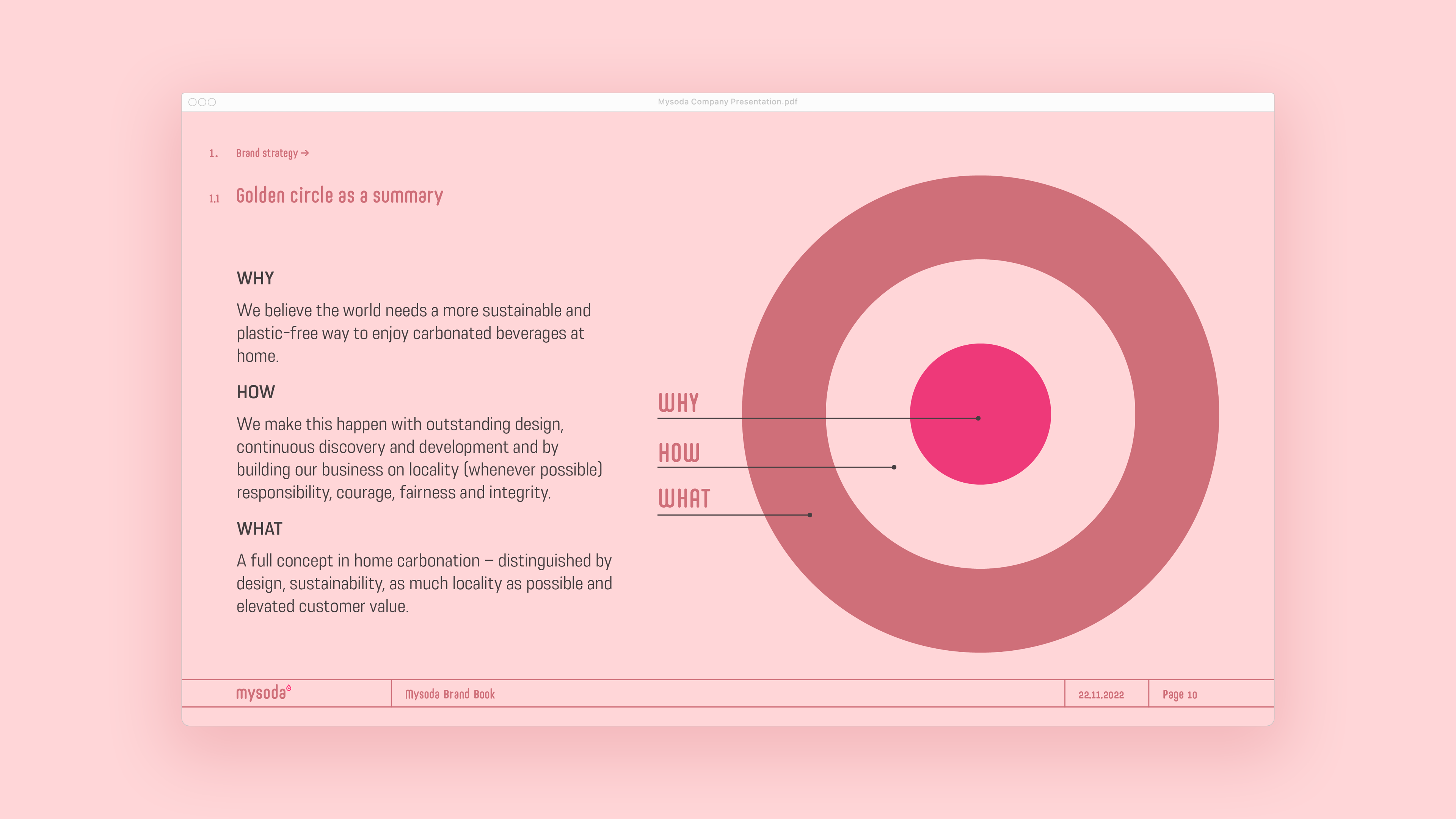
Development of Mysoda's brand strategy
The brand strategy and brand platform were compiled into a brand manual, which is intended to inspire, unify and streamline the work of international brand development in different markets.
The Brand Book contains the key distinguishing factors of Mysoda’s brand and concept, crystallization of the purpose, presentation of the value proposal, positioning and means of differentiation.
In addition, the Brand Book contains guidelines for values and ways of doing things, so that it would be easy to join the activities in line with the brand and so that the values come true in all of Mysoda’s activities.
The work of defining the brand strategy was done in close cooperation with the client, developing and tying into the work both customer understanding and anticipation of changes in the operating environment.
Alongside the brand strategy work, we consider Mysoda’s purchase path from a customer-oriented perspective; the content, needs and possible obstacles of each phase from the users’ point of view.
Based on the analysis, we proceeded together to come up with ideas for Mysoda’s content strategy and the development of thought leadership in relation to the selected topics. We compiled the content development guidelines into Mysoda’s content strategy, which aims to be a backbone and a comprehensive summary of topics and perspectives important to the brand.
“Pentagon Design has been a one-stop strategy, design and brand development partner that has facilitated our entry into new markets and strengthened our global position.”
DAVID SOLOMON, CEO, MYSODA