YIT
Mall of Tripla Visual Identity
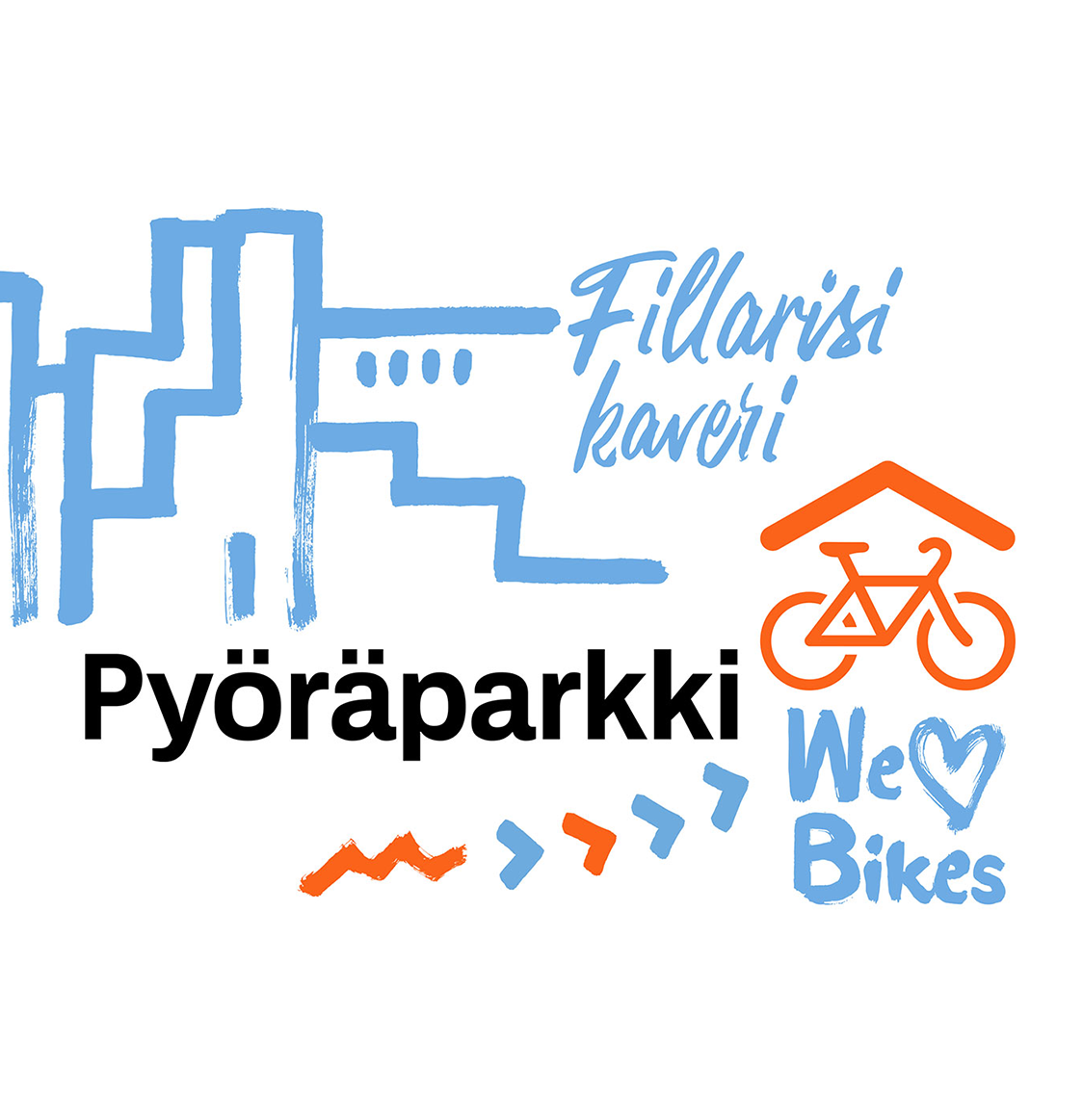
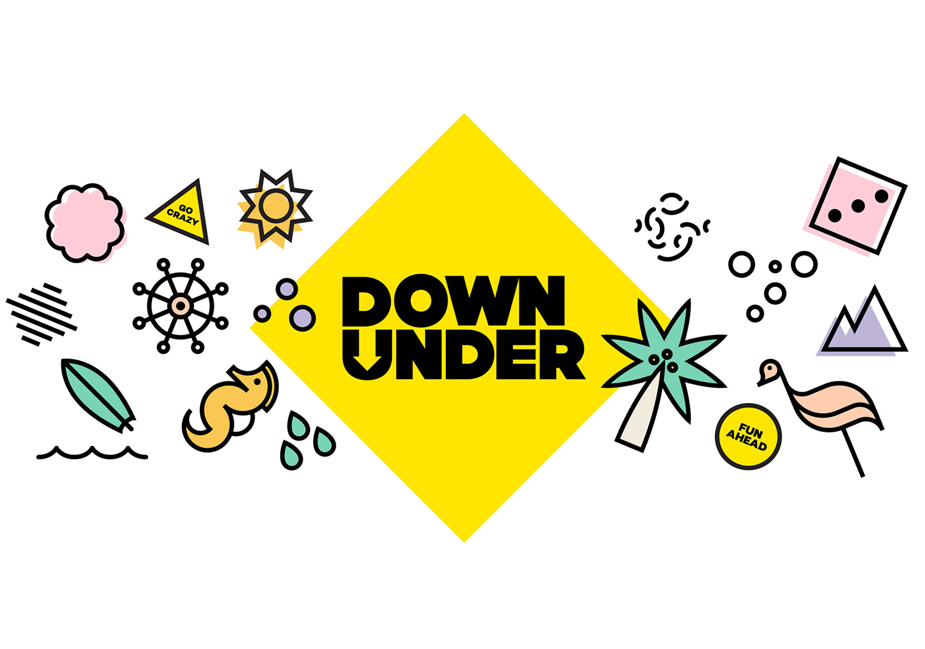
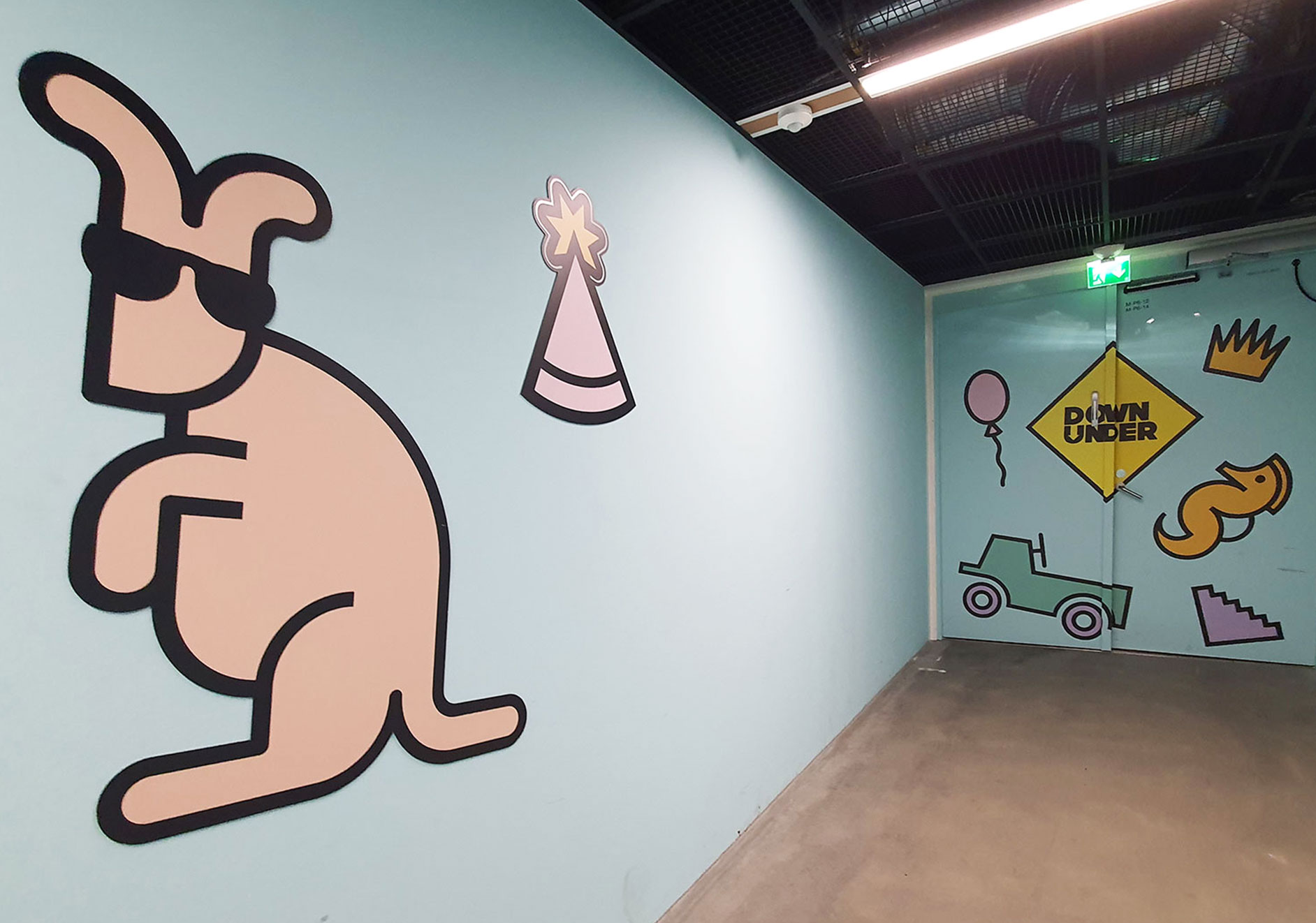
Finland’s largest shopping centre with 250 stores, Mall of Tripla is an urban centre offering new kind of meeting places and experiences. When complete, the new Pasila public transport hub, located also in Mall of Tripla, is the second busiest in Finland, with some 200,000 travellers passing through each day. Along good further connections, there will be e.g. 3400 parking spaces for bicycles. Down Under is an experience centre with multiple free time possibilities located downstairs in the Mall.
The Client YIT looked for developing inviting and bold visual identities for Mall of Tripla, Down Under and Bike parking, as well as design how they would be communicated and visible in the Mall and parking facilities.
Approach
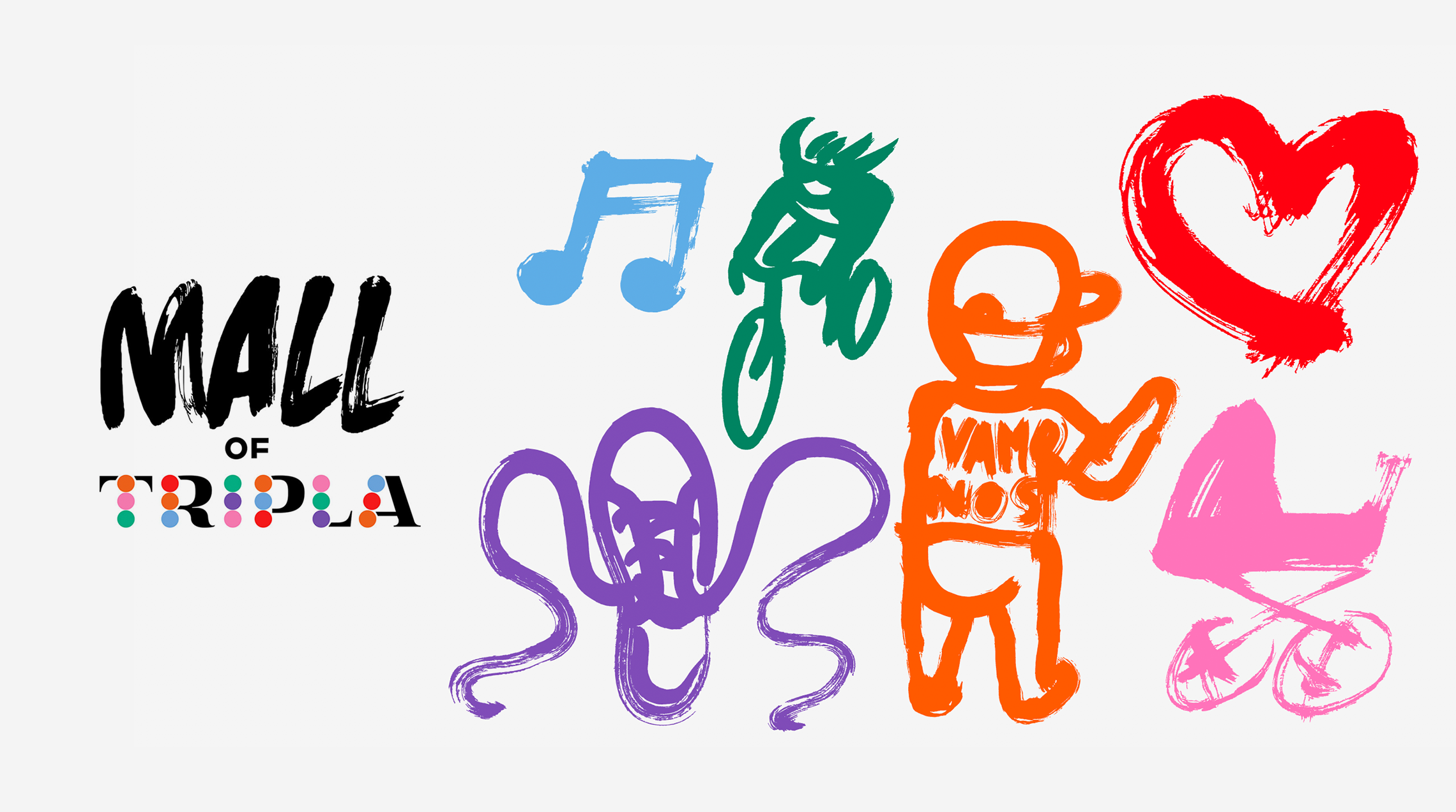
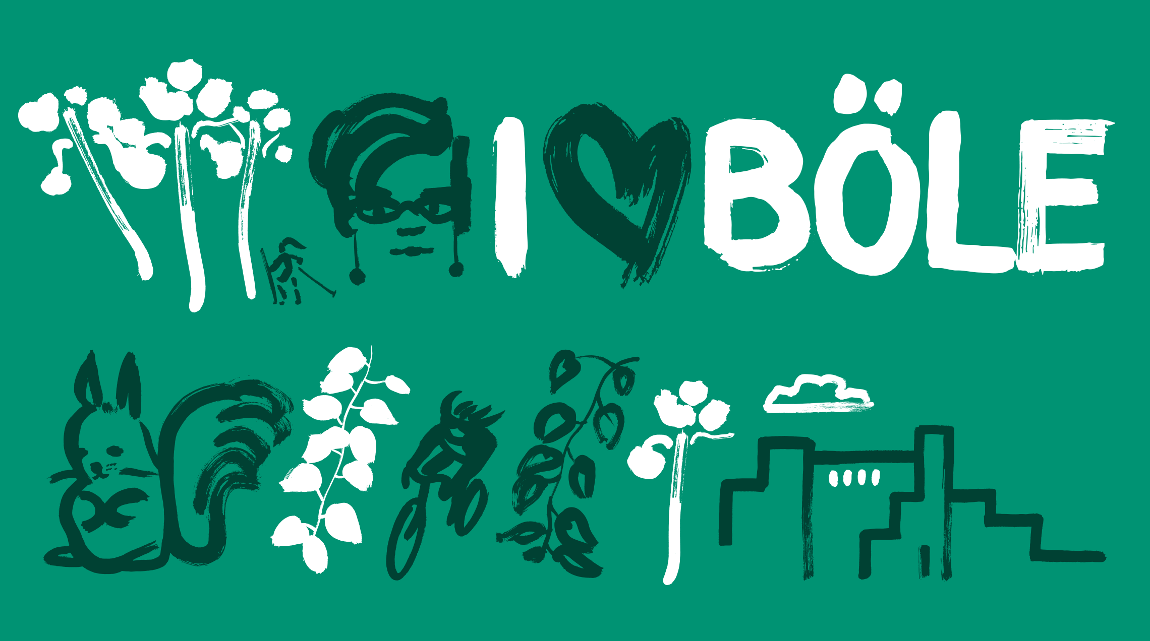
During this two-year co-operation project, first visual identity concept for Mall of Tripla was developed building on the brand concept and preliminary brand identity as a starting point. The visual concept was developed to be colorful and communicate the various kinds of experiences available in the Mall. The concept includes distinctive illustrations designed in co-operation with Linda Linko.
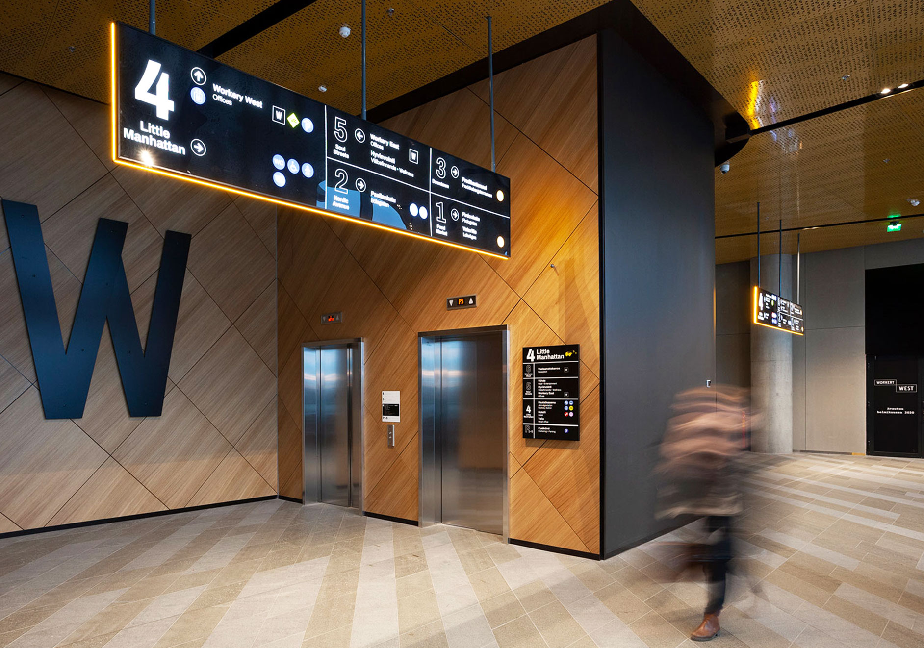
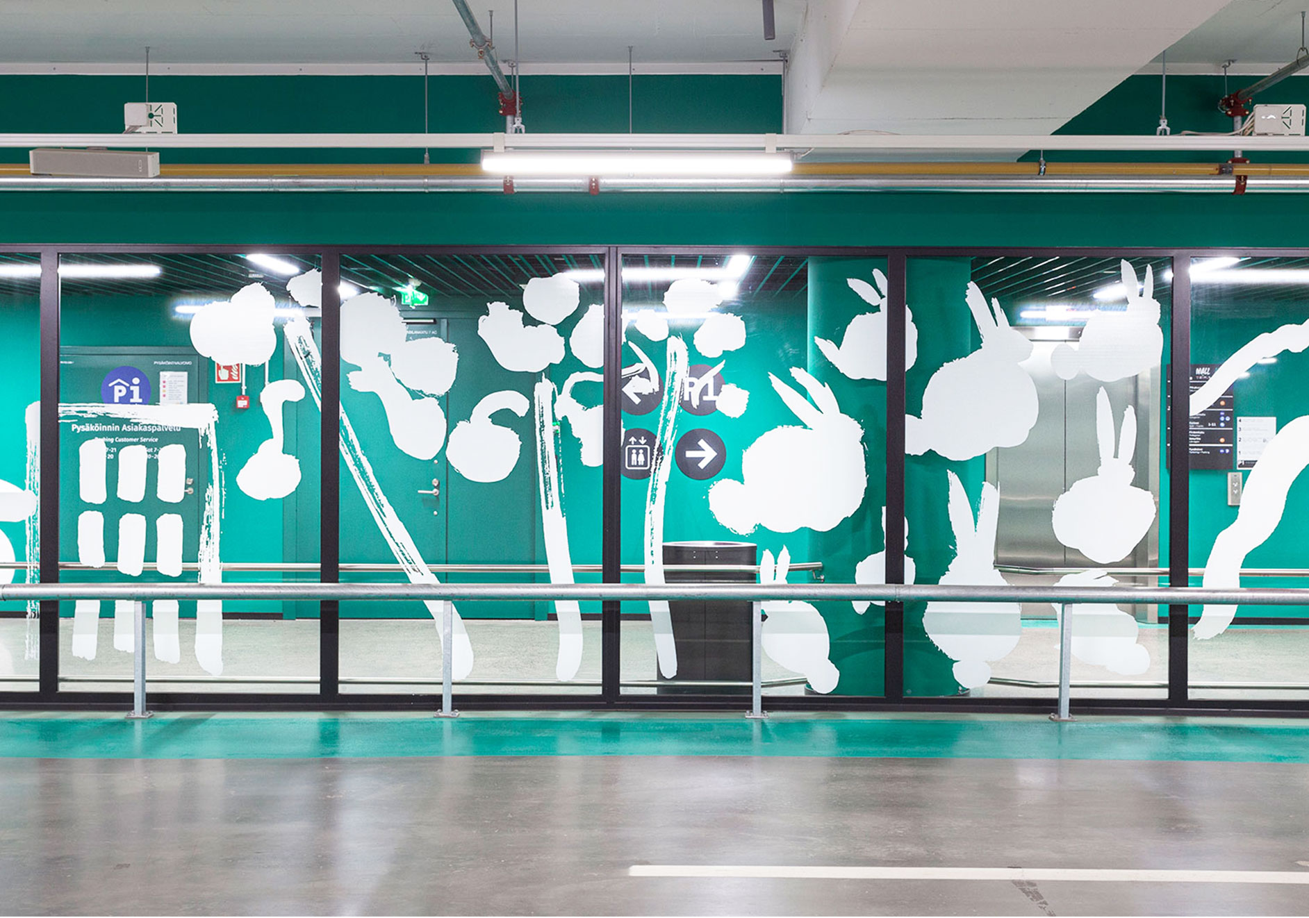
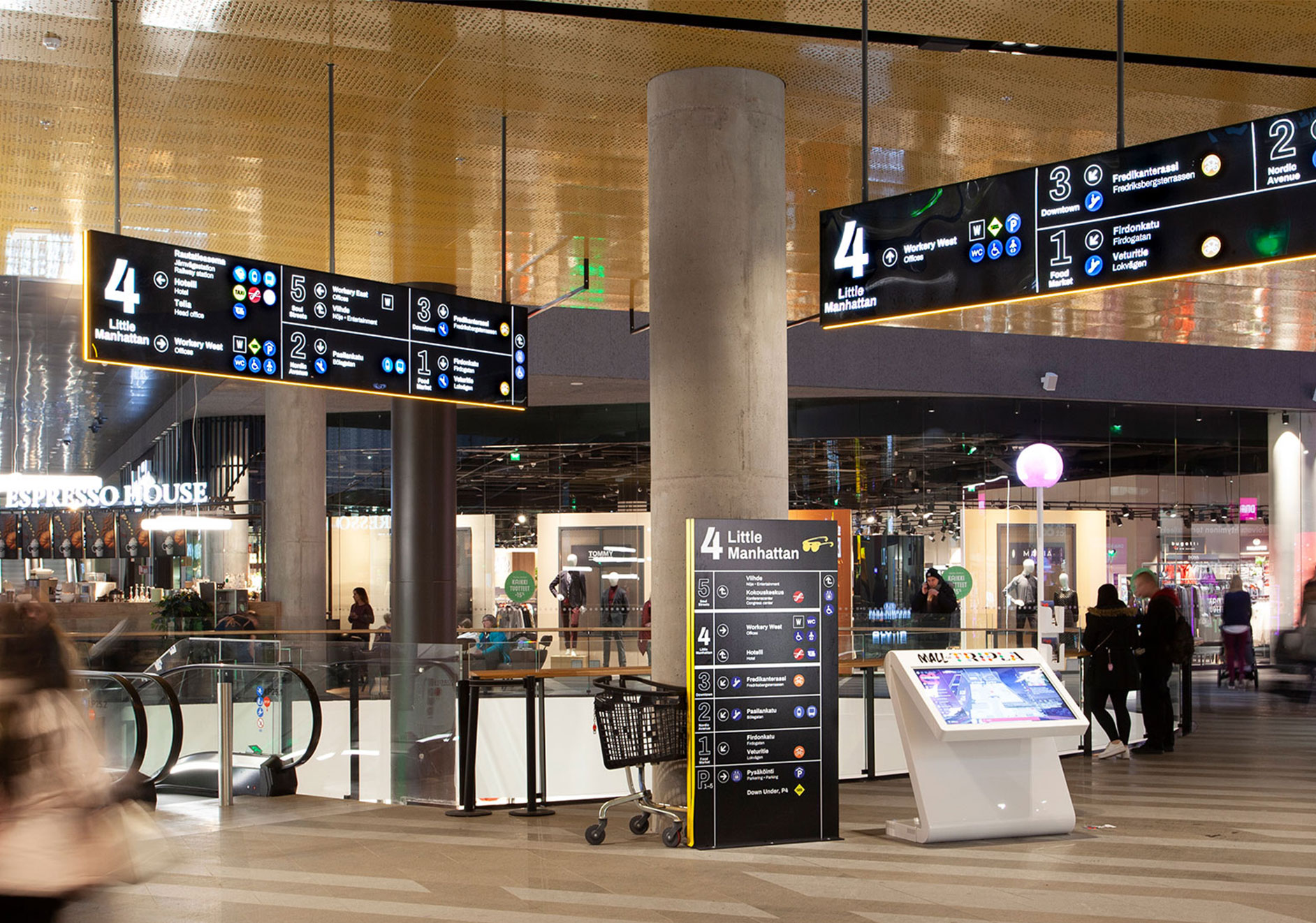
The concept design work included developing visual logic for four vertical areas in the Mall, codifying them with colors that guide visitors in the wide building. As part of wayfinding design and carried out together with related experts, our work included developing user-friendly logic, visual identity and pictograms for wayfinding signage. On top of these, there were illustrations designed to guide people especially in the parking facilities. Co-operation included designing visual identity concepts also for Down Under and Bike parking in Tripla. After designing the visual concepts, our work included design for spatial implementation to the Mall and parking hall.
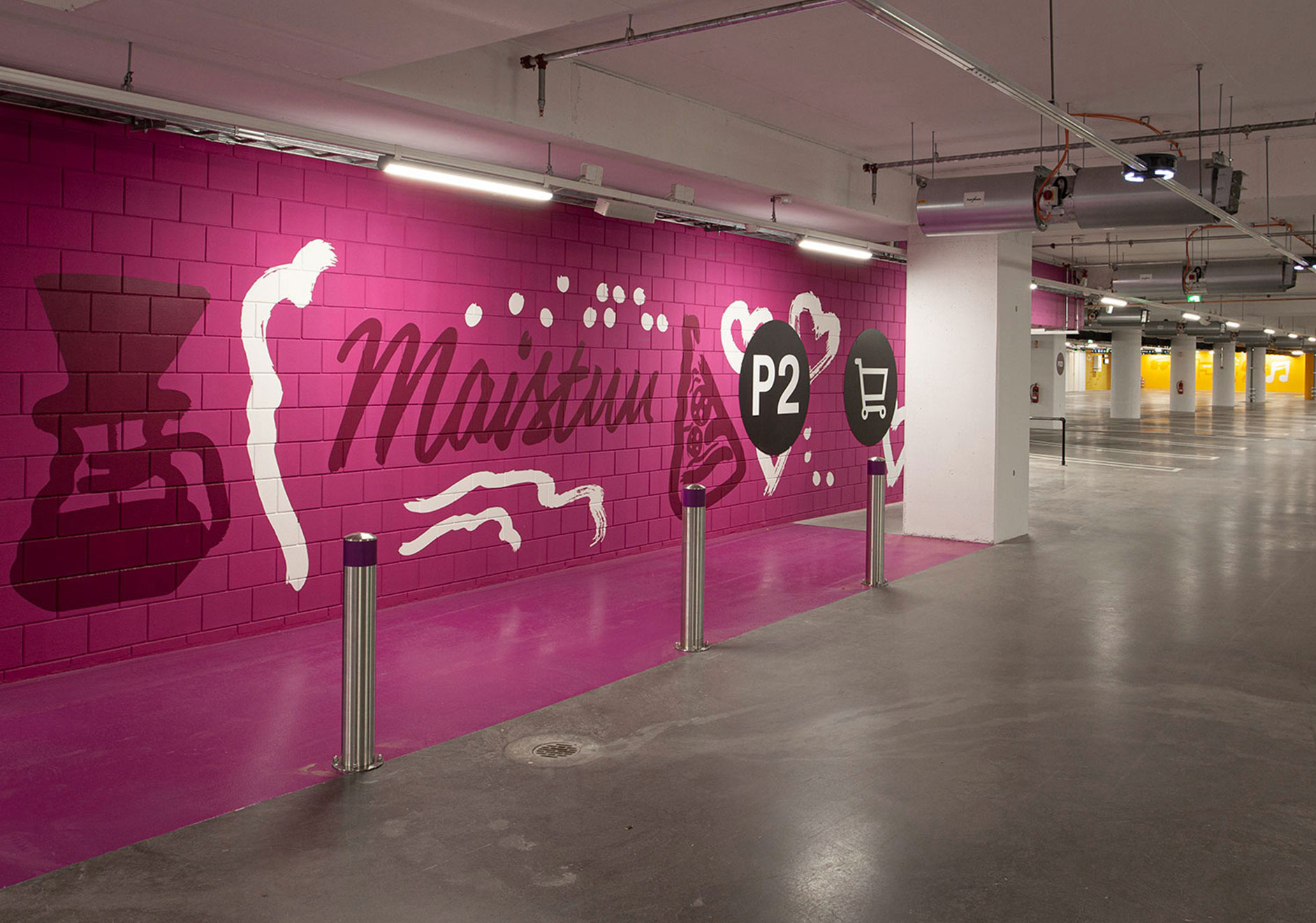
Result
Playful visual identity invites people to enjoy new experiences in the Mall of Tripla. Tripla being called New Heart of Helsinki, visual identity depicts hearts in its core. Hearts and other distinctive hand drawn illustrations, as well as handwritten typography are a recognizable part of the identity and communicate about the relaxed and fun brand. The identity is colorful for a reason. Travelling by public transport, walking in, or arriving by car, Mall of Tripla welcomes with distinctive signage and the visitors can navigate in total 9 extensive floors by following four color blocks and visually coherent wayfinding.
Down Under visual identity takes the visitors also mentally down under. Light green color, kangaroos and surfboards along other inviting signage guide visitors looking for summer vibes.
For the bike parking, design work included design of the bike parking identity and design for spatial implementation. Visitors and commuters changing in Tripla station find bike parking conveniently with distinguishing and colorful bike parking visual identity.
Design of visual identities for Mall of Tripla, Down Under and Tripla Bike Parking


Wayfinding design
Bike park & Down Under