FAZER BAKERY
Oululainen Reissumies – a package renewal for an iconic bestseller in the market
Still, after four decades, Reissumies continues to be one of the most wanted and sold bread brands in the Finnish market. In order to keep the lead and stay relevant and desirable for consumers, it was time to refresh the recipe, brand communications and advertising, as well as the packaging that we redesigned as part of the brand renewal project.
Approach
Choosing our everyday bread from the grocery shelf happens more or less on ”autopilot”, and in this intuitive process packaging plays a significant role. Usually, the trusted, familiar and easily recognizable brands find their way to the shopping basket.
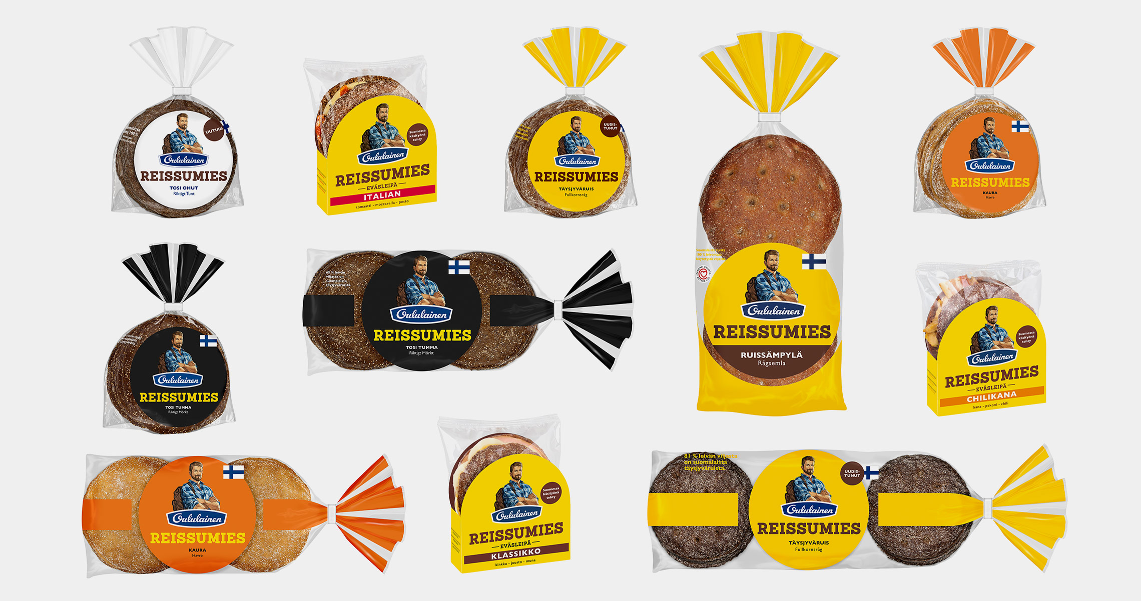
The overall aim for the brand renewal was to highlight Reissumies bread in the minds of consumers, remind of the delicious taste and uplift the brand experience with updated visual identity and convenient new package sizes.
Result
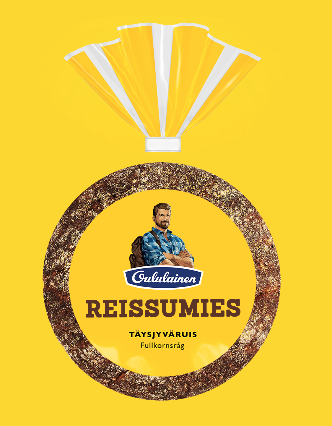
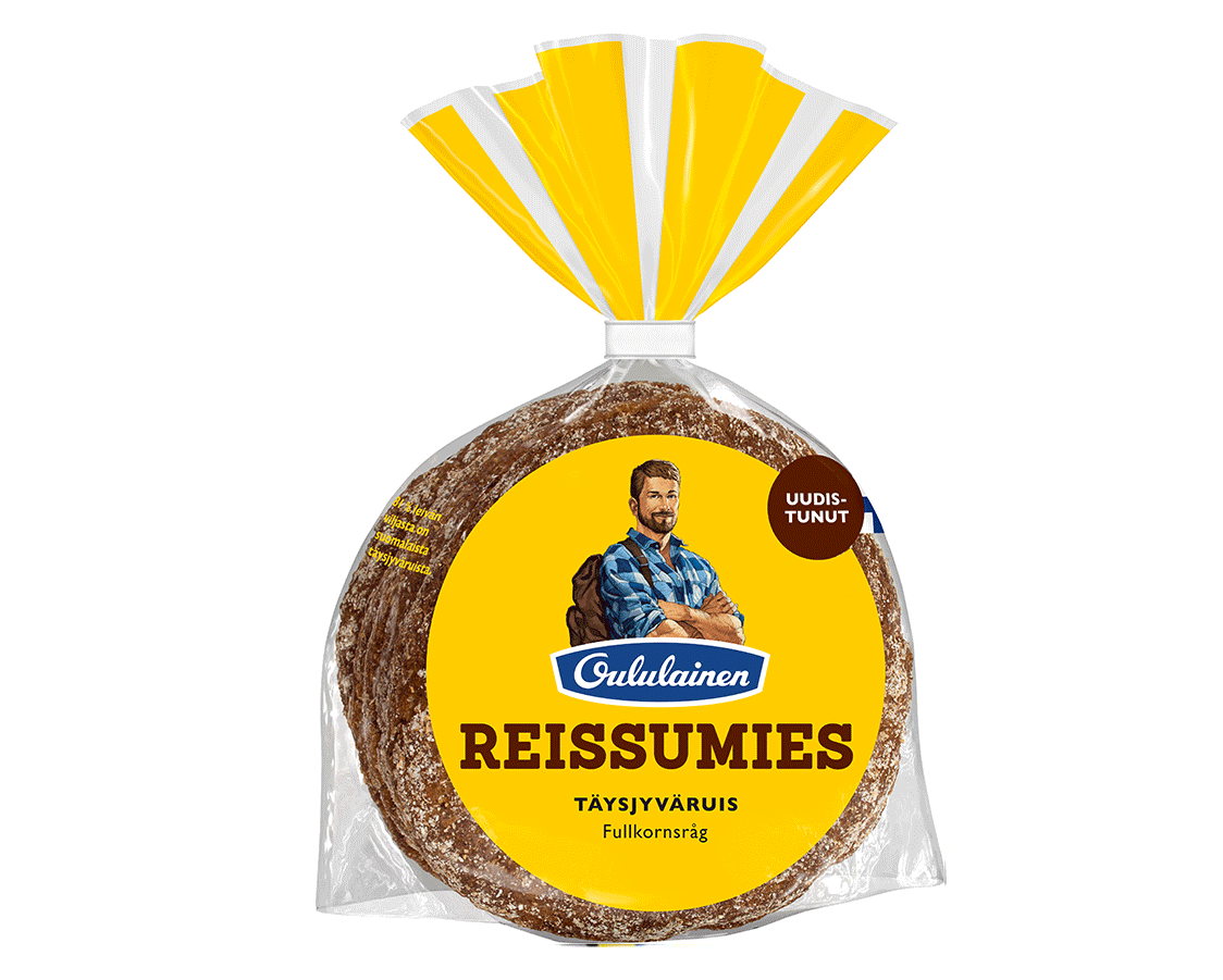
The visual direction of Reissumies was renewed by reshaping the iconic look but cherishing the loved brand elements and ensuring recognizability. The yellow color, the shape of the packaging and the Reissumies character were identified as the strongest visual ques that were retained.
The beloved illustration was delicately refreshed by illustrator Ossi Hiekkala. The messages and elements on the packaging were clarified, the logo renewed and variant communication elements and colors refined.

”We at Fazer have been very pleased with the design and collaboration with Pentagon Design. Pentagon Design’s in-depth and robust understanding of the significance of design and functionality in the store environment clearly shows in the final result.”
– The Oululainen brand team, Fazer